Search This Blog

10/12/11

Exhibition - Post War American Art: The Novak/O'Doherty Collection

LOCATION: Lewis Glucksman Gallery, Cork - a contemporary building set in the gardens of the University College.
Post War American Art: The Novak/ O’Doherty Collection

I almost missed this exhibition and it was well worth a visit, so I feel fortunate that I was able to  just catch it before it ended in early July. 
BACKGROUND: Part of the Irish Museum of Modern Art’s National Programme featuring a rich collection of 76 artworks - paintings, photographs, drawings, sculptures and prints from the New York art scene of the 1950s and 60s. 
Brian O’Doherty, Irish artist and author and Barbara Novak, American art historian built up the collection, acquired through friendships with American artists of the 1960s and 70s and bequeathed it to the Irish Museum of Modern Art. It is a story originating with O’Doherty’s frustration at the lack of access to new trends in art, for art students and the general public in 1940s and 50s Ireland, triggering his re-location from Dublin to New York.

SPACE  The exhibition was divided between two separate areas of the building. This section contained, amongst others, the first artwork (below). This was displayed in a windowless enclosed space in the centre of the building. The only natural light to enter the room was from the entrance door. The room was illuminated by low background and brighter directional lighting. To me this combination had the effect of setting up an ambience of being present in some inner sanctuary.
Jasper Johns - Hatteras
Jasper Johns Hatteras, 1963 
Lithograph 104 x 75 cm
The Novak/O’Doherty Collection
Loan, The American Ireland Fund, 2008
I focused in on a monochromatic lithographic print by Jasper Johns named Hatteras (1963) . A prominent feature of this is a semi-circular arc taking up  a large part of the left side of the picture. Its white background looks dazzling against its surrounding hazy border. The words red, yellow and blue are stenciled horizontally, on three deep horizontal bands and are partially hidden by the large arc. An imprint of a hand and a forearm – very like an x-ray image, sweep across the arc horizontally from the left side and there is a mark at the top like a long blob containing a shape, suggestive to me of another arm imprint. On the lower right hand side is a dark dense tangle of frenzied random lines, looser around the periphery where it encroaches onto the edge of the arc. Another darker limb like shape appears from the lower side of the arc into the tangle of lines. These marks contrast with the relative bright white plainness and transparency of the central area of the large background – this is where my attention is drawn to most. Johns produced a series of variations on a target theme – the target being the semi circle (also changing in design from one piece to the other) was employed frequently in his work.  


 Wolf Kahn - Sea Blue
SPACE: This strikes me as a bright airy space. It is a long curving l-shaped room with high ceilings and plain white walls.  A combination of recessed striplights and spotlights were focused on the artworks. Large floor length windows divide the display spaces giving pleasant elevated views of the trees and parkland outside. The natural theme of the painting appeared to be well suited to the setting.
wolf kahn Sea Blue, 2000
Pastel on paper 33.7 x 43.8 cm
The Novak/O’Doherty Collection
Loan, The American Ireland Fund, 2010


The first thing to catch my attention about this seascape was how isolated and anonymous it looks and could pass for many different coastal locations.
I find it quite ambiguous, in the sense that I can't make out a natural correlation between the grey overcast sky and the large section of intense blue of the sea; in a real landscape I would expect a blue sky with a bright blue sea such as this, or, with a grey sky, the sea to be much less intense in hue. There’s even what appears to be an atmospheric mist hanging over the distant bay, is it low cloud rolling in or is it reflected light from the sky? 
From the corner of  the lower left side are what could be dark shadows, carried over onto the headland.  To me these effects blend the sea, sky and land effectively, helping to draw my attention to those areas, in particular the area bordering onto the mist (or reflections) over the upper part of the sea.
The close study of this landscape has led me to ascertain that it is less about realism and more to do with an experience of colour and light. On reading a couple of articles about the artist's work, my theory perhaps isn't too unlikely.

10/10/11

Assignment Four

If I was to complete the course, naturally I had again to face up to the inevitable challenge of the assignment pieces. It was looming ahead like some dragon waiting to breathe fire at me when I got too close. The trouble is, very often my approach has tended to let me down at this stage and the ensuing drawings become too stiff and contrived.  …not the easiest thing for me to avoid. 
Luckily I was able to obtain a patient and resident model in the form of my husband Kevin, so I was off to a good start.

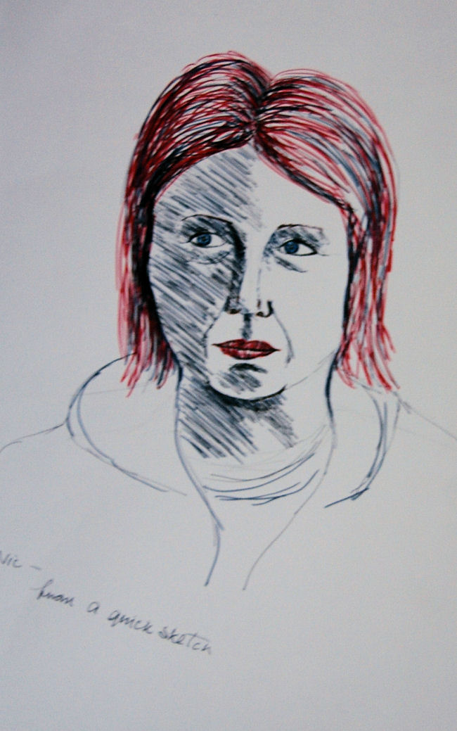
As the instructions didn’t mention anything about using coloured media I thought it safer to stay away.


Line and Shape
I began all the sketches and drawings by marking in the top and bottom of the figures, to give an area to stay within. I find it helps the drawing fit the page. Then I established the size and position of the head with a few feint lines and checked the number of times the model’s head length fitted into the space provided. I simultaneously transferred these measurements onto the page, allowing for a little flexibility. I checked  and re-checked the lower leg length a few times as they took up such a large part of the height from the kneecap to the toe, compared to  the upper legs and lower arms, which were foreshortened by the sitting position.
Because I tend to have difficulty at times (as may be evident), getting the shape of the lower legs to look believable in my drawings, I tried out a method I read about in an ebook about drawing tips. To look convincing as a human leg the upper calf on the outside should be fuller than on the inside and is fuller on the inside lower calf than on the outside. I tried to simplify things on the second sketch with the curving inner lines but it wasn’t as easy as it looked. I spent a relatively long time on the first sketch, to determine proportions were adequately correct in my own mind.
On the first two sketches I was pulled into drawing the details of the hands at the expense of the face, but I was more concerned with the hands for some unknown reason. 
To the relief of my model I was gradually speeding up with my sketches and the third one, in charcoal, was finished the quickest. I enjoyed the doing the sketch in charcoal, mainly because the many repeating lines in the first two have been replaced by a mix of more decisive and undulating lines, but not enough. I do think it looks more spontaneous too. The clothing is indicated more and I’m fairly pleased with the extra features I included this time, considering it was a faster sketch. The model is leaning on the arm of the chair, which I think looks interesting, although I couldn’t expect them to hold a pose like that for two hours or more. The willow charcoal glided smoothly across the cartridge paper surface, and is forgiving and expressive. Because of my sense of success with the third sketch I decided to use it for my final drawing.

I initially decided to go with a pose similar to the first two – the model looking to the front. When I stood back and examined it, after drawing in the outlines, I thought  the model’s pose was too symmetrical and boring. So I then asked the model to turn to a side (or profile) view. I decided to use this angle, as  thinking back over previous exercises I hadn’t used it before with the model in an upright position seated on a chair. It was also a way of the model being comfortable in a non-rigid looking pose.
Final drawing:
For this drawing it was a case of trying to apply a 3 dimensional appearance to the figure using only line and shape with no tone, as per instructions. Looking at the finished drawing I think I had
 some success here and there – the crease running across the 
front of the model’s top slopes in a slightly upwards diagonal
Final drawing (charcoal)
in line & shape
 from left to right (sloping away) so giving a look of perspective. Despite putting in a few outlines first in pencil, there are a good few clumsy looking lines in the wrong place or too thick (behind the upper arm and top of the forearm) but I didn’t want to try and change them incase I made them worse. The base of the sleeve looks a little too narrow. I put in thick line around the figure’s outline – especially the nearest side and the outer edges of the legs to give them definition against the chair, the shape of which I thought would be better to outline only faintly in relation to the figure to give it less significance. The chair arm would probably look better like this also.
I’m glad I used willow charcoal as, apart from the attributes I mentioned beforehand, I found I could vary the weight of line easily and it was easily erased when necessary. I couldn't avoid this as some areas just looked so untidy if I left them alone, but tried to keep this to a minimum.


Tone

The model was lit from the right hand side by an angle poise lamp at least 4 feet away, emitting a good wide beam of light from this distance.


The first sketch (in pencil) again took a long time to do. I was struggling to get to grips with this ¾ elongated angle. I was careful to make sure I was more or less happy with proportions before proceeding further. I didn’t want the final drawing to be a disaster for this reason. I was constantly comparing measurements of one area to another and checking angles against the vertical and horizontal. The model was wearing jodhpurs, yet the roundedness of the upper outer left thigh looks over exaggerated on this one. His feet were sock free this time and I was glad to have the chance to do the fascinating details of the toes from underneath.

Sketch two - this was completed with Pitt art pen. I was less concerned with proportions in this one, more with just correcting the line of the legs. What I notice most here is the flatness of the face - it looks rather like a mask.

The third - a 10 minute scribble drawing in Edding 2.0 calligraphy pen. The poor man looks completely sizzled and/or mummified here. However, I wished I’d done at least one scribble drawing at the start, as I think it would have been a faster operation to grasp the right proportions. It probably would have taken me more than one sketch, as the legs are way too long on this one.   

model has not been electrocuted despite appearances!
Number Four - the ¾ view (in ballpoint pen) I hadn’t tried before, and it looked interesting; It was actually more angled towards a front view. I liked the sharper angle of the legs and the angle of the feet – they looked natural, but this time I already had my sights set on using the same angle as previously. The landscape format appealed more to me, partly because it was a change from the mostly portrait format I had used in the past and because the 
angle of the pose looked well balanced and filled the page.

Sketch four

Tone - final drawing:
The first attempt at a final drawing was a disaster. No matter what I tried I could not get the left foot in the correct position. It was drawn in and replaced 2 or 3 times, when -finally I realized the legs were too long.  At this stage the only thing I could do was take a few deep breaths and start again. At least now I knew what not to do and things went smoother from there on.
I decided beforehand to try out some cartridge paper previously gessoed with a homemade mixture of emulsion paint and pva glue. I read in a book that using this paper one could easily obtain very deep dark tonal shading with 2H to 6H hard pencils. It looked impressive in the book and it had worked well on some other paper I'd gessoed prior to the latest batch.  When I tried it out on the paper I had this time the effect wasn’t quite what I was looking for. I figured maybe I used too much pva in the mix this time and/or the wrong type of emulsion – silk when it should have been matt. Anyhow when I tried 2B and B pencils they seemed to work fine, so I continued in this manner. Fortunately the paper did seem to produce a darker effect with less pressure from the pencils than would be the case using untreated cartridge paper. It also seemed easier to smudge with my silicone paint pusher. The media and surface combined certainly gave a sheen to the whole drawing. To use a different texture paper from the norm was also interesting. 
In the final drawing I tried to treat the background as secondary to the figure, giving it a slightly hazy look, so the figure would have more prominence, while at the same time keeping the background and figure related. I'm not sure I managed to pull this off - the figure seems to blend in with the background quite a lot, although my attention is drawn to the face. 
sketch five
Proportion wise, the model’s hand could be slightly too large, but I’d rather it was this way than too small. When I compared the feet with those in the previous line drawing (after my tutor's comment about them) I noticed they don't look as convincing. The slippers look relatively small. I’m not too happy with the nose, it looks clumsily done – so I’m glad it occupies such a  small part of the drawing as whole. The back left of the chair looks a bit too dark, but probably helps the area as a focal point. The light and shadow seem to form an interesting pattern of movement around the composition. The lines on the picture behind are running in the direction of the model’s head and body. On the smaller picture to the left, the bottom right hand corner of it seems to point towards the head, helping to direct attention towards the area again. These factors I think, are really more of a happy accident than intentional. I feel that I've captured the model's character and achieved a good likeness - and he agrees. However I did struggle with the leg proportions. Comparing this with certain earlier exercises - The Longer Pose and others,  I can detect an improvement in my technique overall, despite the extra time taken in this drawing. I am pleased to be able to admit, my confidence to do both figures and faces has improved markedly over this part of the course, in spite of one or two moments of frustration.
My poor husband was very patient considering I didn’t finish within 2 hours. It was more like 2 1/2 hours not including breaks. I felt relieved and fortunate that he was able to tolerate it as well as he did, since he had already posed for long periods of time for all the sketches and drawings for line and shape in this assignment piece, and the whole project from start to finish took me  several days to complete.


The final drawing (version 1) in pencil on gessoed paper


Spot the difference - in the second drawing above, the cup and slippers have been removed. 
Also I altered the the model's right hand and left foot. These were all points that my tutor commented about in feedback re- the believability of right hand and were the cup and slippers necessary? 
The sole of the model's left foot looked distorted, with no definition to the heel causing the sole to curve round and up the inside of the ankle. This whole are was one solid flat mass. The whole foot looked stiff and too straight. Rectifying this was a process of erasing and re-shading in the odd (appropriate) location.  The toes were adjusted slightly and the lower left leg widened - which looked too narrow and straight before. Practising by sketching my own foot beforehand definitely made the process more straightforward. It surprised me how this time I could see much easier the angles and shapes in relation to one another than during the first attempt. Now the ball of the foot and the toes actually appear to have a convex curve to them, so looking much more natural.
The intention originally with the cup and slippers was to add context, but now they have disappeared I  realize they were over the top and drawing attention away from the focal point - the model. In fact not really doing the job they were intended for. On this occasion there's enough going on elsewhere. 
Beforehand the fingers looked too straight, limp and flat . The fingers were rather like the empty fingers of a glove hanging loose.  I altered the angle slightly, so there was plenty of erasing and rendering to do. It was definitely more demanding  to do than the feet. Now I think it looks more three dimensional and appears to hang naturally as though the armrest is partially supporting the hand, which it is. Looking at the faults now I'm amazed how I didn't see them at first - they appear so obvious now. It's been quite a learning curve I hope that  as I keep looking hard signs of progress will become more apparent. 


10/7/11

Research Point - Self Portraits


Graham Sutherland,  (1903-80)
When I was visiting London earlier in the summer I called into the National Portrait Gallery, where I spotted this self portrait in oil on canvas. Graham Sutherland was a big landscape painter and a war artist, but he also did quite a number of portraits of famous people such as Somerset Maughan and Winston Churchill. As I was scanning each portrait along the walls in the gallery,  this one immediately caught my attention. 
Painted in 1977, during his final years, the expression looks contented, yet I can see a hint of dark underlying sternness on the right side of the face and the intense concentration is evident. The other side of the face is lit up with a lovely reflective quality and light appears to be shimmering out from around the head. I also notice a curious thing about the face - sometimes I find it looks serious and at other times grinning, rather like Leonardo's famous Mona Lisa.  All brushwork looks free and loose, especially in the background. 
I think the domination of the colour and shade of green also help to exude an air of quiet calmness. In effect, every part of the painting seems to be bathed in the green atmosphere. 


Vincent Van Gogh
This was painted shortly after the death of his beloved brother Theo – his last self portrait. The eyes appear to say it all, a look of utter devastation and despair and the background of swirling lines seem to pulsate with the turmoil probably going through his mind.


Rembrandt van Rijn
Rembrandt is thought to have depicted himself in paintings, etchings and drawings a record number of times. 
Another final self portrait - this has misty atmosphere around the face, through it he stares out with a piercing yet contemplating look. Amongst the washes applied on his clothes, I think great tonal depth has been achieved, furthered by fine hatching, although it still retains a soft and flowing appearance. 


Self Portrait 1956
Ink on paper 12.5 x 7.5 cm

William Utermohlen
Through a series of self portraits William Utermohlen recorded a very poignant portrayal of his decline into dementia. Archives http://www.nowpublic.com/health/william-utermohlen-s-self-portraits-chronicling-descent-alzheimer-s#ixzz1YJZ7LRAA


This is a self portrait of him as a young man. Minimal lines very adequately describe the ruffled hair . The vertical hatched lines on the face appear to be rapidly drawn and decisive, echoing his determined expression peering out under the spectacles.


David Hockney
This is another drawing where the treatment is sparse but very effective and there is no doubt about it being a true likeness! A piercing stare again - I guess this is only natural when studying intently one's own reflection. 


Kathe Kollwitz
The last great German expressionist and outstanding artist of social protest.
The portrait emits a darkly sad expression enhanced by deep shadow in the lower half of the face, particularly around the eyes, and the supporting hand on the forehead. The dense mesh of linear hatching spirals outwards from the centre around the eyes, is carried through onto the hand, and becomes gradually bolder and looser towards the outer areas. This dark, quite disturbing mood, emitted (as with so much of her work) is perhaps a reflection of the misery and hardship she witnessed and endured during her lifetime.


Bruno Schulz

Right is a self portrait by Bruno Schulz. He was a well known writer, said to be comparable 
to Franz Kafka, and an artist up to 1942, when he was shot in Poland by the Nazis. I wasn't able to find when he did this portrait. It has a very direct appearance, reflected in the type of marks used, while deep and esoteric.
There is also a serious and wary look about the eyes - hardly suprising.


10/5/11

Self Portrait and Portrait from Memory

Self Portrait  
These sketches made handy references, but I don't think I made enough use of them for measuring in my second portrait, as initially  I had problems getting the facial proportions to look right. Believe it or not they are really me and not copied from a book.


First portrait - pencil
 One of my critics remarked about the similarity between the two...? This photo was the nearest  I could find of Liam Gallagher. Possibly there is  something about the gaze.


Liam Gallagher


Check & Log
  1. Which drawing materials produced the best results? Why?
For the self portrait I found that a mechanical (clutch) pencil with 0.7 lead was versatile for detail and fine lines, but with definition, although I needed to use this with a conventional pencil for shading areas with the side of the point. I discovered that using a silicone paint pusher for blending some shading was easier to use for large and small areas and more accurate than a fingertip, without the grease.
It was easier to control the detail and depth of lines and shading with conte pencil than conte crayon. The crayon was better for more defined, darker tonal areas. I like the fact that conte pencil and crayon aren’t crumbly, so are relatively clean and easy to control in comparison to soft pastel for instance, so I thought it would be a safer bet for a subject requiring accuracy .
For the portrait from memory a Faber Castell Pitt medium art pen was ideal for giving definition by using pressure, delicate enough for feint lines and easy to manipulate. The same would apply also to all the above media.


  1. Does your self portrait look like you? Show it to a couple of friends or family members and note down their comments.
My husband Kevin said that although he thought both portraits were a good likeness of me, especially the second in conte crayon and conte pencil, but the first  (in pencil) looked rather serious for me, as my usual expression suggests a grin lingering under the surface. I’m not sure if this is always true, there are many times when I know I look serious, sometimes too much so.
My sister Nicola was of the same opinion about the second portrait, saying it’s definitely me -I would agree. The first one in pencil, she said looks more masculine, yet still like me with no eye make-up (that would be true) and reminded her of Liam Gallagher! I’m not sure how to take that, particularly as I’m far from being a fan of his, although it could be worse. The eyebrows I would dispute most of all - I doubt she was serious. But I have to admit, when comparing the gaze in the self portrait and the photo - if his eyebrows were trimmed drastically and if I knock a few years off myself, I can see some slight similarity.

  1. Did you find it easy to convert your sketches into a portrait?
The first exercise certainly helped me to observe more closely the basic shapes and facial features of my own head and face and to become more familiar with my own unique appearance. This may sound odd – even though I thought I  knew my own face better than anyone’s, it’s the little nuances that make such a difference in achieving a likeness (or not). Previously I didn’t realize that the corners of my eyes are slightly higher on the outside than the inside. By doing studies of individual features before the portrait/s, really scrutinizing all facial features these things become evident. The same was true for the portrait from memory, although here, I didn’t have nearly as much visual information to hand as for self portrait.

  1. Were your preliminary drawings adequate?
Yes I think they were. For the self portrait I referred to my own reflection for the actual portraits, although the sketches were useful to familiarize myself with aspects of my head and face such as shape and proportion and planes and came in handy as references.  
Portrait from memory -
a sketch I tried without
references
Whereas, in the portrait from memory, my sister posed for me on two separate occasions while I did a couple of sketches of her face. Shortly after the second sketch (the following day) when I tried to do another sketch without any references and purely from what I could remember of her face, the face was too rounded and looked younger by about 20 years. It came as a surprise to realize I didn’t know her face as well as I had thought. I tried this out with a couple of other people I know well and discovered the same problem.
Nic in felt pen
In the end I did a portrait of her in black art pen from the two sketches below. I did a few studies of individual facial features but didn’t use them for reference. Just drawing them seemed enough to help the information sink in a little.  This drawing was definitely more successful in obtaining a likeness, because of the reference sketches.


Portrait from Memory
The drawing on the right in coloured felt pens, is a first attempt at a portrait. I don't like the effect of the facial shading. Most of this is made up from memory, apart from a reference for the nose. The eyes are different sizes, as with most of the portraits I do. Compared to the black art pen (below right) it is a course medium, but it was probably more to do with the way I used it. With a lot more experience I might have had a little more success. 


This is a better likeness than above.
Pitt art pen
Two sketches from life

10/3/11

The Moving Figure

This was a work in progress for about six weeks. With hindsight I should have started these earlier on in this part of the course, as I would most likely have more confidence for quick sketches than I have now. It was hard to get going with this – putting too many mental obstacles such as ‘I live in an isolated place’ in the way of just seizing the moment as often as possible when I’m out and about. However, once I’d got off the ground and into the habit of doing them I started to become aware of my improving confidence and actually enjoying the experience. For a while I felt frustrated with how incapable I was of even getting the pose of a person who would change position after only a few moments. Then I decided to focus only on the gesture, even reducing it a stick figure, and afterwards I was able to fill some of their bodies and clothing to help them appear more lifelike. Although I had to resign myself to be content in leaving some to remain unfinished.
If I saw a particularly interesting pose, for example a woman holding up and reading a newspaper in a newsagents shop and I couldn’t get the angle of the hand in on time I would make the rest up partly from memory, partly from imagination. To my relief using this method did appear to work out occasionally, but not on this one as her (added on) arm looks stiff and unreal.
Sitting and Waiting
Above and below -
Mallow Railway Station
At times I took advantage of TV and DVD, mostly when doing sitting and waiting exercise, and before long it began to dawn on me how interesting it actually is to sketch various poses and actions. Somehow by sketching scene in front of me made people's antics so much more visually fascinating than ever before. The source material on TV for future studies is endless, let alone actual live people out and about.

Mallow Library
DVD 

DVD - Still Game

A man demonstrating how to train a
 dog and another doing a press-up
 challenge on u tube
I can see how easy it would be to include many of these in a longer piece, or part of one. Photos, magazines and DVDs could be very useful for action poses, in particular in longer sketches or a finished piece and the model is required to stay still for quite a while. These could be something with a  storyline - a group of people chatting or walking along a street, someone getting off a train  or painting a door perhaps. Almost anything could be given a narrative with a bit of imagination and one or two props. 
Fleeting Moments
Props seem to make all the difference in making an activity appear more interesting, such as when I was out and about and sketched a line of rowers carrying a canoe or rowing along the river. It was a case of by chance, being in the right place at the right time and this didn't happen too often! But the more I got into the habit of regular people sketching the easier it was.

Rowers on the river and riverbank

A team of female rowers and a single male rower manoeuvring his canoe. 

Workers, walkers and rowers

Fleeting Moments

Airport - had a go at sketching the odd person in the café/s,  but I very soon became conscious that either they or a person with them may have twigged me watching, as they began looking over at me. This meant I had to try and get down what information I could in what seemed like only a minute or two, though it was probably longer. 
On the rail station platform (top right) yet again I think I was spotted by a couple of people who must have been wondering what I was up to observing them so intently. If I continue, as I intend to, I’m sure I will be confronted by someone sooner or later!


Men filling petrol and chatting
Man (left and woman (right) filling petrol


Young woman with hair piled up high, filling petrol


People at the petrol station. I found it a good place to observe gestures and differences in the way men and women go about things. The man (above left) is filling his vehicle with fuel but went about it in a more self assured manner than the young woman (left)


They are rough and very minimal looking but I’m sure that they were crucial to improving and speeding up my technique and observational skills and should help to give more expressiveness to my sketches and drawings - eventually.


Supermarket checkout and the playground

Supermarket checkout

Supermarket checkout - people queuing,

packing trolleys and bags.

Sketching people packing bags was easier to manage than the checkout, as people stayed around a while, not changing their stance as quickly.
Two or three looked quite distinctive in their appearance like the chubby man with the totally bald head with the thick set woman with long hair the and man with the thick moustache and eyebrows. 
The figures to the top right are in a playground. I did quite a few of adults pushing children on the swings. These actions seem to give a great sense of movement.
The others are of a man and a youth sitting on a bench with their backs to me. The man was a great unsuspecting model - he stayed there for quite a while and did a few different interesting poses.


Playground and posture
Playground and
people with bags


Research Point

I noticed a general difference in the way males and females do many things when out and about. Some things I hadn’t noticed before.
Men tend to stand with their hands in their pockets, hands on hips, leaning on one leg. Women are often holding a bag in at least one hand or over the shoulder and tend to stand more erect, with their weight evenly distributed. They look more graceful in their movements overall than men do.
At the petrol pumps (above) -
Women's movements and hair
 I noticed that men often use only one hand to hold the hose, mostly looking confident, whereas women tend to be more careful and use both hands and the odd one even appears to struggle, as with one particular young woman in my sketches, who was having difficulty stretching the hose round to the petrol cap on her vehicle. I saw a man doing the same thing but he looked so calm and self assured in comparison. Another young woman decided to move her car round to the side where the petrol cap was located, after parking first on the other side. I have to admit, these women would have been relatively inexperienced.  I’m sure there are plenty of men who don’t look so confident when filling petrol/diesel but I didn't see any.


Man in the library
Kevin varnishing


On the street and riverbank


I saw a few youths sitting on the back of benches around and about, but I didn’t see any females doing this. I guess all these differences aren’t surprising -as well as obvious differences from birth, social conditioning also has a lot to do with it.
In this little corner of the world I’ve noticed women’s hair is often longer than men’s, though not always, and their hairstyles tend to be more imaginative - sometimes wearing their hair up on top of their heads or plaited, for instance. I found this fascinating to observe, but again, I only did a few rough sketches of them. Men's bodies and
faces are often heavier and stronger than women’s, who have especially in the lower part of the face where men also have hair growth and upper bodies where men often have more body strength. Many men’s ears stick out more, being more noticeable because of their often shorter hair perhaps. Men are usually taller than women, but so many women wear high heels that it is often hard to tell. Obviously these are only generalizations and there a quite a number of exceptions. I do occasionally see weedy looking men or large strong looking women.
In the playground and park
In some of my sketches it is hard or impossible to tell what people are doing as they were done so fast and plenty were incomplete. Others I finished from memory – my early efforts doing this were quite pitiful but as with my sketching generally, I think this became a little more accurate through practice.


Check and Log


  1. How well did you manage to create the sense of a fleeting moment rather than a pose? Many poses, like the more active ones, appear to have an ephemeral feel to them  and the rougher and sketchier ones add to this.  Perhaps this is only because I could see the figures were moving at the time, although some look restless such as the woman on the bench above. The best to me would be the children on the swings in the playground, rowers on the river and varnishing and tiling as they were obviously moving. The petrol station would be better if it was clearer on the sketches what the figures are doing. Occasionally I exaggerated the angle of the pose to try and give more movement, but more often I was too wrapped up in just trying to get something down on paper. 
  1. How successful were your attempts to retain an image and draw later? The results were very unimpressive at times. Yet as I became more comfortable generally, with very rapid sketches – bearing in mind that this was all new to me – it started to become almost second nature. That’s not to say they were convincing or that there weren't a few exceptions - I had a few relapses. However I would say they did improve generally over time. This is definitely something needing an awful lot more practice and perseverance.

Tiling the floor
  1. Were you able to keep to a few descriptive lines to suggest the person’s movement or were you tempted to keep introducing more elements into your work? For a while I was feeling constantly frustrated about people changing position every few moments, very often before I had even had the chance to include their arms, let alone lower bodies. So, I started to use just a few lines to describe the gesture, even reducing them to virtual stick figures. I could often then fill them out enough to look believable. Other occasions I felt it was enough to just give an impression of the gesture and movement. Any subject staying in one place for long enough often led me to add more and more detail, such as the people sitting at computers in the library. With the DVD on pause I tried only to include just enough detail to get an idea of what was going on, but it did give me the excuse to spend a longer time on them so I suppose some extra detail was inevitable. It did give me a chance to study certain more difficult poses in detail, such as a man doing press-up at a foreshortened angle.
Kevin tiling
In the bank and on the street
Anna and Ai