 |
| Collage early stages |
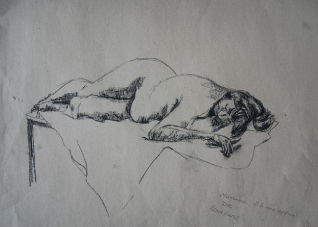
1. Collage – reclining pose
This figure was taken from a drawing I did at life drawing group. It appeals to me, as the particular reclining pose and the model’s figure seemingly combine to form a wide range of interesting curves and shapes. Further interesting aspects of this pose are the effect of gravity pulling the soft tissues downwards and because she is lying on a hard surface this forces the right hip higher than if the model was on a soft surface. I like the slight diagonal formed from this viewpoint, from the lower right to the upper left. The hair spreads around in a spiral from the top of the head.
I wanted to play around with background effects as well as the media for the subject (the figure). I used up some left over acrylic paint from a previous painting and some Quink ink applied as a wash, allowing it to run in places. Before I applied the final coat I stuck on a few torn magazine papers, painted over them, pulling most of them off again before they were dry, inducing a masking or relief effect. I added some white paint splattered on with a toothbrush and dabbed on with fingertips, plus some linear marks of teal blue conte crayon.
Collage final stage |
 Next I sketched in the figure’s outline from the previous sketch (above). With a few more papers – tissue and newspaper stuck down on the surface, I covered the figure’s outline in places. Then I painted the figure with some very watery white acrylic to maintain some transparency on the newspaper print. Over the top I applied tonal areas with coloured pencil and white conte crayon – this being very useful for increasing the effect of the highlighted areas, while simultaneously softening the transition from mid toned areas.
The effect of gravity and the dark shading seem to have the effect of pulling the figure deep into the fabric of what she is reclining on. While the fabric and the figure combined, appear to be floating around in the dreamlike space of a dark transparent background - the directional brush strokes contribute to the effect. The angular shapes of the slightly paler relief areas act as arrows pointing inwards to focus on the subject in the centre.
As I so often do, I think I may have overdone things. It probably would have been better to leave it as it was in the early stages. Having an unfinished look may have helped it's appeal, lending more variety. I've virtually hidden the paper and newspaper collage under all the paint and crayon, which seems to defeat the object of using it.
As I so often do, I think I may have overdone things. It probably would have been better to leave it as it was in the early stages. Having an unfinished look may have helped it's appeal, lending more variety. I've virtually hidden the paper and newspaper collage under all the paint and crayon, which seems to defeat the object of using it.
No comments:
Post a Comment