Search This Blog

Showing posts with label Landscape. Show all posts

6/18/11

Assignment 3 first attempt

Please click on this link to go to the Assignment 3 piece I eventually chose to submit for assessment

The project for this assignment piece contains preliminary sketches and a final drawing of a view of a rather overgrown driveway at home.


From my position just inside the window of the front porch in the house, I began with a few small sketches, moving some objects around a little to position them more to my liking (see sketches). I went on to check out the perspective in the gate and the driveway by first establishing my eye level and a vanishing point . From this it was easier to place the angles. I tried to encourage a look of aerial perspective by using overlapping forms in the trees and shrubs and a very pale area behind the gate.


Preliminary and perspective sketches

In the colour sketches I tried out watercolour pencil washes under dry shading, also wet tipped pencils. In another, I used felt tips brushed over with water to smudge in places. I didn’t feel happy pursuing any of these avenues and was becoming weary by this stage. Then almost as an afterthought I very casually had a go with oil pastel, chiseling out the shapes with the side in different directions and was surprised by how liberating it felt. So now there was no contest for what media to use for the final drawing - oil pastel, although in some areas I did use some felt tips a little and coloured pencil, but they aren't very visible.
Perspective sketches - pencil and watercolour pencil
Felt tip pen and wash


Oil pastel
In the final drawing I found it took a long time to build up depth in the trees and shrubs and I used lots of layers. At one point I thought it wasn’t working and becoming muddy in places, especially on the left, but I persevered with varied tones of colours and techniques, using lighter flecks to help bring out where the sunlight was catching some lighter areas. I remember using my non dominant hand occasionally – particularly on the corresponding side of the paper – the right hand side and noticed the resulting lines were freer in appearance. A trick some Impressionists used for shadows was to use purples and blues in the shadows, so I followed their example and it seemed to work well. I also erased certain places, which I thought needed lightening, such as the pink flowers on the left and a thin sliver of light to the right of the gate, with thinners on a cotton bud. If I was doing another landscape in oil pastel I would consider doing an underpainting with diluted thinners on a brush or rag to give more intensity to the colours. I stumbled across this tip in a book after the drawing was completed. I would also try tinted paper, perhaps in another drawing. Using oil pastel for a finished drawing was to me a challenge I’m now glad I took on and will try to continue using more often.
Assignment 3 Final Drawing
I found it difficult to find a view incorporating many of the elements suggested in the instructions from what seemed a limited choice available to me; I found that this view came closest to fitting the bill. At least it has depth being a driveway and contains a straight lined object - a gate. It also has plenty of trees and shrubs around the sides - giving a layered look, with a gate at the end together with a glimpse of a view beyond.
It came as a surprise to me that as the drawing progressed I began to see more interesting things in the view than I ever did beforehand. It's a pity the result didn't reflect this new found enthusiasm, turning out to be so disappointing and artificial looking considering the amount of time I put into it.
It was not put together in the same spirit as the sketches and as such is not successful. Unfortunately I was blind to this until my tutor pointed it out. I will make another attempt, so watch this space!....


After yet another attempt things still didn't prove successful - another 'overdone' drawing. Image as follows:


To describe it further, this is an excerpt from the tutor's report after the second attempt:
Both finished versions look over finished and somewhat sentimental and fussy. You are trying to make a picture here instead of investigating your subject/view through interpretive drawing; these are the same issues as when you first sent me assignment 3.
I think that says it all really, needless to say it has become a real thorn in my side as I think I'm starting to develop a complex about this assignment piece and I will be happy when I've got the third one over with. That will be the final drawing no matter what..


Above - a few preliminary sketches for the second attempt. I dare say these turned out better than the final drawing.


I did further sketches for a third try at a view of the garden, but after some deliberation I decided to make another version of a townscape drawing from this assignment (Part 3).

6/15/11

Pat Moran

Unfortunately I didn’t get to an exhibition this time, but as I’m going to London next week (and hopefully a couple of exhibitions!) this should help to fill the void. 

Pat Moran (1961-1992). I remember visiting a retrospective exhibition of Pat Moran’s work at the Crawford Gallery, Cork with my dad in 2003. It made a lasting impression on me because I was so captivated by the look of sheer spontaneity and freshness in all the drawings and paintings on display. It is probably a reflection of the way he lived his life.  Looking at his work is further proof to me that almost any view can be made to look interesting and one doesn’t need to spend hours searching for that ‘perfect’ subject . It is what you make of it, something I need reminding of now and again, and to me he certainly had a talent for making the ordinary appear fascinating in the entirely unique way in which he interpreted every day scenes. They seem to show a deep appreciation for the place he captured on paper or canvas. 


Gardner Street - charcoal 1984

His career was spent in Dublin, Italy and Cork and he did many paintings of Cork City scenes. The same exhibition was shown also in Dublin, where he spent most of his career, and Portlaoise where he was born.


Annaghmakerrig Path,
 oil on paper 1989 (60x50cm)
Gardner Street, Dublin, 
oil on canvas

Bernini Fountain, Rome - pencil 1984 

South Gate Bridge and Beamish & Crawford Brewery, Cork - oil

Italian landscape - pencil on paper 1984  (21x30cm)

"Pat Moran painted pictures and he painted pictures of what he knew and experienced. The honesty to paint cars - no one paints cars in the romance language of cityscape. Giddily leaning lampposts clawing in to blue and green streetscapes - black and white expressions of inner city grubbiness. Pat painted as he lived with vitality and directness, and of course in the usual confusions of our being" (Richard Gorman, 2001)


6/7/11

Claire Spencer - The Charcoal Forest

Recently, I re-discovered an article in an old copy of  The Artist magazine.
I recall saving the article because I found these charcoal drawings, by the artist Claire Spencer, so compelling -  I could literally gaze at them for hours on end. The drawings
were inspired by the Wyre Forest and two books written by 19th century naturalist/philosopher Henry David Thoreau - The Maine Woods and Walden. They are based on his diary of thoughts and observations of the wilderness and nature, when he lived for a year by Walden Pool in the Maine Woods.


The first thing to strike me about these drawings is their dark brooding, yet alluring presence and strong sense of mystery, intensified by the strongly contrasting values. An amazing variety of mark making brings out wonderfully well the form and textures of foliage and tree bark, revealing the character and atmosphere of the natural woodland - graceful sinewy branches of trees appear to be alive and moving. Some ancient parts of this forest were managed over many centuries for charcoal burning, so charcoal is, I think, a perfectly fitting medium to use for this series. Apart from the way it lends itself so well to the subject, I think the artist has paid a great complement to Thoreau’s writings and to these woods by interpreting them in such a sensitive way.


6/1/11

Drawing Trees - Sketch and Study of an Individual Tree

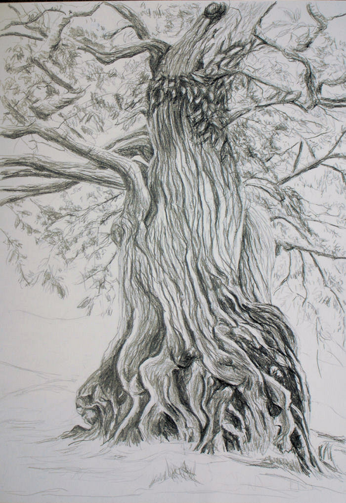
1. I wasn’t sure what type of tree was in the sketch of the individual tree, so I took away a small branch to identify it later. With the help of a park guide and the internet I managed to ascertain that it is most likely a Cork Oak. The tree in the larger study is an ancient Sweet (or Spanish) Chestnut and in the third drawing in pastel they are Alder and Osier Willow, located in a wetland area of the park.

2. To distinguish each type I tried to use the most appropriate technique I could think of for the individual subject, closely following their growth pattern. For example in the final study of the Sweet Chestnut: to bring out the prominent spiral ribs on the trunk I loosely held the pencil at least half way along applying loose tenuous flowing lines and filled some of them out using the side of the pencil.  For the branches and outline of the trunk I applied broken light and heaver lines.  I used loose thin lines with the side of the pastel tip for the trunks of the Osier Willows on the left side of the later pastel drawing and a very dark brown pastel on the side for the dark trunks of the Alder trees in the middle ground. I made a conscious effort to look intently at the subject rather than the paper for the most part and I feel this has helped me, as it is so necessary, to pick out the individual tree type’s distinctive appearance.
Study of an Indiviual Tree
5. To select and simplify I tried to see things as shapes in the scene rather than as particular objects, which was not so easy at times. Constantly trying not to get bogged down in too much detail (a recipe for disaster) I blocked in the larger shapes, then the smaller shapes, again squinting often. I think it worked mostly, apart from the leaves on the individual tree (Chestnut) - I had a problem conveying these simply yet convincingly and I ended up overworking them. If  I was to do them again, or similar, I would be more mindful of taking the  time to study their characteristic growth pattern by building up with loose very light pressure in the early stages. One problem here for me was obtaining a 3D look and I thought I could solve this by enlarging the closest leaves more, while giving just a vague suggestion of the leaves further away. I put too much in at the early stages and couldn’t alter this successfully later on when I had realized my mistake.


5/6/11

Research Point 4

Claude Lorrain and JMW Turner - how these artists divide their landscapes into foreground, middleground and background.
Claude was a master of aerial perspective and was very curious about the effects of light at different times of the day - of which he made many studies. His lighting effects were soft and subtle and he had a great ability to depict vast areas of sky and great distance.
Usual characteristics of his paintings are enclosures of dark trees and/or rocks in the foreground bringing into focus brighter paler tones in the middleground, containing figures, animals and/or a building or some other structure - mostly classical looking. The sky is calm and magnificent, sometimes luminous (as in View of Tivoli at Sunset) above distant blue hills or mountains. The harmonious nature of his paintings is enhanced not only by the classical/biblical themes he employed, but also by his use of a very wide tonal range throughout. His paintings of sunrise and sunset reveal these effects very effectively. Many of his works are believed to have darkened over time, so some spatial clarity has disappeared.
The famous Claude Glass is small slightly convex mirror tinted a dark colour. It subdues and simplifies the colours in a scene, so giving them a mellow tone. They were once popular with travellers and poets.

View of Tivoli at Sunset


Ascanius Shooting the Stag of Sylvia 1682.


Joseph Mallord WilliamTurner (1775-1851)
Turner emulated Claude and other masters such as Poussin. At the time, this kind of landscape art - the Grand Style was held in high esteem. All three artists made wonderful observations of aerial perspective in their paintings.
Claude’s landscapes had a look of calmness while Turner’s were much bolder.
Unlike them, he portrayed more dramatic scenes – ships in a storm or shipwrecks and aspects of nature, such as storms and lightning, more ‘real’ scenes. A huge glowing sun was often a feature in Claude’s paintings, which Turner too used repeatedly. He was fascinated by the sea and air and the motion of the elements. Light was a major factor and it certainly seems so in two such studies – ‘Sunlight' and 'Sea: Stormy Sky'. His finished watercolours and later his oil paintings, although still full of atmosphere, are more detailed and describe a more defined foreground, middleground and background. Much of his later work was criticized as abstracts of aerial perspective causing his reputation to suffer - they were studies of the elements rather than representations of objects of nature. Interestingly, Turner’s work has enjoyed a revival in popularity in more recent times, following an exhibition at the Museum of Modern Art in New York in 1966, coinciding with the rise of Abstract Expressionism.

Sea: Stormy Sky - watercolour

Sunlight - watercolour


Norham Castle, Northumberland: Sunrise – is a painting in which the paint (oils) appears to have been applied thinly, giving a delicate appearance.  Bathed in a warm golden glow and an atmospheric haze, there is an impression of vast space and  minimal detail. In the foreground there are soft warm yet clear contrasts. The tones are warm yellows and reds and there is a grazing animal in warm red. Red and warm yellow tones and relatively distinct brushmarks bring the area forward. Moving back, the middleground contains some
 cooler blues. The horizon is very blurred and colours merge even more. Golden reflection on the water from the sun is quite noticeable and contrasts with the blue of the castle, while it is also very subtle. The background is bluer still and so indistinct as to give only a slight suggestion of distant hills, giving the illusion of great distance.
Norham Castle, Northumberland: Sunrise 1835-40, 78 x122cm, oil canvas

4/21/11

Distant Worlds

Distant Worlds 1 and 2 - acrylic and paper on board.

My 360 degree studies partly inspired these two paintings, completed recently in time for an exhibition with my art group. The photos aren't great as they were taken when under the glare of gallery lighting.

4/20/11

Drawing Landscape Sketchbook Walk and 360 Degree Studies

Sketchbook Walk
Initially I didn’t see much of interest in most views on my sketchbook walks and some even looked quite bland. But on re-examining and checking the direction of certain lines and shapes I noticed that these helped to establish a directional flow around the composition. In places they had the effect of drawing the eye towards certain features such as a building or distinctive tree or trees, with the potential for use as focal points.
The biggest challenges were for me, areas of foliage such as lines of trees across a middleground and large patches of grass and heather. I squinted my eyes to try and make out only basic shapes, but if there was a continuous line of trees going across a middleground it was impossible to make them look sufficiently interesting, at the same time simplify them. This was evident in sketch no. 4, Doneraile Park, Sketchbook Walk 2. However, I think there was some progress in the right direction with the trees, by the time I did the larger more finished drawing of a similar scene. 


Sketches from the first walk (above)
I became frustrated with my lack of success in attempts to simplify the view, yet obtain variety and interest from the patterns and textures. The large grassy pastures in some sketches on the sketchbook walks looked mostly featureless, apart from the odd grazing cow or subtle shadows and directional lines which were often tricky to make out. The only detail I wanted to add here was to give some subtle impression of varied terrain, rather than leave a huge yawning empty space, so I just allowed my pencil to loosely follow the direction of them. I think the detail is probably minimal enough to still act as a welcome contrast to the more detailed areas.   A couple of sketches from the first walk
As I wasn't happy with the background in my first sketchbook walk – it was playing on my mind, so I decided to go on a second sketchbook walk almost a month after the first one and in another location. The background in my first attempts featured an old folly on a hill and I felt that this was pulling too much attention away from anything else. Because it was in the background I felt it wasn't in a suitable place, otherwise it might well have worked as a focal point. It was so dominant that any reasonable sense of distance also seemed unobtainable. With hindsight, maybe I could have made up some distant hills behind the folly, so that it could have been used as a focal point in the middle ground. On the second occasion and with different views, I was hoping that I would have more success with simplification and aerial perspective. It was easier to obtain a sense of distance and form in scenes where there were trees at varying heights, shapes and distances away, as it gave more sense of overlapping forms. To help strengthen the composition, I didn't stick rigidly to the arrangements in the actual scenes and moved certain features around slightly. 


 I was conscious that treatment of the midground had to involve adding more detail and contrast than the background, but less than the foreground. I had trouble with this in some sketches, but because of the practice the sketches gave me, by the time I did the finished drawing I think had an increased awareness of the midground in relation to the composition as a whole.
In dull or hazy conditions - as in the first 2 sketches in Doneraile Park, it was more of a challenge to discern light and shade than on a bright day when contrasts were clear. When conditions were dull and overcast, making tonal values hard to pick out, I made up shadows here and there, but none existent highlights were more difficult to visualize and I really had to squint constantly to pick anything out.


Above three pages - sketchbook walk sketches - Doneraile Park
Being able to make use of natural light and shade in turn seemed to help me enormously to create some sense of form and distance with tonal shading. Other elements which contributed to this were: the placement of objects/features as overlapping shapes, sometimes gradually reducing in size as they moved into the distance, such as fence posts, tyre tracks and pathways. The distant hills or trees helped the appearance of any atmospheric haze (360 degree and some sketchbook walk sketches) with very light uniform shading.
In the more finished drawing (Plotting Space...) I think certain areas would have improved with further study of:
(a) cattle grazing to help familiarize me with their individual characteristics.
(b) the foreground was quite uninteresting in reality with short grass in slightly dappled shade. Some studies beforehand  of rough foreground grasses would have helped to give me more idea of the best way to depict them. The actual grasses I drew are mostly upright and they could look more interesting if I had varied the direction of them with multi directional marks.
(c) the sky was devoid of clouds on the day I made the sketches and the horizon was high from the viewpoint I chose, and I thought it might improve the composition to give a suggestion of the sky by adding very light clouds.  


360 DEGREE STUDIES 
Summit of a nearby hill - Kilcruig (or Carrigieenamronety) what a mouthful! Part of a range called the Ballyhouras. Some here would call it a mountain.
A bit of a stiff climb, but a very peaceful walk. Hidden under a rock is a tin box containing a visitor’s book.
Wide open views all around of surrounding hills and mountain ranges as far as parts of  the four counties of Cork, Tipperary, Limerick and Waterford.

In a couple of my 360 degree studies large blankets of heather, interspersed with rocks, took up most of the foreground – in one of them (no. 1 below) the heather stretched away into the middleground - looking quite monotonous.
1  looking south

2  looking west

3  looking north

4  looking east

Above - the four 360 degree sketches

When I did the 360 degree studies and my second sketchbook walk there was a much stronger sense of distance in the scenes before me than with the first sketchbook walk - top. An atmospheric haze threw the background into relief,  and it was further away. This in turn seemed to help to make the middle ground more distinguishable in most cases, providing there was something in that area to use as a focal point, or to balance a focal point perhaps in the foreground, as in the second 360 degree sketch (above). Once I had completed the 360 degree sketches on the hilltop, I realized I would have preferred to have done the more finished sketch (Plotting Space) from one of these. The drawback was on that occasion I forgot to take my camera along, so I didn’t have enough confidence to use any of these sketches without photos to back them up.  I reckoned it was safer instead to use a sketch with some photographic back-up.

SOME SKETCHES AND PAINTINGS INSPIRED BY DOING THE 360 DEGREE  STUDIES


Above are two sketches which I later followed up with paintings - 'Distant Worlds'  inspired by the 360 sketches. I had no qualms about doing the paintings from sketches without photos, but then I wasn't too worried about reality on this occasion. Maybe I was a little over concerned about it before.


Research Point 3 - Monet, Pissaro and Cezanne

The Hermitage at Pontoise, ca. 1867
This is over six feet by five in size - Pissarro’s largest painting.


Artists who worked in series with the landscape such as Monet, Pissarro or Cezanne -  the challenges they faced and how they tackled them.

Camille Pissaro (1830-1903)
Although considered an Impressionist, Courbet (a realist painter) was a major influence upon Pissaro. He is believed to have been the first artist to paint with a technique and palette typical of Impressionists. Recognition in the art world was slow for the Impressionists, as their work was such a departure from art that was generally admired around this time – technically detailed realism and idealism, yet he remained true to his vision. Conversely, today his subjects may be regarded as idealistic, but they were truthful depictions rather than more popular paintings which were far removed from reality. He was a well respected figure amongst other Impressionists. Remaining so true to his vision contributed to the fact that he was almost 74 before he finally gained the recognition he deserved.
Pissaro lived in the town of Pontoise from around 1866 to 1883 and painted a series of large scale landscapes. He chose to portray the everyday life of ordinary people who lived there, challenging conventions by his use of colour and expressive brushwork. 


By painting on a large scale he sought to give as much significance to scenes of everyday life as to ‘important’ mythological or historical themes which were often painted on a large scale.

Pontoise – ‘Red Roofs’.
Pontoise – ‘Red Roofs’ he had to work very hard to achieve  the expected effect  as he believed in painting according to the first unconscious reaction – not giving more importance to one object over another - if it wasn’t for the title the red roofs might be less noticeable.

Later in his life he preferred to paint in comfort, doing a series of cityscapes of Paris at different times of day, from a hotel room giving him a high vantage point.

 
Paul Cezanne 1839-1906
Pissaro was also highly revered by Cezanne, who is regarded as a Post Impressionist as he was concerned particularly with form and structure aswell as light and colour. Cezanne sought the help of Pissaro about 10 years into his career. His approach was a great influence on Cezanne’s and had the effect of steadying his style, helping him to focus his energy. Yet, he became such a perfectionist with the way he applied each individual brushstroke, in a way that each colour and each value had to be absolutely aligned with others. The effect was to build up a clear sense of depth.
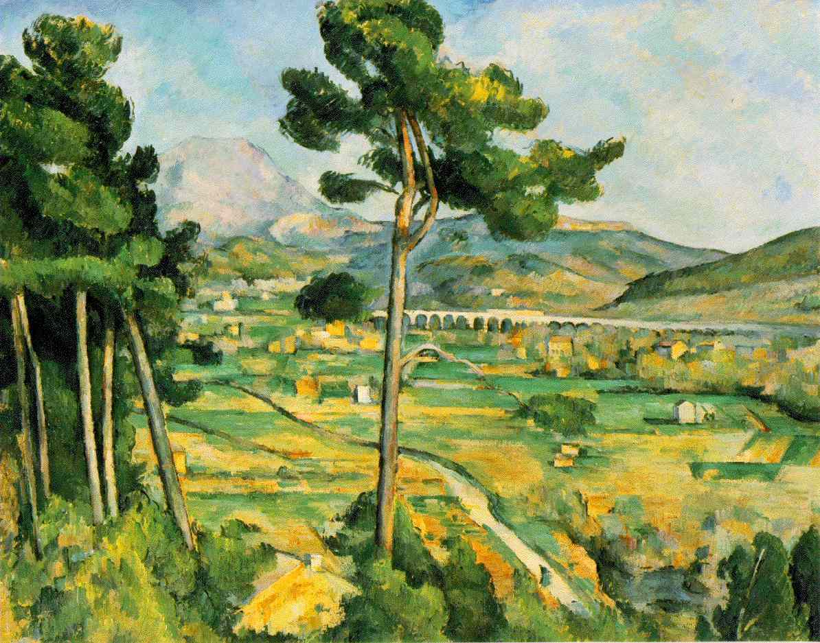
In his series Mont St. Victoire he was fascinated by its rugged geological forms. He painted and sketched it repeatedly from many angles, building up a sense of mass and solidity in his brushstrokes - I can see how his use of bold geometric brushwork inspired the Cubist style.
Painting outdoors in all weathers would surely also have presented him with its own challenges; indeed it was through his detemination to continue working for hours in the pouring rain during one autumn that caused pneumonia and subsequently his death.

Cezanne St Victoire-1886
Mont Sainte-Victoire 1902 oil on canvas 83x65cm
Mont Sainte-Victoire seen from Les Lauves - pencil & watercolour 1901-06 48x31cm


Claude Monet (1840 –1926)
Monet produced much of his series of water lilies (approximately 250 oil paintings) towards the end of his life while he was suffering from deteriorating eyesight, caused by cataracts. According to his letters to friends he would complain about how colours were getting dull and how he found them increasingly hard to tell apart. As the condition worsened, the colours in his paintings became more vibrant. This can be seen when comparing Water lilies (Rome) 1897-99, Water-Lily Pond and Weeping Willow (1916-19 and 044 circ.1920). His anxiety was such that it eventually led him to suspend work on the Lilies series until after the eye operation.  After suffering for many years, he had surgery in 1923 – only 3 years before his death at the age of 86. However, he still complained following the operation how his sight was too yellow then blue. He continued with the series, but only one eye was operated on and his binocular vision was adversely affected, with it his sense of depth. He destroyed many paintings due his frustration, though some of them were salvaged by his family and friends.
Water lilies (Rome) 1897-99.

Water-Lily Pond and Weeping Willow (1916-19).

Water lilies 044 circ.1920.
The series is now displayed in separate museums all over the world. An exhibition of part of the series was held in the Musée de l’Orangerie and since a few months after his death, eight of them are on permanent display.

4/5/11

Landscape Drawing Research Point 1

LS Lowry b. Stretford (1887-1976)

Most of the paintings of LS Lowry – in the Salford/Manchester area, personify the northern English industrial townscape. In fact Manchester is known as "the town of tall chimneys". It certainly was in Lowry’s day anyhow!
As a rent collector in the 1920s and 30s he would travel all over the city. The subjects for his paintings were on his doorstep and that is when he started to become fascinated by the industrial scenes all around him. As these townscapes were affected later by the blitz, slum clearance and new housing they changed very noticeably during his lifetime.
As far as I can make out from reading about some of his techniques on the Lowry Gallery website, it seems that he would use sketches rather than a camera to help record the scenes. With a pencil he used smudging and erasing to work the surface of his drawings and rubbing the lines to build the atmosphere. With paper he had in his pockets he would do quick on the spot sketches. His paintings were composed in a room at his home often on a white surface using firmly drawn backgrounds and buildings. Some of these paintings were semi-imaginary.

Pendlebury 1936 -It certainly looks as though Lowry made use of smudging and erasing in this drawing, but in a very neat way.


Industrial river scene


Peel Park


Peel Park


Peel Park

Peel Park
I almost prefer these 4 spontaneous looking sketches (above) of scenes in Peel Park, Salford, to the paintings.
 
 
View from window looking towards Broughton


Dewer's Lane


Albrecht Durer (1471 – 1528) was born in Nuremberg,Germany. Aswell as being a painter, printmaker he was also a mathematician, engraver, and theorist. He was very successful in spreading his work across EuropeItalyVeniceAlps he made watercolour sketches. These are regarded as the first pure landscapes ever produced in Western Art. , on his way there, in 1494. As he traveled over the and The Netherlands and he made his first trip to through printmaking. The variety and innovative nature of his work made him a true leading light in the art world of his day. Living in Nuremburg, he was well situated to make excursions to Italy and The Netherlands and he made his first trip to Venice in 1494. As he traveled over the Alps, on his way there, he made watercolour sketches. These are regarded as the first pure landscapes ever produced in Western Art. 
In the spring of 1495 he returned to Nuremberg but continued to paint landscapes – although he is far better known for other subjects. Landscape as a category of painting, only began to emerge during the Renaissance and was usually populated by figures.


Watercolour 1494-95


Alpine landscape 1495
Below is an extract from the British Museum website and contains an interesting description of the drawing - Landscape with a Woodland Pool (below) Near Nuremberg, Germany, around 1496:
Wooded landscape with distant buildings 1640-50
On the left we see the broken trunks of pine trees rising on a grassy bank. To the right are more pine trees, their deep green tops filling the paper. In between is deep blue water which disappears into the darkening distant horizon. As the sun sets, the clouds turn a deep blue which is mirrored in the blue of the lake. Similarly, the green branches of the pine trees are balanced by the green banks around the water. Dürer's fluid brush and deep colours make it a very beautiful and harmonious depiction of restful nature.
The scene may be outside Nuremberg and was probably painted after Dürer had returned from his first visit to Italy, around 1496-97.
The drawing is unfinished at lower right where the white of the paper is clearly visible. Dürer's monogram in the upper centre was added later in another hand.
It is generally agreed that this landscape drawing is one of the most sensitive of Dürer's portrayals of nature. It is painted with a brush in water and bodycolour. Dürer was the first artist to recognize the potential of watercolour. Indeed, his work as a landscape artist in watercolour raised the status of this medium.


Claude Lorrain (1600-1682) – better known by the French province of Lorraine where he was born. Claude Gellée was his real name. He was a painter of the Baroque style and era.
So as to follow the classical order of the times and because of commercial pressures, he included figures and gave narrative (usually mythological), as landscape in its own right was not considered important around this time. He was more interested in uninhabited natural scenes, as his many drawings and sketchbooks show. Much of his popularity was also based on his use of subtle gradations of tones. Many artists used a 
Claude glass to view scenes. This was meant to help them produce works of art similar to Claude’s.
John Constable – a Romantic artist held Claude’s landscapes in high regard and  described Claude as "the most perfect landscape painter the world ever saw". He declared that in Claude’s landscape "all is lovely – all amiable – all is amenity and repose; the calm sunshine of the heart".
Claude glass

Wooded landscape with distant buildings 1640-50

View of the campagna


Landscape with latium with farm labourers - pen, brown indian ink wash and black chalk (1660-63)

Study of oak tree c.1638 black chalk, pen &ink; brown ink with gray-brown wash on white paper