Search This Blog

Showing posts with label charcoal. Show all posts

2/15/12

Assignment 5

Apologies for rambling on in this section - I fear the reader will tire of reading long before reaching the end.
 Looking back, there appears to be a pattern emerging of my being quite comfortable with the  media I've used so far for figure studies - apart from soft pastel that is. Although it isn't  to say I think I'm proficient with most media. Pen and wash haven't figured at all, which seems a shame really. Maybe this was an oversight I should try to resolve, but I think it is precisely the immediacy of dry media that attracts me.   I enjoyed enormously trying out some experimental techniques like subtractive tone with charcoal and eraser (blending and/or hatching) and similarly using pencil (or charcoal) in a loose linear fashion with multi directional strokes then erasing and replacing lines as I drew them – especially easy over paint (see Using Colour 2.). I find Charcoal has the advantage of being very ‘smudgeable’ but the disadvantage of difficulty with detail.  I’m not totally sure why I chose to concentrate on figures rather than portraits for the assignment drawing. I reckoned I needed more experience in this area and it was my main area of focus during this part - Part 5, not to mention the fact that I’ve been going to a weekly life drawing group (with the odd exception) over the past 3 - 4 months, so I decided to continue with figures. I think I also have a fascination with the various angles and shapes made by the human form. Therefore it seemed a natural step to choose the same for my assignment drawing.        See also Course Reflections

sketch 1 - pencil
 When I attempted some sketches for my assignment piece I felt that all 3 of them went a bit haywire – the third being the worst. I tried to sketch quickly, taking a risk by relying on sight only and soon realized things weren’t working out as intended. In the third sketch – which I have destroyed, the head grew larger and larger. The feet were too small in comparison, the legs too puny. I won't say what I thought it looked like, but quite tragicomic, in a way. Even  careful measuring didn't produce the desired results. A slight crisis of confidence ensued causing me to feel as though, despite all my figure drawing practice, I wasn’t improving but getting worse! So I left things alone for a couple of days and fortunately when I returned (with a more relaxed and controlled approach) things went much more smoothly. I have to admit I made careful measurements and noted down many of them in the fourth and final sketch before the finished drawing. 
Ignore the labels on the images themselves - the captions below are correct.
sketch 2 - charcoal


sketch 4 - pencil
I ended up drawing a reclining figure with the head furthest away from me. Although I had done a very similar pose to this in Part 4 (3 Drawings) I wasn’t very pleased with the former drawing, partly as I struggled so much with the foreshortening. Yet I was hankering after the challenge of yet again attempting a foreshortened figure. Their main appeal to me is probably because of the interesting angles and perspectives they create, giving the look of a three dimensional figure moving forward in the picture space - if successful.
Charcoal was the medium I chose, the surface is heavyweight medium textured cartridge paper. I first covered the paper using the side of a stick of scene painter’s charcoal. This is a very similar technique to the one Seurat used to begin many of his monochromatic conte and charcoal drawings.  Then I rubbed it lightly with newsprint to push back the darkness into the picture plane and make it easier to bring the figure forward in space, re-establish the mid-tones if need be and to erase for creating highlights.
The model was illuminated from the right with artificial and natural light. He was positioned below eye level, so I could include much of the surrounding surfaces and objects. These helped to place the figure in context. I included some details of the cushions and soft covers underneath, as I think they also promoted the directional flow, helping to balance out diagonals with horizontal and vertical lines. I tried to give the most emphasis to the feet to help bring them forward and add to the 3 dimensional look. The fingers were difficult – they are so detailed and small in relation to most other features. Also if I included much detail here I was afraid they would detract too much attention away from the feet. So, I only wanted to give them the very minimum of detail, so as to knock them back quite a bit into the distance.  
To help in my attempts at accurate proportions and placement of the figure I did the following: repeatedly checked the negative spaces and measured by making comparisons with the length of one area against another, using the outstretched arm and pencil method. I also marked in the direction lines for angles of limbs and divided up the length and width into equal portions. For the sketch of the final drawing I also used a window mount to help to roughly place in the best way, the figure within the picture plane. With all these checks I think I was well insured from all angles on this occasion.
Finished drawing -charcoal
I tried to feel the direction of the surface plane as I hatched the marks with charcoal and carve out the whites with the corner of cut off pieces of hard eraser. Although I tried it out in earlier exercises, it has been something of a revelation to me to use the eraser as a drawing tool as much as I have, rather than as an eraser for rubbing out mistakes. I now find this technique to be one of the most enjoyable parts of this drawing process.


Conclusion
Certain areas of the drawing at this point, I think, need more work. Leaving an assignment drawing alone at this stage was a test of will power for me, not being something I’m accustomed to - I certainly didn’t have the confidence to do that before. Instead I think I would often put in  too much detail.  I decided not to develop it further as I wanted the choice of being able to return to and tweak it later on, when I am more certain of what needs to be done, if anything and if my tutor suggests it. Now at last I realise it's much easier to add on than take away afterwards. Already I can see that some areas may need softening such as the edge of the shadow under the left upper arm and the vertical lines behind the head, while others need bringing more into focus, such as the feet, which I want to draw attention to a little more. The large highlighted area, I think, needs more emphasis to the right of the figure. Trying not to give the fingers much detail while at the same time getting them to look convincing as fingers, proved to be too elusive. Consequently those on the right under the book, look too dark and chunky around the edges. Perhaps it would have been easier to use a charcoal pencil for these so I could do them more delicately and inconspicuously without smudging the charcoal everywhere. I should try it out. 
It is now becoming almost second nature to discern shapes – their relative size and positions, and measuring, for the most part, has become much easier compared to the beginning of Part 4.  I even find myself wanting the challenge of attempting foreshortened figures in reclining poses, which is why I decided on just that for Assignment 5. Besides being a reclining foreshortened pose, it proved to be a relatively comfortable one for the model. In spite of this the quality of my work has not shown consistent signs of improvement. There have been a few setbacks along the way. Though I would say, because of the practice, that in general I'm finally beginning to approach a subject with more ease and confidence than previously. Fortunately my tutor didn't suggest any re-doing or changes this time, unlike some of my other drawings. I was amazed and relieved with the feedback on this one - here is an extract: 
Assignment piece
'This is a beautiful drawing for this level. It is very well composed and well structured. The use of tone and light is excellent. This drawing has presence and intent and is very well observed and interpreted. The pulling out of light is really working well as is the whole diagonal composition. The drawing has a strong visual impact borne out of hard looking and a determined effort to achieve a successful outcome. It is always good to see successful culminations in assignment five and this certainly is. Put it in your assessment prominently. The prep work for this drawing is good also'. -  one gobsmacked student!

2/12/12

Drawing Workshop

workshop 1
Some fruit, avocado, pear
etc and a candlestick
This is the second drawing workshop I have attended with this tutor Gillian Cussen. Her enthusiasm was infectious and created an atmosphere with strong sense of motivation. We did many rapid sketches of plants and flowers, plus a few ordinary everyday objects. The emphasis initially  was to do huge areas of mark making with various materials - ink, charcoal, pencil using toothbrushes, sponges, fingers etc. - rather similar to the mark-making exercises
on a large format in Part 1.Then, with more directed guidance, rapid drawings of objects while trying to feel the gesture within them, in an attempt to feel the object's dynamic presence. The purpose was to really see what is there and ways of interpreting what you see, definitely not about producing a pretty picture. I think I got more out of doing these than most other workshops I have attended - either drawing or painting and I intend to return again for more of these and similar workshops in the future with this tutor if I feel in need of them. 


workshop 2
Plant and poultry


workshop 1
Driftwood, corkscrew and apple


Above and right comprise of mostly rapid sketches of a selection of subjects, including poultry, in charcoal and pencil, from both workshops 1 and 2. The plant detail (above left) was of the longest duration. Although most of them may look like virtual scribbles, I got a great sense of achievement and possibilities out of it.
http://gilliancussenartist.com/
Taking a quick peep at the artists website it is so apparent how  very free and expressive her own work is - something I aspire to and will have to keep working on....

2/10/12

Tonal Study 2 - Portrait in Charcoal

Portrait in charcoal
White paper
Initial part of drawing took less than 30 mins at my life drawing group.
I found the experience of building up areas of light and tone with a combination of erasing, soft blending and vigorous directional lines and marks quite rewarding. By using thin charcoal sticks adding detail became quite easy.
Doing this drawing gave me yet another reminder of the ever so forgiving nature of charcoal and the ease with which a richness of tone and dramatic contrasts of light and shade can materialize in a relatively short length of time.
After I received the drawing back from the tutor the compulsion to make some alterations to the facial features was overwhelming. Although he seemed to like the drawing I felt these elements looked too severe – and I have to admit, I don’t recall the model’s expression giving me that kind of impression. I reduced the length of the nose and softened the nostrils. I also softened the eyes as I thought they appeared too hard looking and the line of the mouth, also moving it up slightly. 
A frustratingly long time passed just fiddling about with these adjustments before I was reasonably happy that there was actually any improvement. It was exacerbated by not having the model in front of me this time, or even any reference photo/s so I used a couple of portrait images of other people, with similar angles to help as references. 
The result is now certain aspects of both drawings that I prefer over others; the latter version seems to have certain more appealing qualities than the former and vise versa.Though I made no alterations to any parts of the latter drawing other than eyes, lips, nose and chin, my hope is now that I haven’t spoiled its whole atmosphere by making these adjustments. However, I do find it easier to look at than previously, especially around the nostril area. Perhaps adjusting only this area and leaving the rest alone would have been quite sufficient, but any changes to one area  seemed to show up a perceived fault in another area and so on.
When I compare the two versions I notice that the facial profile is now flatter and taken back below the nose. The chin is sharper than before, more so than I think it should be in reality. Then again I think the whole jaw area was too prominent beforehand. It was a mistake to alter the eyes. Strangely I think they were preferable before as they were more defined and varied. The gaze though very intense, was also perhaps more intriguing.

No. 1 - a bit scary!


After alterations, but still looking giving daggers!

12/3/11

Don't Plan, Just Respond

completed sketches in charcoal
This is an exercise I tried recently from the book Drawing and Painting People – A Fresh Approach by Emily Ball. When I first browsed through this book a couple of years ago, the attraction wasn’t immediate – I thought the images were a little primitive and childlike, yet at the same time I was intrigued and after reading a few pages my  perception was beginning to change. From the start I couldn’t help but be fascinated by the unconventional approach to drawing and painting the human figure, which for someone who’s approach has tended towards constraint and over-finishing, was very liberating, yet not easy to get used to.
The point of this particular exercise is about just responding to the pose of the model without thinking, so as to help remove fears and encourage spontaneity.  In short, the instructions began by dividing the A2 paper into 16 equal sized portions, or use 16 x A6 pieces of paper. This was to enable drawing a different pose in each section. Next  to try out the model’s pose for yourself before attempting to draw - very important. Begin  by rubbing some charcoal dust into the first section, carefully but quickly following the movement and form. Then draw the pose without looking at the paper or attempting to be tidy. From start to finish, without rushing, each drawing should only take between 30 seconds and a minute. Although I have only tried 3 or 4 of the exercises in the book so far, I’ve found them all so motivating that I intend to return to the book repeatedly in the future. Hopefully if I continue on this path my drawing (and painting) in general will improve the way I want it to. I will have to perservere…

10/10/11

Assignment Four

If I was to complete the course, naturally I had again to face up to the inevitable challenge of the assignment pieces. It was looming ahead like some dragon waiting to breathe fire at me when I got too close. The trouble is, very often my approach has tended to let me down at this stage and the ensuing drawings become too stiff and contrived.  …not the easiest thing for me to avoid. 
Luckily I was able to obtain a patient and resident model in the form of my husband Kevin, so I was off to a good start.

As the instructions didn’t mention anything about using coloured media I thought it safer to stay away.


Line and Shape
I began all the sketches and drawings by marking in the top and bottom of the figures, to give an area to stay within. I find it helps the drawing fit the page. Then I established the size and position of the head with a few feint lines and checked the number of times the model’s head length fitted into the space provided. I simultaneously transferred these measurements onto the page, allowing for a little flexibility. I checked  and re-checked the lower leg length a few times as they took up such a large part of the height from the kneecap to the toe, compared to  the upper legs and lower arms, which were foreshortened by the sitting position.
Because I tend to have difficulty at times (as may be evident), getting the shape of the lower legs to look believable in my drawings, I tried out a method I read about in an ebook about drawing tips. To look convincing as a human leg the upper calf on the outside should be fuller than on the inside and is fuller on the inside lower calf than on the outside. I tried to simplify things on the second sketch with the curving inner lines but it wasn’t as easy as it looked. I spent a relatively long time on the first sketch, to determine proportions were adequately correct in my own mind.
On the first two sketches I was pulled into drawing the details of the hands at the expense of the face, but I was more concerned with the hands for some unknown reason. 
To the relief of my model I was gradually speeding up with my sketches and the third one, in charcoal, was finished the quickest. I enjoyed the doing the sketch in charcoal, mainly because the many repeating lines in the first two have been replaced by a mix of more decisive and undulating lines, but not enough. I do think it looks more spontaneous too. The clothing is indicated more and I’m fairly pleased with the extra features I included this time, considering it was a faster sketch. The model is leaning on the arm of the chair, which I think looks interesting, although I couldn’t expect them to hold a pose like that for two hours or more. The willow charcoal glided smoothly across the cartridge paper surface, and is forgiving and expressive. Because of my sense of success with the third sketch I decided to use it for my final drawing.

I initially decided to go with a pose similar to the first two – the model looking to the front. When I stood back and examined it, after drawing in the outlines, I thought  the model’s pose was too symmetrical and boring. So I then asked the model to turn to a side (or profile) view. I decided to use this angle, as  thinking back over previous exercises I hadn’t used it before with the model in an upright position seated on a chair. It was also a way of the model being comfortable in a non-rigid looking pose.
Final drawing:
For this drawing it was a case of trying to apply a 3 dimensional appearance to the figure using only line and shape with no tone, as per instructions. Looking at the finished drawing I think I had
 some success here and there – the crease running across the 
front of the model’s top slopes in a slightly upwards diagonal
Final drawing (charcoal)
in line & shape
 from left to right (sloping away) so giving a look of perspective. Despite putting in a few outlines first in pencil, there are a good few clumsy looking lines in the wrong place or too thick (behind the upper arm and top of the forearm) but I didn’t want to try and change them incase I made them worse. The base of the sleeve looks a little too narrow. I put in thick line around the figure’s outline – especially the nearest side and the outer edges of the legs to give them definition against the chair, the shape of which I thought would be better to outline only faintly in relation to the figure to give it less significance. The chair arm would probably look better like this also.
I’m glad I used willow charcoal as, apart from the attributes I mentioned beforehand, I found I could vary the weight of line easily and it was easily erased when necessary. I couldn't avoid this as some areas just looked so untidy if I left them alone, but tried to keep this to a minimum.


Tone

The model was lit from the right hand side by an angle poise lamp at least 4 feet away, emitting a good wide beam of light from this distance.


The first sketch (in pencil) again took a long time to do. I was struggling to get to grips with this ¾ elongated angle. I was careful to make sure I was more or less happy with proportions before proceeding further. I didn’t want the final drawing to be a disaster for this reason. I was constantly comparing measurements of one area to another and checking angles against the vertical and horizontal. The model was wearing jodhpurs, yet the roundedness of the upper outer left thigh looks over exaggerated on this one. His feet were sock free this time and I was glad to have the chance to do the fascinating details of the toes from underneath.

Sketch two - this was completed with Pitt art pen. I was less concerned with proportions in this one, more with just correcting the line of the legs. What I notice most here is the flatness of the face - it looks rather like a mask.

The third - a 10 minute scribble drawing in Edding 2.0 calligraphy pen. The poor man looks completely sizzled and/or mummified here. However, I wished I’d done at least one scribble drawing at the start, as I think it would have been a faster operation to grasp the right proportions. It probably would have taken me more than one sketch, as the legs are way too long on this one.   

model has not been electrocuted despite appearances!
Number Four - the ¾ view (in ballpoint pen) I hadn’t tried before, and it looked interesting; It was actually more angled towards a front view. I liked the sharper angle of the legs and the angle of the feet – they looked natural, but this time I already had my sights set on using the same angle as previously. The landscape format appealed more to me, partly because it was a change from the mostly portrait format I had used in the past and because the 
angle of the pose looked well balanced and filled the page.

Sketch four

Tone - final drawing:
The first attempt at a final drawing was a disaster. No matter what I tried I could not get the left foot in the correct position. It was drawn in and replaced 2 or 3 times, when -finally I realized the legs were too long.  At this stage the only thing I could do was take a few deep breaths and start again. At least now I knew what not to do and things went smoother from there on.
I decided beforehand to try out some cartridge paper previously gessoed with a homemade mixture of emulsion paint and pva glue. I read in a book that using this paper one could easily obtain very deep dark tonal shading with 2H to 6H hard pencils. It looked impressive in the book and it had worked well on some other paper I'd gessoed prior to the latest batch.  When I tried it out on the paper I had this time the effect wasn’t quite what I was looking for. I figured maybe I used too much pva in the mix this time and/or the wrong type of emulsion – silk when it should have been matt. Anyhow when I tried 2B and B pencils they seemed to work fine, so I continued in this manner. Fortunately the paper did seem to produce a darker effect with less pressure from the pencils than would be the case using untreated cartridge paper. It also seemed easier to smudge with my silicone paint pusher. The media and surface combined certainly gave a sheen to the whole drawing. To use a different texture paper from the norm was also interesting. 
In the final drawing I tried to treat the background as secondary to the figure, giving it a slightly hazy look, so the figure would have more prominence, while at the same time keeping the background and figure related. I'm not sure I managed to pull this off - the figure seems to blend in with the background quite a lot, although my attention is drawn to the face. 
sketch five
Proportion wise, the model’s hand could be slightly too large, but I’d rather it was this way than too small. When I compared the feet with those in the previous line drawing (after my tutor's comment about them) I noticed they don't look as convincing. The slippers look relatively small. I’m not too happy with the nose, it looks clumsily done – so I’m glad it occupies such a  small part of the drawing as whole. The back left of the chair looks a bit too dark, but probably helps the area as a focal point. The light and shadow seem to form an interesting pattern of movement around the composition. The lines on the picture behind are running in the direction of the model’s head and body. On the smaller picture to the left, the bottom right hand corner of it seems to point towards the head, helping to direct attention towards the area again. These factors I think, are really more of a happy accident than intentional. I feel that I've captured the model's character and achieved a good likeness - and he agrees. However I did struggle with the leg proportions. Comparing this with certain earlier exercises - The Longer Pose and others,  I can detect an improvement in my technique overall, despite the extra time taken in this drawing. I am pleased to be able to admit, my confidence to do both figures and faces has improved markedly over this part of the course, in spite of one or two moments of frustration.
My poor husband was very patient considering I didn’t finish within 2 hours. It was more like 2 1/2 hours not including breaks. I felt relieved and fortunate that he was able to tolerate it as well as he did, since he had already posed for long periods of time for all the sketches and drawings for line and shape in this assignment piece, and the whole project from start to finish took me  several days to complete.


The final drawing (version 1) in pencil on gessoed paper


Spot the difference - in the second drawing above, the cup and slippers have been removed. 
Also I altered the the model's right hand and left foot. These were all points that my tutor commented about in feedback re- the believability of right hand and were the cup and slippers necessary? 
The sole of the model's left foot looked distorted, with no definition to the heel causing the sole to curve round and up the inside of the ankle. This whole are was one solid flat mass. The whole foot looked stiff and too straight. Rectifying this was a process of erasing and re-shading in the odd (appropriate) location.  The toes were adjusted slightly and the lower left leg widened - which looked too narrow and straight before. Practising by sketching my own foot beforehand definitely made the process more straightforward. It surprised me how this time I could see much easier the angles and shapes in relation to one another than during the first attempt. Now the ball of the foot and the toes actually appear to have a convex curve to them, so looking much more natural.
The intention originally with the cup and slippers was to add context, but now they have disappeared I  realize they were over the top and drawing attention away from the focal point - the model. In fact not really doing the job they were intended for. On this occasion there's enough going on elsewhere. 
Beforehand the fingers looked too straight, limp and flat . The fingers were rather like the empty fingers of a glove hanging loose.  I altered the angle slightly, so there was plenty of erasing and rendering to do. It was definitely more demanding  to do than the feet. Now I think it looks more three dimensional and appears to hang naturally as though the armrest is partially supporting the hand, which it is. Looking at the faults now I'm amazed how I didn't see them at first - they appear so obvious now. It's been quite a learning curve I hope that  as I keep looking hard signs of progress will become more apparent. 


10/2/11

Life Drawing Class

Pencil


Sat 16 July today I went to my first life drawing class ever and glad to say I enjoyed it, when I finally found the venue, after getting lost on the way, then arriving late! It's over an hour's drive away from my house, but the most local one I can find at the moment. There was plenty of help and encouragement from the tutor, the class was small (only 7) and there was good lighting. It is a pleasant environment to draw in - beautiful old room in a larger building which is a museum.
I began drawing the model with contoured edges, but the tutor encouraged me instead to focus on building up areas of tone to depict the model’s form, rather than using any outlines. As well as going to life classes, this was also a new thing for me. It took some getting used to, but I think I got the hang of it before long.


Charcoal


This week we used a reverse process, toning the whole paper with willow charcoal, lightly adding the outline of the figure then erasing areas in light, and adding some darks towards the end to strengthen the darks.


1 charcoal (below right) - using shading to display the form with charcoal – full figure – 2 (above) same with pencil focusing on smaller area

Quick gestural warm-ups
Charcoal - everything below the knees,
particularly the feet,
looks too small in relation to the rest


4th week began with quick gestural sketches. I didn't mind these as I'd been practising at home. Then a long pose in pencil.
Life drawing class has been helpful for: pointers on proportion, placement, angles, looking at tonal values and different techniques for rendering the effects of light. I think I have learned quite a lot from practice at home from two library books – Basic Figure Drawing (editor Greg Albert) and Basic Anatomy and Figure Drawing by John Raynes – forms and proportions, central axis, the balance of the figure and line of movement.
Long pose in pencil
By avoiding outlined edges it really made me look closely at the negative space around the model and observe how it appears lighter when next to a dark edge and darker when next to a light edge. It was easier to begin this by working on and around the edges.
There was a break in classes soon after this week. I later joined a life drawing group, which is more local for me, but there have been a few unexpected setbacks and I'm still waiting for it to get off the ground. Hopefully it will soon as I really miss  the classes...
Update - the group did get under way and proved to be quite a success, although our numbers are low up to now.  I have yet to upload some of the many sketches and drawings I produced there......

6/7/11

Claire Spencer - The Charcoal Forest

Recently, I re-discovered an article in an old copy of  The Artist magazine.
I recall saving the article because I found these charcoal drawings, by the artist Claire Spencer, so compelling -  I could literally gaze at them for hours on end. The drawings
were inspired by the Wyre Forest and two books written by 19th century naturalist/philosopher Henry David Thoreau - The Maine Woods and Walden. They are based on his diary of thoughts and observations of the wilderness and nature, when he lived for a year by Walden Pool in the Maine Woods.


The first thing to strike me about these drawings is their dark brooding, yet alluring presence and strong sense of mystery, intensified by the strongly contrasting values. An amazing variety of mark making brings out wonderfully well the form and textures of foliage and tree bark, revealing the character and atmosphere of the natural woodland - graceful sinewy branches of trees appear to be alive and moving. Some ancient parts of this forest were managed over many centuries for charcoal burning, so charcoal is, I think, a perfectly fitting medium to use for this series. Apart from the way it lends itself so well to the subject, I think the artist has paid a great complement to Thoreau’s writings and to these woods by interpreting them in such a sensitive way.


4/20/11

Drawing Landscape Sketchbook Walk and 360 Degree Studies

Sketchbook Walk
Initially I didn’t see much of interest in most views on my sketchbook walks and some even looked quite bland. But on re-examining and checking the direction of certain lines and shapes I noticed that these helped to establish a directional flow around the composition. In places they had the effect of drawing the eye towards certain features such as a building or distinctive tree or trees, with the potential for use as focal points.
The biggest challenges were for me, areas of foliage such as lines of trees across a middleground and large patches of grass and heather. I squinted my eyes to try and make out only basic shapes, but if there was a continuous line of trees going across a middleground it was impossible to make them look sufficiently interesting, at the same time simplify them. This was evident in sketch no. 4, Doneraile Park, Sketchbook Walk 2. However, I think there was some progress in the right direction with the trees, by the time I did the larger more finished drawing of a similar scene. 


Sketches from the first walk (above)
I became frustrated with my lack of success in attempts to simplify the view, yet obtain variety and interest from the patterns and textures. The large grassy pastures in some sketches on the sketchbook walks looked mostly featureless, apart from the odd grazing cow or subtle shadows and directional lines which were often tricky to make out. The only detail I wanted to add here was to give some subtle impression of varied terrain, rather than leave a huge yawning empty space, so I just allowed my pencil to loosely follow the direction of them. I think the detail is probably minimal enough to still act as a welcome contrast to the more detailed areas.   A couple of sketches from the first walk
As I wasn't happy with the background in my first sketchbook walk – it was playing on my mind, so I decided to go on a second sketchbook walk almost a month after the first one and in another location. The background in my first attempts featured an old folly on a hill and I felt that this was pulling too much attention away from anything else. Because it was in the background I felt it wasn't in a suitable place, otherwise it might well have worked as a focal point. It was so dominant that any reasonable sense of distance also seemed unobtainable. With hindsight, maybe I could have made up some distant hills behind the folly, so that it could have been used as a focal point in the middle ground. On the second occasion and with different views, I was hoping that I would have more success with simplification and aerial perspective. It was easier to obtain a sense of distance and form in scenes where there were trees at varying heights, shapes and distances away, as it gave more sense of overlapping forms. To help strengthen the composition, I didn't stick rigidly to the arrangements in the actual scenes and moved certain features around slightly. 


 I was conscious that treatment of the midground had to involve adding more detail and contrast than the background, but less than the foreground. I had trouble with this in some sketches, but because of the practice the sketches gave me, by the time I did the finished drawing I think had an increased awareness of the midground in relation to the composition as a whole.
In dull or hazy conditions - as in the first 2 sketches in Doneraile Park, it was more of a challenge to discern light and shade than on a bright day when contrasts were clear. When conditions were dull and overcast, making tonal values hard to pick out, I made up shadows here and there, but none existent highlights were more difficult to visualize and I really had to squint constantly to pick anything out.


Above three pages - sketchbook walk sketches - Doneraile Park
Being able to make use of natural light and shade in turn seemed to help me enormously to create some sense of form and distance with tonal shading. Other elements which contributed to this were: the placement of objects/features as overlapping shapes, sometimes gradually reducing in size as they moved into the distance, such as fence posts, tyre tracks and pathways. The distant hills or trees helped the appearance of any atmospheric haze (360 degree and some sketchbook walk sketches) with very light uniform shading.
In the more finished drawing (Plotting Space...) I think certain areas would have improved with further study of:
(a) cattle grazing to help familiarize me with their individual characteristics.
(b) the foreground was quite uninteresting in reality with short grass in slightly dappled shade. Some studies beforehand  of rough foreground grasses would have helped to give me more idea of the best way to depict them. The actual grasses I drew are mostly upright and they could look more interesting if I had varied the direction of them with multi directional marks.
(c) the sky was devoid of clouds on the day I made the sketches and the horizon was high from the viewpoint I chose, and I thought it might improve the composition to give a suggestion of the sky by adding very light clouds.  


360 DEGREE STUDIES 
Summit of a nearby hill - Kilcruig (or Carrigieenamronety) what a mouthful! Part of a range called the Ballyhouras. Some here would call it a mountain.
A bit of a stiff climb, but a very peaceful walk. Hidden under a rock is a tin box containing a visitor’s book.
Wide open views all around of surrounding hills and mountain ranges as far as parts of  the four counties of Cork, Tipperary, Limerick and Waterford.

In a couple of my 360 degree studies large blankets of heather, interspersed with rocks, took up most of the foreground – in one of them (no. 1 below) the heather stretched away into the middleground - looking quite monotonous.
1  looking south

2  looking west

3  looking north

4  looking east

Above - the four 360 degree sketches

When I did the 360 degree studies and my second sketchbook walk there was a much stronger sense of distance in the scenes before me than with the first sketchbook walk - top. An atmospheric haze threw the background into relief,  and it was further away. This in turn seemed to help to make the middle ground more distinguishable in most cases, providing there was something in that area to use as a focal point, or to balance a focal point perhaps in the foreground, as in the second 360 degree sketch (above). Once I had completed the 360 degree sketches on the hilltop, I realized I would have preferred to have done the more finished sketch (Plotting Space) from one of these. The drawback was on that occasion I forgot to take my camera along, so I didn’t have enough confidence to use any of these sketches without photos to back them up.  I reckoned it was safer instead to use a sketch with some photographic back-up.

SOME SKETCHES AND PAINTINGS INSPIRED BY DOING THE 360 DEGREE  STUDIES


Above are two sketches which I later followed up with paintings - 'Distant Worlds'  inspired by the 360 sketches. I had no qualms about doing the paintings from sketches without photos, but then I wasn't too worried about reality on this occasion. Maybe I was a little over concerned about it before.


2/10/11

Drawing Animals

The main challenges:
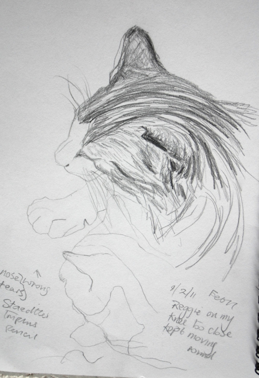
As we have a resident feline, it was my natural choice to use him as a model. Prior to doing this project I didn’t have much experience of sketching cats, but it wasn’t totally new to me either as I had made the odd quick sketch of cats before.
one of the first of many cat sketches
-  lots  more on view in my sketches blog
 In the early stages I tried sketching him when awake and sometimes found it almost impossible to complete a sketch – I was lucky to even get the shape of the head down on paper. It seemed to make sense at this point to wait until he was asleep before attempting to do any serious sketching. When I did this things became much easier. Although even when he stretched and changed position just slightly (which happened frequently) it was a challenge that made me anxious to get the basic form in as fast as possible yet with some degree of accuracy. The process wasn’t helped by the fact that I wasn’t very speedy and only very seldom did the cat return to the same position – particularly the head and forelegs.
The next day I found a few tips on the internet on quick basic sketching of cats, so I tried out a few of them and found that when I attempted to capture his pose when eating, where had failed previously, the new technique made it much easier. The idea is to get the basic structure down on paper by first putting in the line of the spine, roughing in the oval shapes of the head, shoulders, belly and rump.  I found this to be a good basic guide for filling in the broad forms with simple fast strokes.
I continued with method when I did a few more sketches in soft pastel and oil pastel later on and it really simplified things for me. Beforehand I had found it frustrating to sketch any animal moving frequently and it had always deterred me from doing them to a great extent, so I will try to persevere with it.

oil pastel
pencil
pencil


Charcoal

Reggie, large scale drawing, conte pencil and conte crayon
Charcoal 

For both drawings of fishes on a plate I used watercolour pencils and/or crayons. The shimmering colours on the surface of the mackerel seemed to be constantly changing and served only to confuse me. Mostly because of this it seemed to take me hours to build up the layers of colour in the first drawing. Also my technique was quite labour intensive, first shading an area with dry pencil, blending the shading with a clean damp brush, followed by dry hatching and dots, then intensifying some areas with a wetted pencil tip for the dark patterns around the line of the spine and the eyes and head. The plate and background were quicker to do because I softened the detail in these areas.
Meg  asleep - my sister' dog - pencil

For the second fish drawing I propped up the plate at an angle so that it was more face on than the first fish drawing. It didn’t take as long, as I included only one fish and feeling more certain about the colours, I didn’t incorporate as many. However, the fish looked rather lost on the plate due to the plate looking more circular than the first, being almost face on and only one fish occupying the plate. As a result there was more empty space above and below. There is slightly more space below the fish and this was quite empty looking, so I added further tonal shading which I think helped to solve the problem. By this stage I was beginning to feel more at home with the medium and techniques.

No. 1


Media I enjoyed using most and reasons why:
Cat sketches and drawing Chalk and conte crayon were very conducive to heavy, light,  thick or thin and soft textured lines and lines (mostly used for the texture of the fur) combined with shading in places, although I used the medium in a more linear fashion to describe the texture of the fur. It was quite easy to control and not smudging as easily as soft pastels. I liked the conte crayon enough to choose it for a larger drawing combined with Pierre Noire conte pencil, which was easier for finer detail such as eyes, nose etc. The white crayon was ideal to describe the white areas of fur on the tinted paper and I left areas of paper unshaded for the light grey/brown areas. It was quite pleasant to use this medium on ingres or fabriano paper, (I bought them in large separate sheets and I’m not sure which it was) as having a smooth yet uneven surface. I also used chalks and conte crayon on sugar paper for a few sketches but in comparison it produces quite an unpleasant scratchy sensation.
Fish drawing no.2
Amongst various media I experimented with when doing the sketches were: 6B graphite pencil - fine for both fine line and shading under or over.
Gel pen – the effect has an appealing linear and spontaneous look.
 Both the graphite and gel pen are smooth and pleasant to handle.
Other interesting media and techniques I thought about trying since then, might be pen or pencil underneath pastel or conte crayon.


Fish drawing no 2 cropped and turned
Fish  Some techniques I used with the watercolour pencils and crayons were fascinating. This medium has really grown on me, it is so versatile. A wetted pencil tip smudged slightly when applied to the paper and intensified the colour. I found the very strong mark made, ideal for dark accents around the eye and tail area and patterning along the length of the body.  It made an interesting textured wash which I used mostly on the plate and underlying background – applying loose open dry pencil shading then a damp wash over it retained many of its marks depending on how much pressure I applied in the dry shading and the wash. Applying the wetted pencil tip to a damp wash softened and spread the marks giving an undefined smudgy look. This seemed to work well for playing down the decoration around the edges of the plate, causing an out of focus effect, helping it to blend into the background, as opposed to more definition which I think would have resulted in a battle for attention with the detail of the fish, which I didn’t want. In the second drawing the yellow background was too dominant so I turned the angle of the fish, cropping it at the same time. I think the yellow still needs to be toned down even though only visible at two corners.

Where to go to draw more animals - places that will give me opportunities:
Local wildlife park - Doneraile – swans, herons and wildfowl, deer, cattle. Local fields and riverbanks – horses, cattle, sheep, birds.  Fota Wildlife Park – exotic species, African wild animals. Open farms – other farm animals. Donkey sanctuary.
Have I tried drawing a moving animal yet?
I tried sketching some horses in a field and swans on the river – from the car as the weather was cold, my sister’s dog and some cattle in the fields from the window of my dad’s house. This of course proved quite difficult with my limited experience, but I enjoyed the challenge and I feel eager to go out and do more, especially as spring is at last approaching.
Many months later I did some speedy sketches of a large group of horses in the field next to my dad's - just having time to get in a few lines, but I was quite pleased all the same. I have yet to upload them here.......