Search This Blog

Showing posts with label check and log. Show all posts

7/20/11

Quick Poses


Previous to doing these, the only sketches of figures I’d recently done  were a few rapid scribbled gestures of the figure. So, to finish an outline sketch in 2 minutes and obtain accurate proportions was for me, a tall order by comparison. By the time I’d finished 5-6 sketches, using only basic outlines, I was beginning to feel more comfortable with this method. The instructions were to draw from the middle of the body out to the feet and the head. So far I’ve found, that I usually have more success with proportions when I begin with the head and work rapidly down to the feet and hands using a few very feint lines, then find the midpoint of the figure, followed by building up detail around the body.
If I do begin in the centre of the body and work outwards, I would find the midpoint of the figure in relation to where I’ve marked the rough position of the head and feet, I would then add the head using basic measuring, followed by the torso, arms, legs and feet. I have to admit I find the concept of beginning in the middle totally alien, without marking in the position of the head and feet first. In this set of sketches I also divided up the length of the body into roughly between 7 or 8 equal parts, using the head as a unit of measurement. It was easier to think in terms of shapes and forms for the various elements, such as the head as a sphere, the arms, legs and torso as cylinders and the hands and feet as ellipses and I think it helped promote a 3D effect. 
2 minutes
2 minutes
I struggled with proportions in the initial couple of sketches – exacerbated by the model sitting down, shortening the lower half of the body. The upper torso appeared too long in relation to other parts, but by trying to ignore logic and record what I saw I soon discovered that it wasn’t as far out as I first thought, when measured using divisions equal to the length of the head. That seems quite incredible considering how ridiculous it looks. In a shortened pose the body is naturally reduced to fewer divisions when measured (as the crow flies) with the usual pencil or similar tool, so I tried a piece of string following the angles and contours along the length of the body and reassured myself that the number of divisions were the same as on an elongated pose. As I expected, the longer 10 minute sketches looked more accurate in relation to proportions. In one of these – a seated sketch, the arms looked too long, but again when checked against the position and length of other areas on the model, I was quite sure they were more accurate than arms in other sketches. To correctly place the level of the top of the knees, because of foreshortening, was tricky until I lined them up with the top of the chair seat. On the lying down figure the arm on view was definitely too long. I made the lower legs look spindly in standing poses a couple of times. These kinds of faults will hopefully start to fade out as I become more experienced at figure drawing – we’ll see..
2 minutes


Emulating the natural curves of the figure ie. legs and arms, helped to prevent their shapes from looking too flat and two dimensional, I think, but the changes of plane being gradual in most places on a human figure, would look more convincing if the line weight varied. Although the planes of the neck and upper torso, hands and feet would suggest flat sided shapes, this is not to say that all straight edges promote a flat appearance. , Helping to alleviate this are concave and convex curves at chin level and base of neck lines for instance, giving a cylindrical look. Receding and advancing planes would be been more convincing if I’d varied the weight of the outlines more. I would say the human figure is practically all curves, containing flat surfaces as part of its make-up.


Two of the 10 minute sketches – one seated, one standing – their differences are: that the torso, neck, shoulders, arms and hands in the standing pose look more three dimensional than in the other seated pose in black pen. In the latter sketch these areas have mostly straight edges, as is clear in the waist and shoulder line, which to me contribute towards a flatter look.


10 minute seated pose

10 minute standing pose

10 min lying down

5/15/11

A Townscape in Line, a Sketchbook of Streetscapes and a Limited Palette Study


For the drawing of the townscape in line, I searched round for quite a while to find a view that might come somewhere near to what was suggested in the instructions. Finally I found it - some unremarkable looking backs of buildings which fronted on to the main street of a local town - Mitchelstown. Although I hadn't noticed it initially, while in the process of trying some early sketches I began to realise that it had the potential to make an interesting drawing. I was a little intimidated by the idea of interpreting what appeared like a multitude of textures in pen and ink, but after some practice sketches (below) and outlining the main features in pencil beforehand my fear slowly began to diminish. A couple of areas did give me a fright when I thought I had messed them up with a slip of the pen or over zealous shading - the eaves on the two central buildings), but I think I managed to reduce most of the damage with a little first aid.  

A few of the townscape sketches


Townscape in Line


How did you use a limited colour palette to create a sense of depth?
This applied only to the Limited Palette Study in coloured pencil (below). I used a little black conte crayon and dark blue watercolour pencil – a cool receding colour, with a touch of rose red pencil in the shadow areas. Where I used only blue and rose red combined, they merged into a vibrant but cool dark purple like shade. In areas where I thought increased shadow was needed I added a little black. A sense of depth was enhanced by repeated layers of shading and increasing amounts of pressure on the pencils. I applied rose pink alone, to areas where I wanted an advancing effect. I changed the colour, from what it actually was, on the larger building. The actual colours were black and light grey but I wanted to use a palette that would help to unite its appearance with the much smaller deep pink painted building next door. As the light grey paint on the large building had a blue tinge I decided to deepen the blue and mix in some of the pink shade from the adjoining building into the shadows, and vice versa with the blue and a little black.


Above - a sketchbook of streetscapes

As all the check and log questions seem to be geared towards them, I will keep to the sketchbook of townscape drawings and the limited palette study. I found some of the instructions confusing, as I’m not sure whether, for the limited palette study, I was meant to leave some parts unfinished (as stated at the end of the townscape sketches exercise) or to do a complete drawing, while leaving out a small amount of detail present in actuality. If this had been another sketch I would have done so.
It transpired I wasn’t happy that my preliminary sketches were sufficient because:
1. There was no variety light and shade, as the weather was overcast and at that time of day the orientation of the building I wanted to sketch was away from the sun.
2. I concentrated totally on the flat façade containing the shopfront and the ornate doorway next to it, which didn’t appear to have much potential to provide some sense of form.
After some thought I decided to return on a bright evening a couple of days later, when the sun was shining on the front right hand side of the building and was also casting quite long shadows. I did another couple of sketches - one of them of the complete scene. Admittedly, part of it was from photos I took there and then, as I didn’t have enough time to complete them on the spot.
It was quite frustrating trying to get the scale correct, as I had the scale inaccurate in the sketch of the buildings and I initially used the proportions in this for my final drawing. As the drawing progressed I soon noticed that a roof looked too high in one place then too low in another. When I took out a 30cm ruler to check these with the estimated vanishing point off the paper, this confirmed things, along with one or two other mishaps. So trying to judge the scale and perspective purely by sight was something I certainly wasn’t ready for!

Limited palette study


I felt it was really important to capture the architectural details such as the scrollwork and carved details around the nearest door and the left of the shopfront, even the roofs and chimneys, but in an understated way, as I think they are such a crucial part of the atmosphere and character of the buildings in the village and in the surrounding area. Part of the reason I wanted to extend the scene to include the small cottage type building next door was its smaller size and lower roof level. There are also other interesting disparities between this (pink building) and the larger, closer building. The two are both old and full of character. They are very different in style, one is older (probably), more rustic and relatively plain. The other, the larger blue building, is more elaborate in style but still traditional in appearance. Both are typical of local vernacular buildings.

4/30/11

Check & Log 2 Perspective

I decided to draw a view from a corridor into a kitchen for the parallel perspective drawing. The floor being tiled, I think, was an advantage, although the horizontal spaces between tiles on the inside of the door were too close together. The space is too narrow to fit what is there in the available space. The architraves around the doors on the left are too narrow. Once I’d chosen the vanishing point and drawn in the first parallel line along the dado rail on the right I discovered that many angles were completely wrong, apart from the area below eye level, which isn’t too bad. Before I drew in the receding lines to the vanishing point I knew that some angles were wrong, but I didn’t realize they were so inaccurate! I should have noticed the top of the frames and the bookshelves on the right hand side as these are so obvious to me now.


Parallel perspective drawing
In the second drawing of the building positioned corner on (two point perspective), with the help of a pencil, I gauged the angles, shapes and proportions of features in relation to other points and angles – particularly the horizontal line at my eye level.  I didn’t use a ruler, but a pencil helped with the angle and measurements. Amazingly for me, I think most of it is accurate, apart from the roof line on the left of the high building on the corner, where the receding lines are at too low an angle. The vanishing point is way off the paper, so again I was guessing the angles, but I think they generally look correct.

Two point perspective drawing

Using rulers as a guide really helped me to check the accuracy of the angles.  Even with the two point perspective where the vanishing points were off the paper, I was able to estimate with a ruler where they were, and to draw in the eye level (horizon line). This is something I doubt I could have managed otherwise, even with a pencil as a substitute.
Although, I wouldn’t want to be tempted to use a ruler to draw straight lines - I’m sure they would appear far too technical looking. By not using a ruler for this purpose the lines may often be wobbly and uneven looking but at least they have far more chance of looking expressive. It is more difficult to judge the correct angles of the horizontal building, window and door lines etc. without a ruler and I found myself having to resort to using a pencil as a substitute to help with this.

4/20/11

Drawing Landscape Sketchbook Walk and 360 Degree Studies

Sketchbook Walk
Initially I didn’t see much of interest in most views on my sketchbook walks and some even looked quite bland. But on re-examining and checking the direction of certain lines and shapes I noticed that these helped to establish a directional flow around the composition. In places they had the effect of drawing the eye towards certain features such as a building or distinctive tree or trees, with the potential for use as focal points.
The biggest challenges were for me, areas of foliage such as lines of trees across a middleground and large patches of grass and heather. I squinted my eyes to try and make out only basic shapes, but if there was a continuous line of trees going across a middleground it was impossible to make them look sufficiently interesting, at the same time simplify them. This was evident in sketch no. 4, Doneraile Park, Sketchbook Walk 2. However, I think there was some progress in the right direction with the trees, by the time I did the larger more finished drawing of a similar scene. 


Sketches from the first walk (above)
I became frustrated with my lack of success in attempts to simplify the view, yet obtain variety and interest from the patterns and textures. The large grassy pastures in some sketches on the sketchbook walks looked mostly featureless, apart from the odd grazing cow or subtle shadows and directional lines which were often tricky to make out. The only detail I wanted to add here was to give some subtle impression of varied terrain, rather than leave a huge yawning empty space, so I just allowed my pencil to loosely follow the direction of them. I think the detail is probably minimal enough to still act as a welcome contrast to the more detailed areas.   A couple of sketches from the first walk
As I wasn't happy with the background in my first sketchbook walk – it was playing on my mind, so I decided to go on a second sketchbook walk almost a month after the first one and in another location. The background in my first attempts featured an old folly on a hill and I felt that this was pulling too much attention away from anything else. Because it was in the background I felt it wasn't in a suitable place, otherwise it might well have worked as a focal point. It was so dominant that any reasonable sense of distance also seemed unobtainable. With hindsight, maybe I could have made up some distant hills behind the folly, so that it could have been used as a focal point in the middle ground. On the second occasion and with different views, I was hoping that I would have more success with simplification and aerial perspective. It was easier to obtain a sense of distance and form in scenes where there were trees at varying heights, shapes and distances away, as it gave more sense of overlapping forms. To help strengthen the composition, I didn't stick rigidly to the arrangements in the actual scenes and moved certain features around slightly. 


 I was conscious that treatment of the midground had to involve adding more detail and contrast than the background, but less than the foreground. I had trouble with this in some sketches, but because of the practice the sketches gave me, by the time I did the finished drawing I think had an increased awareness of the midground in relation to the composition as a whole.
In dull or hazy conditions - as in the first 2 sketches in Doneraile Park, it was more of a challenge to discern light and shade than on a bright day when contrasts were clear. When conditions were dull and overcast, making tonal values hard to pick out, I made up shadows here and there, but none existent highlights were more difficult to visualize and I really had to squint constantly to pick anything out.


Above three pages - sketchbook walk sketches - Doneraile Park
Being able to make use of natural light and shade in turn seemed to help me enormously to create some sense of form and distance with tonal shading. Other elements which contributed to this were: the placement of objects/features as overlapping shapes, sometimes gradually reducing in size as they moved into the distance, such as fence posts, tyre tracks and pathways. The distant hills or trees helped the appearance of any atmospheric haze (360 degree and some sketchbook walk sketches) with very light uniform shading.
In the more finished drawing (Plotting Space...) I think certain areas would have improved with further study of:
(a) cattle grazing to help familiarize me with their individual characteristics.
(b) the foreground was quite uninteresting in reality with short grass in slightly dappled shade. Some studies beforehand  of rough foreground grasses would have helped to give me more idea of the best way to depict them. The actual grasses I drew are mostly upright and they could look more interesting if I had varied the direction of them with multi directional marks.
(c) the sky was devoid of clouds on the day I made the sketches and the horizon was high from the viewpoint I chose, and I thought it might improve the composition to give a suggestion of the sky by adding very light clouds.  


360 DEGREE STUDIES 
Summit of a nearby hill - Kilcruig (or Carrigieenamronety) what a mouthful! Part of a range called the Ballyhouras. Some here would call it a mountain.
A bit of a stiff climb, but a very peaceful walk. Hidden under a rock is a tin box containing a visitor’s book.
Wide open views all around of surrounding hills and mountain ranges as far as parts of  the four counties of Cork, Tipperary, Limerick and Waterford.

In a couple of my 360 degree studies large blankets of heather, interspersed with rocks, took up most of the foreground – in one of them (no. 1 below) the heather stretched away into the middleground - looking quite monotonous.
1  looking south

2  looking west

3  looking north

4  looking east

Above - the four 360 degree sketches

When I did the 360 degree studies and my second sketchbook walk there was a much stronger sense of distance in the scenes before me than with the first sketchbook walk - top. An atmospheric haze threw the background into relief,  and it was further away. This in turn seemed to help to make the middle ground more distinguishable in most cases, providing there was something in that area to use as a focal point, or to balance a focal point perhaps in the foreground, as in the second 360 degree sketch (above). Once I had completed the 360 degree sketches on the hilltop, I realized I would have preferred to have done the more finished sketch (Plotting Space) from one of these. The drawback was on that occasion I forgot to take my camera along, so I didn’t have enough confidence to use any of these sketches without photos to back them up.  I reckoned it was safer instead to use a sketch with some photographic back-up.

SOME SKETCHES AND PAINTINGS INSPIRED BY DOING THE 360 DEGREE  STUDIES


Above are two sketches which I later followed up with paintings - 'Distant Worlds'  inspired by the 360 sketches. I had no qualms about doing the paintings from sketches without photos, but then I wasn't too worried about reality on this occasion. Maybe I was a little over concerned about it before.


2/10/11

Drawing Animals

The main challenges:
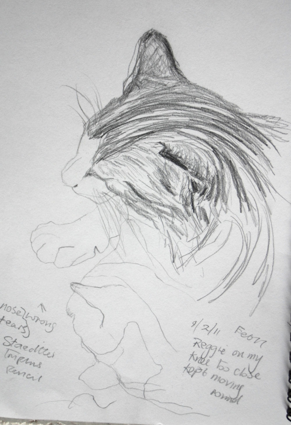
As we have a resident feline, it was my natural choice to use him as a model. Prior to doing this project I didn’t have much experience of sketching cats, but it wasn’t totally new to me either as I had made the odd quick sketch of cats before.
one of the first of many cat sketches
-  lots  more on view in my sketches blog
 In the early stages I tried sketching him when awake and sometimes found it almost impossible to complete a sketch – I was lucky to even get the shape of the head down on paper. It seemed to make sense at this point to wait until he was asleep before attempting to do any serious sketching. When I did this things became much easier. Although even when he stretched and changed position just slightly (which happened frequently) it was a challenge that made me anxious to get the basic form in as fast as possible yet with some degree of accuracy. The process wasn’t helped by the fact that I wasn’t very speedy and only very seldom did the cat return to the same position – particularly the head and forelegs.
The next day I found a few tips on the internet on quick basic sketching of cats, so I tried out a few of them and found that when I attempted to capture his pose when eating, where had failed previously, the new technique made it much easier. The idea is to get the basic structure down on paper by first putting in the line of the spine, roughing in the oval shapes of the head, shoulders, belly and rump.  I found this to be a good basic guide for filling in the broad forms with simple fast strokes.
I continued with method when I did a few more sketches in soft pastel and oil pastel later on and it really simplified things for me. Beforehand I had found it frustrating to sketch any animal moving frequently and it had always deterred me from doing them to a great extent, so I will try to persevere with it.

oil pastel
pencil
pencil


Charcoal

Reggie, large scale drawing, conte pencil and conte crayon
Charcoal 

For both drawings of fishes on a plate I used watercolour pencils and/or crayons. The shimmering colours on the surface of the mackerel seemed to be constantly changing and served only to confuse me. Mostly because of this it seemed to take me hours to build up the layers of colour in the first drawing. Also my technique was quite labour intensive, first shading an area with dry pencil, blending the shading with a clean damp brush, followed by dry hatching and dots, then intensifying some areas with a wetted pencil tip for the dark patterns around the line of the spine and the eyes and head. The plate and background were quicker to do because I softened the detail in these areas.
Meg  asleep - my sister' dog - pencil

For the second fish drawing I propped up the plate at an angle so that it was more face on than the first fish drawing. It didn’t take as long, as I included only one fish and feeling more certain about the colours, I didn’t incorporate as many. However, the fish looked rather lost on the plate due to the plate looking more circular than the first, being almost face on and only one fish occupying the plate. As a result there was more empty space above and below. There is slightly more space below the fish and this was quite empty looking, so I added further tonal shading which I think helped to solve the problem. By this stage I was beginning to feel more at home with the medium and techniques.

No. 1


Media I enjoyed using most and reasons why:
Cat sketches and drawing Chalk and conte crayon were very conducive to heavy, light,  thick or thin and soft textured lines and lines (mostly used for the texture of the fur) combined with shading in places, although I used the medium in a more linear fashion to describe the texture of the fur. It was quite easy to control and not smudging as easily as soft pastels. I liked the conte crayon enough to choose it for a larger drawing combined with Pierre Noire conte pencil, which was easier for finer detail such as eyes, nose etc. The white crayon was ideal to describe the white areas of fur on the tinted paper and I left areas of paper unshaded for the light grey/brown areas. It was quite pleasant to use this medium on ingres or fabriano paper, (I bought them in large separate sheets and I’m not sure which it was) as having a smooth yet uneven surface. I also used chalks and conte crayon on sugar paper for a few sketches but in comparison it produces quite an unpleasant scratchy sensation.
Fish drawing no.2
Amongst various media I experimented with when doing the sketches were: 6B graphite pencil - fine for both fine line and shading under or over.
Gel pen – the effect has an appealing linear and spontaneous look.
 Both the graphite and gel pen are smooth and pleasant to handle.
Other interesting media and techniques I thought about trying since then, might be pen or pencil underneath pastel or conte crayon.


Fish drawing no 2 cropped and turned
Fish  Some techniques I used with the watercolour pencils and crayons were fascinating. This medium has really grown on me, it is so versatile. A wetted pencil tip smudged slightly when applied to the paper and intensified the colour. I found the very strong mark made, ideal for dark accents around the eye and tail area and patterning along the length of the body.  It made an interesting textured wash which I used mostly on the plate and underlying background – applying loose open dry pencil shading then a damp wash over it retained many of its marks depending on how much pressure I applied in the dry shading and the wash. Applying the wetted pencil tip to a damp wash softened and spread the marks giving an undefined smudgy look. This seemed to work well for playing down the decoration around the edges of the plate, causing an out of focus effect, helping it to blend into the background, as opposed to more definition which I think would have resulted in a battle for attention with the detail of the fish, which I didn’t want. In the second drawing the yellow background was too dominant so I turned the angle of the fish, cropping it at the same time. I think the yellow still needs to be toned down even though only visible at two corners.

Where to go to draw more animals - places that will give me opportunities:
Local wildlife park - Doneraile – swans, herons and wildfowl, deer, cattle. Local fields and riverbanks – horses, cattle, sheep, birds.  Fota Wildlife Park – exotic species, African wild animals. Open farms – other farm animals. Donkey sanctuary.
Have I tried drawing a moving animal yet?
I tried sketching some horses in a field and swans on the river – from the car as the weather was cold, my sister’s dog and some cattle in the fields from the window of my dad’s house. This of course proved quite difficult with my limited experience, but I enjoyed the challenge and I feel eager to go out and do more, especially as spring is at last approaching.
Many months later I did some speedy sketches of a large group of horses in the field next to my dad's - just having time to get in a few lines, but I was quite pleased all the same. I have yet to upload them here.......


1/5/11

Drawing plants and flowers


plants and flowers in coloured pencil
How will experiments with negative space help my observational drawing in the future?
No 2 felt pen & oil pastel 
Because I'd already had the experience in the previous exercise (markers and dip pens) with what I see as an imbalance of light and dark, drawing more attention to the negative spaces around the dark areas, I'll be more aware of and try to avoid it in future - hopefully. So, this exercise served to help reinforce in me the idea that negative space is just as important as positive space in promoting a balanced composition, by looking carefully at where the objects aren’t.  It is well worth constantly checking the effect of both positive and negative space from the very early stages, before deciding whether to go straight ahead or to change things around. The negative shapes can often form interesting patterns in themselves and doing the negative space drawing should really help me to see what kind of pattern is forming and whether a good balance is resulting from this.
Techniques I used to ensure I drew plants in proportion:


I used a homemade viewfinder with roughly the same proportions as my paper, and marks dividing the sides in to four equal divisions all around.  By placing a feint mark on my paper in the corresponding places and in the centre I then divided my page. If there was any object close to the middle I would begin by plotting in its basic shape around here. From this I was able to estimate how many times a certain shape would fit into the left side of the picture, from the centre to the left edge for instance, and so on. This was especially important when doing the flower drawings, in helping to prevent me from running out of space. In the case of the drawing of Negative Space in a Plant, I also roughly plotted out the strategic locations, (i.e. top, middle and bottom) where I estimated a few main leaves were located and drew them in as very rough squares or rectangles. It was a bit like doing a puzzle where the aim was to locate and draw as many negative spaces as possible. This method wasn’t always foolproof as it is impossible to keep the hand holding the viewfinder perfectly still, so I do make a few mistakes and end up having to re-draw some of the lines. Although I found it was only really necessary to put in the first one or two basic shapes with the viewfinder and do the remainder by rough estimation as above.
No 3 - col pencil  and chalk pastel

How did I achieve an effect of 3D space in my drawing?
There is only the slightest indication of 3D in the negative space drawing I think, where I added in a few feint lines for stalks and borders around some of the leaves, especially in ‘busy’ areas which looked confusing. This also helped to separate and push back some of the leaves behind. Infact,  in a couple of places I put in positive shapes where there should have been negative shapes, and had to correct them – so I’m glad I chose to use pencil for this, rather than pen.
In the flower drawings I think the composition holds together even though all objects are well spaced apart. The objects are all placed on different levels (one behind the other) affecting the cast shadows in the same way, producing some recession and overlapping. This appears to give an illusion of 3D space around the objects. The tonal shading on the objects, the shading in the background behind the flowers and one of the leaves overlapping the jug also helps the 3D effect. The negative shapes look more obvious where there is more contrast between object and background, as in for example, around the vase.

Negative space in a plant (monsterra) -  pencil
This is what my tutor had to say about the three tulip drawings:
For me due to how you have treated the larger size some of the intensity of the studies and feeling for what you are drawing has been lost. These drawings are somewhat generalized and considering what you are capable of they are disappointing. They are adequate but considering what quality is in this assignment, adequate should not be good enough for you!
A general point which weakens all 3 drawings is the over reliance on directional mark making which lessens the believability of the objects within the whole. The most effective part of all 3 is the tulips themselves in the pastel version.
Amongst areas which could have been given more thought: the flowers - tulips (above). I realise now that I got rather carried away on one directional hatching and could have varied this much more.On reflection I don't particularly like any of the tulips drawings. They have a top heavy look and are too stiff, controlled and conventional and yes - generalised is a good way to describe them. I spent a lot of time doing these drawings yet I remember feeling uncomfortable with the way they had turned out and couldn't quite put my finger on it. Now I can see the faults more clearly (after some help) I hope flowers will be more successful in the future. It might be a while though because they are not one of my favourite subjects.  

12/28/10

Drawing fruit and vegetables in colour

Check & Log
Your composition should occupy most of the paper’s surface. How much negative space do you have left?
In all three drawings I was conscious of this and feel I have been quite successful, but less so with the drawing using coloured inks and markers. Probably because I arranged the lighting to cast long shadows on one side (intending to dramatically enhance the appearance of the negative spaces around them) with the light falling on the objects on the opposite side, producing dramatic contrasts of tone – light on one side, dark on the other. I couldn’t arrange things in a way which looked balanced and the cast shadow at the far right looks as though it is pulling off the corner of the page. Despite this I concentrated intently on the shapes formed by the negative spaces, trying to achieve a balanced composition by carefully arranging the objects and the lighting, together with the resulting shadows. I tried to fill up most of the paper’s surface with the objects and and cast shadows, even running some off the edge of the page in the coloured pencil drawing. In the pen and ink drawing I thought about cropping the paper on the left hand side but didn’t. Although I have done this in the image on my learning b/log. With the other two exercises I wouldn't say I had a problem arranging the objects to fill up most of the paper. The only problem with them was arranging them in a balanced way, but I got there eventually. Of course I could have zoomed into the views more, but then I think the negative spaces would have been less apparent.


Using hatching to create tone - watercolour pencil


What I have learned from drawing the details of fruit and vegetables:
Using hatching to create tone:
When using coloured pencils on their own in the past, I couldn’t take to them. The colours appeared weak compared to other mediums, but when I tried them out by firstly applying dry pencil shading, then a damp (not wet) wash over the top, it gave more intensity to the colours, helping to build up depth and definition where desired. Shading with a pencil point dipped first in water (on the grapes sketch) intensified the depth of tone even further – perhaps too much. Yet when I looked at them from a distance they looked more convincing than I expected.
On reflection, especially with the second and third sketches, I can see I got too carried away experimenting with different techniques rather than concentrating on just hatching alone. But if nothing else it was probably good practice for future drawings. I used loose hatching on the orange segment, rolling the pencil between my fingers. A technique I used for the first time was to use the pencil dry, blend with a slightly damp brush, once dry, hatch or shade with dry pencil. I used complementary colours for shadows, as well as cool muted colours. Blue being the complementary of orange was used in the areas of shadow. I also decided to use it in shadow areas generally, to help unify the composition, particularly as it seems to combine successfully with the dark sepia I used to tone down and help darken the shadows. Whereas I think sepia alone would have been too colourless and ineffective. I also think blue is effective for cooling down areas of deep shadow, helping to give them depth and recession.
Dip pens and markers – when doing my experiments, I discovered that using lighter colours first (under darks) is a good idea; if things are done in the reverse the lines and colours will be visible.
I also discovered that I really enjoyed using ink from a medicine or ink dropper – squeeze and instantly a blob of ink appears, which can simply be pulled outwards with the end of the dropper to form lines of varying thicknesses, reaching outwards in all directions - had to be careful though, otherwise the ink could easily run all over the paper. Dip pens (changing between 3 different nibs) worked surprisingly well when I tried them out on 90lb watercolour paper, considering its uneven surface,  yet were hopeless on a certain absorbent sketch paper. I’m guessing that maybe the watercolour paper was sized better, making it less absorbent.
Altogether I did three or four preliminary sketches of the fruit in different arrangements with the dip pens and markers, but they aren't illustrated here.

Using markers or dip pens - final drawing


Oil pastels
As I’d included a sliced section of red cabbage in the arrangement I thought it wise to practice possible techniques to use for the texture of the sliced section. Whether I filled the dark tonal areas first, then the lightest or the other way round, I noticed the colours merging into one another, darkening the light tones and lightening the darks. Eventually I tried a really light sketchy technique, simplifying the detail significantly, leaving areas of the paper showing through. This seemed to be more successful than all previous attempts. Although the paper was a buff shade it was noticeable and at last I think I began to realize the meaning and intention behind using the term ‘let the white of the paper break through’ in the instructions - the metaphorical ‘white’, designed to help discourage people such as me from using a too heavy handed technique which shows in the resulting merged and dulled down appearance. This may be fine for some effects but I don’t think it was the intention on this occasion.
By using a cotton rag dipped in odourless thinners in parts of the background and gently dabbing it onto areas of dry colour, this resulted in gently spreading the colour giving a subtle muted effect. I used this technique in the background, which I think helped it to merge more softly into the distance, helping to make the fruit and vegetable arrangement more apparent in comparison.
As the red cabbage looked very isolated from the rest of the group – being the only object not overlapping with any other, I tried to integrate it by adding touches of the colours from within it, throughout the rest of the composition, which seemed to help promote a more harmonious effect.


What I found most challenging about this part of the course:
 During the process of drawing the cos lettuce with coloured pencil - using hatching to create tone, initially I wasn’t enjoying filling the veined leaves – getting impatient with the complex network and my enthusiasm was starting to wane. But I decided to persevere and eventually started to notice some semblance of recognition appearing. I could make out pattern and shape in them and some directional movement – however the central area is inaccurate (see sketchbook). The final drawing has only one lettuce leaf, and this was fairly straight and flat in reality, whereas I previously sketched the whole lettuce. I think the sketch version works better as a three dimensional object because of this. Although, adding plenty of tonal shading and cast shadow on and around the lettuce leaf helped its 3 dimensionality. On the part furthest away, using a little artistic licence - adding more curves would probably also have helped. When sketching the individual pieces I have the distinct impression I got too carried away by detail.
Building up what I thought was adequate colour and tone on each object, without going overboard, proved a little tricky, particularly with the pear in the first drawing, as it had a stubborn tendency to look flat and distorted. I noticed that even after applying what I thought was sufficient build up of varied yellows it still looked rather colourless - but I suspect by then I had already added a bit too much purple and sepia in the shaded areas, trying to obtain more three dimensionality. So I added more rich dark yellow in an effort to balance the effect. I was a little nervous of using purple for shading on the pear as it is such a strong dark colour, but I think it worked better once I warmed up the look of the whole pear with deep gold yellow near the end. The process was helped by repeatedly moving away to view the drawing from a distance.


For some reason I had more difficulty arranging the objects in the dip pens and markers exercise (above), trying to achieve a sense of balance, once the shadows were included. Because the bottom right hand side shadow runs of the edge of the paper it seems to pull the whole composition in that direction, causing it to look bottom heavy. The shadow being so long and dark doesn’t help matters either. The final drawing seemed tedious and I felt I had completely overdone some of the colours and layers, to the point of deadening the effect in places. The cast shadows became very dark, whereas beforehand I thought they were too bright, so I added the darker colour, which I think it needed, but it is probably too dark. I think the first sketch gives a better example of cast shadows, as they appear more vibrant to me in this one, without looking over the top.
I wanted to include the complementary hues of violet/yellow with red/green in the shadows, some red from the apple and yellow from the banana, but the risk of the colours merging and mixing into a dull mud was quite high, so I had to be careful with this aspect. Fortunately I don't think it turned out too bad and the underlying colours are visible, adding interest and depth, which I was  surprised about, considering how many layers of colours I applied in some areas. I did get lots of prior practice, scribbling around with and overlaying a multitude of  colours in my sketchbook, so maybe it paid off a little.


Using oil pastel
 I was getting increasingly frustrated at the length of time it was taking to arrange the objects for the oil pastel drawing – over and over again, still not arriving at an interesting composition and yet often when I turned away and happened to glance at some other fruit literally thrown into a couple of bowls nearby, I found their arrangements somehow interesting. However, I couldn’t use these as they were mostly just one or two types of fruit without sufficient contrasts of texture and shape i.e. oranges and bananas. I wondered if I was thinking about it too much and just becoming fussy to the extreme, but from what I’ve read on the subject it does seem to be a not too uncommon problem! On the whole I was quite pleased with this drawing. What I like about it are the variety of textures and the objects look quite 3 dimensional, picking up the directional light effectively. There is a sense of depth also created by the overlapping nature of the objects. However, the blinds in the background are too distracting. I realized my error and tried to blur them with a turpsy rag but it isn't sufficient, and - as my tutor pointed out - the line between the top of the sliced red cabbage and the blinds should be more broken up ie. it would look more interesting if its shape at the top was angled so that it doesn't run parallel to the slats.

12/8/10

Still Life Group Using Line and Still Life Group Using Tone


Still life group using line Medium used - black Pitt artist's pen and coloured felt tips.
Still life group in tone Medium used - conte crayon


Aspects of each drawing that have been successful, and what I had problems with:
Still life group using line I decided to again try using the upright easel but had difficulty with accuracy of the contour lines due to my arm hanging in mid air and having nowhere to rest. I became frustrated by this, and consequently  picked up the board and placed it on my knee so that I could turn it round to enable easier drawing of shapes of outlines of certain objects ie. the top of the leek and the shape of the parsnip. 
I was also having difficulty placing the objects accurately on the paper even though I was really concentrating on the negative spaces, their size and shape, in between. On occasions I have used a viewfinder (as in this case), but even with this I find  that if I move even only very slightly I have to continually line it up again with the objects. Despite this, it does usually help with correct placement of the first one or two objects, after which, the rest will hopefully follow on easily, but it doesn’t always happen. I can often lightly sketch in one object after another and so on (but my eye can deceive me) and when I look again I spot some inaccuracies in scale and positioning, compelling me to adjust them again. Its seems that only a slight movement of the head can make all the difference, so it’s just as well I didn’t draw them in straight away with ink and then discover the above discrepancies! Alas, further practice is needed – and a very still head!  
In the early stages my approach started to become quite uptight, which naturally is far from ideal! As I progressed (once the objects had been placed) I began to cool off, realizing I wasn’t helping myself with that kind of approach. So I made a conscious effort to loosen up, especially as I don’t want my work to look tight and contrived.
I wasn’t sure how to go about making reference to the colours so I decided to just hint at it in strategic places – as the drawing was primarily about line rather than colour.
By doing this I did find that it helped in deciding whether the colours were balanced and distributed evenly.
The inclusion of the chopping board, I would say, helped to emphasize a diagonal movement, preventing the drawing from becoming too static looking.
As I was conscious of correct perspective and foreshortening I think I have gone some way to achieving this, with the mushroom on the right hand side and the near end of the long leek. The sliced onion at the back would be larger if placed directly alongside it, but in this case it is only the same size as it was placed a little further away.
Using line - art pen and felt tip markers
 With the still life group in tone - below, after I had every object sketched in, I reduced the size of the celeriac as it seemed to dominate the rest of the arrangement and I didn’t think it was desirable, considering its position at the back (it would also make creating a sense of depth difficult). Even after this it still looks large but more in proportion. I also slightly increased the size of the earthenware pot – I included this because it was hand made and has an organic look, harmonizing with the shape of the other objects. I found that I needed to repeatedly blend the area on the left side of the celeriac (in shadow) to give a smooth transition with the cast shadow area, as it had a persistent tendency to look too obvious and cumbersome, as if about to topple over.
Although I tried to work quickly and was conscious of varying the marks, I think the drawing appears to lack some spontaneity, mainly because I also thought that the drawing needed to look finished. I wouldn’t say it is overworked, yet there seems to be such a fine line between this and finished I’m not always sure where it is. The paper I chose to use has a good tooth and is neutral in tone, and the chosen medium – conté crayons. I enjoyed using both because: the medium lends itself well to a tinted paper; the neutral tone causes the colours to appear more vibrant than on a white background and is perfect to use white on.  It is relatively easy to build up layers with this medium and it is vibrant and expressive, yet quite easy to obtain detail due to its sharp corners and edges. It is also very stable and controllable in comparison to the crumbliness of soft pastel.


How did I manage a sense of depth in my drawings? what elements of the drawings and still life groupings helped to created that sense?
The sense of depth I think is created by inclusion of: the overlapping of objects and the diagonal direction of the board in the case of the group in line - above, all help to create movement within the composition. I felt there needed to be at least a suggestion of light and shade to give a feeling of depth and I think I got too carried away with this. The onion at the back looks about the same size as the mushroom at the front on the right, but it is larger in actuality, which is what I wanted to achieve. At the suggestion of my tutor I deepened the ellipse on the pot (below). It's an improvement but I'm not sure if it's enough, as the upper part looks slightly more curved, yet is closer to eye level than the base, so should be more level. 
Before ellipse rounded off on base of pot


Still Life Group Using Tone after improving the ellipse at
base of pot - Conte crayon 

I think there is an apparent sense of depth also in the still life group in tone, despite the onion and garlic being relatively small objects in the foreground. This may have been due to the gradual building up of tonal layering and the obvious differences (contrasts) between the tonal ranges used and the use of complementary colours of orange and blue. The lines seem to respond by creating a sensation of pushing and pulling against one another. Using lines and marks following the contours of the objects blending some areas quite smoothly (such as the celeriac) also to help to define depth in the composition.

Difficulties created by being restricted to line or tone:
Still life group using line I thought it would be impossible to create a sense of depth without using tone, so I added cast shadows and shading to the objects and as I wasn’t really sure how far to go with shading in this drawing, I have a feeling I went too far with it…..and that they tend to detract from the other details in the objects.
By being restricted to three colours in the still life group in tone I had to be more aware of trying to depict a varied tonal range – more of a challenge to remind myself to vary the pressure and density  of the shading within each colour. I think this is much more obvious in the darkest shade. I decided to use two very close colours for each of the three tonal ranges i.e. dark  green combined with dark blue for the darkest areas. This was to help give some added variety within each tonal range.