Search This Blog

Showing posts with label mark making. Show all posts

2/12/12

Drawing Workshop

workshop 1
Some fruit, avocado, pear
etc and a candlestick
This is the second drawing workshop I have attended with this tutor Gillian Cussen. Her enthusiasm was infectious and created an atmosphere with strong sense of motivation. We did many rapid sketches of plants and flowers, plus a few ordinary everyday objects. The emphasis initially  was to do huge areas of mark making with various materials - ink, charcoal, pencil using toothbrushes, sponges, fingers etc. - rather similar to the mark-making exercises
on a large format in Part 1.Then, with more directed guidance, rapid drawings of objects while trying to feel the gesture within them, in an attempt to feel the object's dynamic presence. The purpose was to really see what is there and ways of interpreting what you see, definitely not about producing a pretty picture. I think I got more out of doing these than most other workshops I have attended - either drawing or painting and I intend to return again for more of these and similar workshops in the future with this tutor if I feel in need of them. 


workshop 2
Plant and poultry


workshop 1
Driftwood, corkscrew and apple


Above and right comprise of mostly rapid sketches of a selection of subjects, including poultry, in charcoal and pencil, from both workshops 1 and 2. The plant detail (above left) was of the longest duration. Although most of them may look like virtual scribbles, I got a great sense of achievement and possibilities out of it.
http://gilliancussenartist.com/
Taking a quick peep at the artists website it is so apparent how  very free and expressive her own work is - something I aspire to and will have to keep working on....

10/2/10

Using Texture

Texture Squares
When doing the texture squares I discovered a few new ways of using various drawing techniques to depict surface texture: Blending pencil dust with the fingers I found quite fun, and useful for dense grey or black smudgy areas, then erasing to depict lighter areas or reflections.
A blending stump was helpful to soften tonal transitions with control and has more precision than using fingers or a cloth. I used this to emulate dull metal.
For paper pulp I used ink, rubbing the paper with grass stick and quite dry ink,  producing scratchy rendering.
Ink in a dropper was dabbed and pulled to make tadpole like circles and smears for a certain type of rock.


Frottage
I find this to be an exciting experimental technique and ideal to use a point of departure for drawing, or to incorporate into other artistic applications, such as printmaking, collage and painting. I had real fun with this exercise. Apart from helping me to understand and appreciate the textural make up of surfaces of objects around me, it also helps to build up a library of textural marks. Even what I thought were the most unlikely of surfaces, such as the relatively smooth ones of brown paper, a candle and a chair cover gave surprisingly interesting results and would make  good contrasts to the more obvious textures. To use frottage directly in a drawing, I think texture rather than form would be the objective, although it would be interesting to see the results possible.

In the Drawing with Textures – after spending quite a long time experimenting with different materials I decided to try a combination of media for the natural objects, and begin with an open mind. I took a chance with some new effects with ink, including a cotton bud to dab in very dark shadow areas, dark holes in the bark,dragging it (with quite dry ink) for broken texture and for the rock fissures and textures in the bark. I knew I wouldn’t be able to render every object with ink, so I started by using an 8B pencil on the side of the point to apply smudgy tonal shading to the rock at the rear. Then I decided to try charcoal and was so impressed with the results, I continued rendering the bark with this. It seemed the the perfect medium for applying broken texture when I dragged it along lengthways on its side. Certainly it was so easy to smudge with the fingers or blending stick and manipulate on the side of the point for the fissures in the rock, particularly using the thin sticks. For the foliage overlying the large rock I made squiggly marks using a black Conte Pierre Noire pencil.

It is the first finished drawing in which I’ve used my opposite hand (right hand) for some otherwise awkward areas and it felt rather liberating - so not before time! Before very long, charcoal seemed to be dominating other mediums in the drawing – I just found it was ideal for achieving the right textures in so many areas, apart from the large leaf at the front. For this I used a 7B pencil to do the short diagonal veins. It would have had more impact on this occasion (from a textural point of view) if I’d used a grass or bamboo stick and ink,  as I’d originally intended, after trying it out during the experiments I did beforehand. If I’d used tonal hatching with ink and pen for the dark leaf at the top left it might have implied form better, but it probably wouldn't look balanced unless other parts of the drawing were rendered with ink also - the berries and leaves may also have been improved by the same treatment. I think the rock and bark aren’t too bad in this respect, as they seem to have more tonal variations, although I concentrated on bringing out the textures more than anything else. I also included the wooden texture of the supporting surface and the fabric background in this drawing.


A few earlier experiments


A Drawing with Textures - my final attempt.


9/21/10

Line and Other Marks and Trying New Media

Initially it felt quite inhibiting trying to fit the composition inside a small box, and I almost decided to do the designs on a larger area and cut and paste 5cm² pieces onto the sketchbook page. Instead I decided to persevere with trying small designs within the given area and after a while I got used to it. Infact I would say it was probably a good discipline for me to fit these designs into a thumbnail size area, generating a self contained composition in each box.
The small area became once more very apparent to me when using pastels which were tricky to maneouvre properly, but easier if used on the side of the flat end.
Added  interest and lift, I think was produced by adding colour contrasts and harmonies to some designs.

For certain types of marks in this exercise, I found the most enjoyable tools and techniques to use were:

Gel pen – for thin scratchy marks

Feather and ink (top end) held near opposite end, lightly twisted and flicked

Ink – with feather, homemade stick pens such as teasel and course grass stems and bamboo were all enjoyable for easily producing a wide variety of lines with, an often unpredictable outcome

Ballpoint pen – energetic and whispy

Watercolour crayons – grainy and smooth with the addition of a damp brush on some areas

Oil pastel – resist and scratching out

Soft media (charcoal, pastels etc.) - stipples for speed of coverage and relatively large scale

Soft pastels – easy to blend

Homemade sticks and ink ie. bamboo, teasel, reed, feather, coarse grass - a diverse range of marks and lines.


Using Charcoal

After much experimentation with charcoal, I found it difficult to stop, mostly because it seems to have such great versatility. It seems to me that the number of effects achievable is almost endless and great depth of tone and atmosphere can appear very easily and quickly. Almost any thickness of line is possible depending on the size of the stick, the angle and pressure applied.

Using a piece lengthways (either full or broken) it was good for rapid, straight or wavy lines.

Straight lines could be useful for many buildings and angular objects, poles, stalks and conifer trees. If moved from side to side using straight or wavy lines the look of calm, rippling or choppy water can be brought about. The same method could also be used to emulate hair, rays of light or windy weather, rain and blizzards, an approaching storm and heavy cloud cover.

Using the side at a 90° angle to the previous method the thickest lines can be created – ideal for covering a large area quickly with tone and/or texture i.e. water, sky, rocks, rough surfaces, tree trunks etc.

When using a piece on the flat end, medium or thick lines appear, and if twisted or twiddled around the lines become more uneven and expressive, similar to those of a bamboo or dip pen and ink.

Using the end of a stick on the side I could get quite thin lines. The thin stick looks similar to charcoal pencil, except unlike pencil, it creates a much darker and more dramatic looking line if more pressure is applied. At the other extreme, light wispy looking lines are very little effort to produce.

Charcoal’s speed of coverage and its ability to easily create mood and atmosphere to almost anything, is second to none - in a format large or small. It would lend itself well to sketching many subjects (large or small) when out and about or when time is short  – particularly landscape sketches. It is definitely ideal for large expansive drawing.

The only drawback I find is its inherent messiness, but this is also part of its attraction because this makes it so easy to produce fascinating effects by erasing or manipulating with any eraser, fingers or cloth.


8/15/10

Mark Making and Tone Mark Making Techniques – Hatching and Stippling

Various hatching and stippling marks, made inside 5 to 10 cm squares, were required for this exercise.
I began by experimenting with charcoal. As it’s such a soft and smudgy medium, encouraging large marks, I decided to first draw the marks on a larger piece of paper, then cut them into small squares and paste them into my sketchbook. This in itself seemed to work out well in charcoal. Stippling is a technique which I tend to find tedious and slow using finer mediums, so I liked being able to cover a large area relatively fast. Thick felt tip pen was the only other medium I liked using for stippling, again for fast covering ability.
It was more difficult when it came to trying out hatching and crosshatching with charcoal, especially with fine detail. I found this only possible using a very thin stick, or if I made a conscious effort to separate the lines well when using the medium and thicker kind on the side, or flat side of the end. Certainly, fine definition was much easier using a hard pencil, a well sharpened softer pencil, ballpoint and fine marker pens and to some extent, the coloured pencils.
One interesting effect I discovered was to first make hatched indentations in the paper using the dry nib of a bamboo stick, then shade over the top with a soft pencil on the side of the tip, leaving the paper white
where the indentations were made.

What I found most enjoyable of all was experimenting with variations requiring a more spontaneous and loose approach. A feather quill, using either end seems to lend itself well to this, as well as thick dip pens and hollow homemade pens such as teasel, course grass stick and bamboo.
Manipulating the drawing tool in different ways also of course had a big effect on the kind of results possible.


8/11/10

Project Making Marks continued.


Adding colour was useful for creating 3D illusion by using darker and lighter shades of the same colours next to one another such as in the exercises on page 17 - Hatching and Stippling and page 19 - Line and Other Marks. It also had the effect of advancing or receding depending on the colour temperature used (3rd example, last page, Hatching and Stippling) or by mixing complementary colours giving more intensity to each colour (last page, Line and Other Marks) with violet/deep yellow and deep blue/rusty orange. Another example on the same page looks vibrant and fiery – almost jumping out of the page, through using red and orange in combination. By contrast, another one is calmer and receding because of using dark cool greens and blues together.
 

Most interesting and rewarding experiments
Overall I quite enjoyed all the mark making exercises. As I’m naturally quite inclined to sketch, draw and paint in quite an abstract, perhaps indefinable way, I guess this may have something to do with it.
I found the following particularly enjoyable:
 Doodling while thinking of a subject - using charcoal, chalk and soft pencils; they appear to have great ability to emulate weather phenomenon and climatic elements.
 In another doodling experiment, I was impressed by many unpredictable techniques and effects which occurred often by accident, such as blowing ink through a straw producing branch like lines. In lines and marks: using the top end of a quill for wavy and zig zag lines and freehand scribbles generating a random naturalistic appearance. These usually materialized from holding tools further away from the tip with a relaxed and flexible grip.
 Using larger sized paper (A3 to A1) was liberating and it felt easier to be more spontaneous particularly with the above mediums.
 At one point I found I was having fun making patterns which reminded me of ‘Spirograph’ a drawing toy from the 1960s. These developed from playing about with fast marks with a ballpoint pen held half way along or close to the top. Through this I think I accidentally found a quick and easy way to produce singular and multiple (though not accurate) ellipses. As I’m often inclined to doodle with ballpoint pens it was perhaps a natural progression with them. I tried this out with pencil, plus charcoal which worked well on a larger scale.
 Ink - pressing an inked fingertip onto the surface gave intriguing textural effects perhaps indicating foliage or rough stony areas. Toothbrush – to flick and spatter and scrape to suggest conifer like foliage.
Dip pens - the contrasting variety of thickness of mark, with a relaxed hold, while twisting and turning them. Fine liners and ballpoints - very scribbly scratchy marks produced on fairly textured paper. I used Quink black ink in these exercises, with which I found easy to obtain certain interesting watery effects and it develops a watery looking bloom when manipulated on smooth paper with a brush. Dilute and undiluted Quink used in combination produced a 3D effect. It appears to be quite soluble when dry if a wash of water is applied over the top. I also like the way the ink settles into the paper in an erratic way. The ink in Crayola children’s markers dissolves in a similar fashion.
 Charcoal and chalks ie. conté and soft pastel - for the ease of producing areas of soft tones quickly and full of depth . When twisted around on side - full of 3D depth and not to forget, lines and tones of varying thickness capable with just one stroke.

8/10/10

Project 1 - Making Marks - holding pens and pencils and doodling

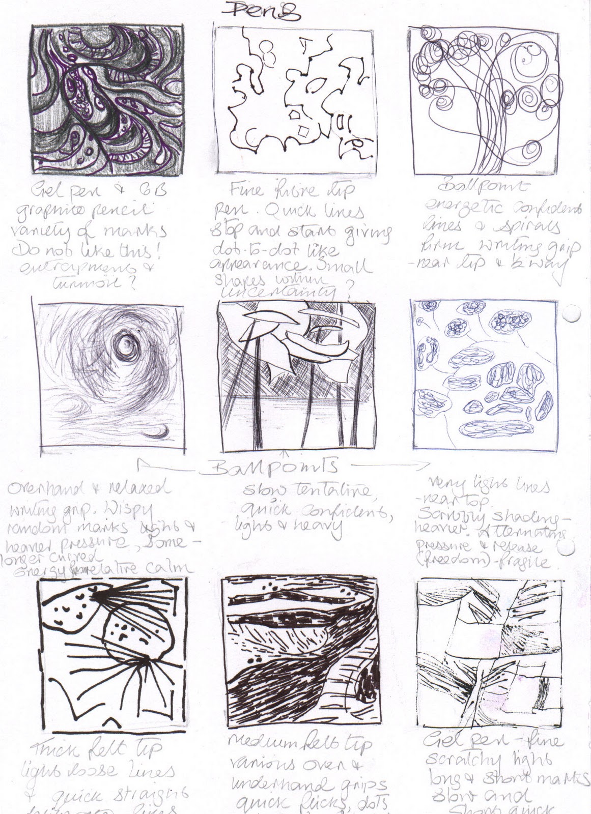
Throughout all the exercises in this very first project, I concentrated on holding the pen or pencils in as many different ways that I could think of i.e. near the tip, near the top, half way along and variations on these. I also tried out the effects of using light and heavy pressure and using both smooth and textured papers.
The huge variety of effects resulting just from changing the way I held the drawing tool was often quite surprising.
Generally, holding the drawing tool near the tip promoted the most precise detail – good for small dots, spots, dashes small patterns and shapes, especially where accuracy is important. Holding the implement at or near the top had the least control and forced a looser more expressive kind of line or mark (especially when standing) which I really like. Small is also possible, but with less control than other grips.
Holding the pen or pencil half way along was like a half way house - found to be good for shading larger areas,  loose gestural lines with more freedom of movement than holding near the tip, but with more control than holding near the top – again this was easier when standing up or using an easel on large paper.  Placing the forefinger on top of the pen/pencil made it easy to apply firm pressure. With the forefinger underneath and thumb on top, held at least half way along so the pencil was at a low angle to the paper, was good for covering large areas.
During the first few exercises I enjoyed the freedom of being able to include
drawing on a large format. From the beginning, I consciously used as wide a range of media as possible, including those I hadn’t used much in the past - these consisted mostly of pens and inks, because I hadn’t been too impressed by them when trying them out. After this experience I realize I dismissed them too hastily, as I find most of them definitely have many positive attributes.

 I used a variety of pens in many different ways, beginning with fine markers, ballpoints, calligraphy pen, dip pens and fibre tips. Some of the finer pens – ballpoints, fountain pen fine dip pens and fine markers were good for fast, spontaneous, scribbly and sometimes scratchy looking lines almost disappearing completely when pressure was reduced. Some of these tentative looking lines could be used to emulate creases in fabric or tangled undergrowth. Shorter versions - for fragile branches and stalks. Thicker felt pens and dip pens - ideal for giving plenty of definition in lines if twisted around – wonders of the great rotating pencil/pen!

Dip pens, quills, bamboo and homemade pens such as teasel and coarse grass gave a quite interesting variety of thickness of line, especially for accidental effects and produce a spidery line when held near the top.

Most drawing mediums can be used for producing uneven zigzag up and down lines – to emulate long grass and foliage on trees, but I think pencils or fine nibbed pens are ideal. They also proved to be good for curving and straight criss cross lines – for areas of undergrowth, tufts of grass or dead grasses, heavy clouds and the base of waves. Infact, lots of loose textured effects with scribbly random lines in a multitude of ways.
and quick short flicks of most drawing tools.
A whirlpool effect was produced by drawing fast ellipses and circles and spirals with ballpoint pen, charcoal and pencil.
Calligraphy pen - for producing a varied thickness and density of line.
Ink dropper and straw (for blowing ink).
Homemade sticks and ink i.e. bamboo, teasel, reed, feather, coarse grass seemed to have quite an alluring way of producing a diverse range of marks, with an element of unpredictability, from dense masses of ink to a minutely thin line hardly visible, just by adjusting where and how it was held. I found it became quite addictive.

Many and varied emotions or feelings were brought to mind in the resulting marks, by employing certain techniques with certain tools. Below is a selection:

Sketchbook - ballpoints, markers and pencils - scribbly, tangled lines convey confusion, anxiety and perhaps indecision when the lines suddenly change direction. Sharper lines - frustration. Sharp, light and tentative – nervousness, fragility. Fast marks – confidence, aggression. Jagged fast marks – fury, anger. Slow deliberate – determination, desisiveness. Jagged knotted/tangled (some reversing back sharply) – resentment, turmoil. Quick tight lines close together – tension. Graphite stick, conte crayon, soft pastel - smudgy fuzzy marks – calmness, tranquility. Smudgy swirls – inner turmoil. Charcoal (Page 18) - heavy smudges over lighter – depression. Side of charcoal – circles – dizziness, vertigo. Pen, ink, pencil - groups of swirling lines directed outwards – joy. Straight lines reaching outwards – freedom or desire for freedom. Ink, charcoal - crisscross lines – claustrophobic, suffocating, trapped. Spirals/swirls – intrigue. Similar marks are continued on the larger paper.
NB - There are also many notes on emotions/feelings in the sketchbook exercises in Line and Other Marks.