Search This Blog

Showing posts with label figures. Show all posts

2/15/12

Assignment 5

Apologies for rambling on in this section - I fear the reader will tire of reading long before reaching the end.
 Looking back, there appears to be a pattern emerging of my being quite comfortable with the  media I've used so far for figure studies - apart from soft pastel that is. Although it isn't  to say I think I'm proficient with most media. Pen and wash haven't figured at all, which seems a shame really. Maybe this was an oversight I should try to resolve, but I think it is precisely the immediacy of dry media that attracts me.   I enjoyed enormously trying out some experimental techniques like subtractive tone with charcoal and eraser (blending and/or hatching) and similarly using pencil (or charcoal) in a loose linear fashion with multi directional strokes then erasing and replacing lines as I drew them – especially easy over paint (see Using Colour 2.). I find Charcoal has the advantage of being very ‘smudgeable’ but the disadvantage of difficulty with detail.  I’m not totally sure why I chose to concentrate on figures rather than portraits for the assignment drawing. I reckoned I needed more experience in this area and it was my main area of focus during this part - Part 5, not to mention the fact that I’ve been going to a weekly life drawing group (with the odd exception) over the past 3 - 4 months, so I decided to continue with figures. I think I also have a fascination with the various angles and shapes made by the human form. Therefore it seemed a natural step to choose the same for my assignment drawing.        See also Course Reflections

sketch 1 - pencil
 When I attempted some sketches for my assignment piece I felt that all 3 of them went a bit haywire – the third being the worst. I tried to sketch quickly, taking a risk by relying on sight only and soon realized things weren’t working out as intended. In the third sketch – which I have destroyed, the head grew larger and larger. The feet were too small in comparison, the legs too puny. I won't say what I thought it looked like, but quite tragicomic, in a way. Even  careful measuring didn't produce the desired results. A slight crisis of confidence ensued causing me to feel as though, despite all my figure drawing practice, I wasn’t improving but getting worse! So I left things alone for a couple of days and fortunately when I returned (with a more relaxed and controlled approach) things went much more smoothly. I have to admit I made careful measurements and noted down many of them in the fourth and final sketch before the finished drawing. 
Ignore the labels on the images themselves - the captions below are correct.
sketch 2 - charcoal


sketch 4 - pencil
I ended up drawing a reclining figure with the head furthest away from me. Although I had done a very similar pose to this in Part 4 (3 Drawings) I wasn’t very pleased with the former drawing, partly as I struggled so much with the foreshortening. Yet I was hankering after the challenge of yet again attempting a foreshortened figure. Their main appeal to me is probably because of the interesting angles and perspectives they create, giving the look of a three dimensional figure moving forward in the picture space - if successful.
Charcoal was the medium I chose, the surface is heavyweight medium textured cartridge paper. I first covered the paper using the side of a stick of scene painter’s charcoal. This is a very similar technique to the one Seurat used to begin many of his monochromatic conte and charcoal drawings.  Then I rubbed it lightly with newsprint to push back the darkness into the picture plane and make it easier to bring the figure forward in space, re-establish the mid-tones if need be and to erase for creating highlights.
The model was illuminated from the right with artificial and natural light. He was positioned below eye level, so I could include much of the surrounding surfaces and objects. These helped to place the figure in context. I included some details of the cushions and soft covers underneath, as I think they also promoted the directional flow, helping to balance out diagonals with horizontal and vertical lines. I tried to give the most emphasis to the feet to help bring them forward and add to the 3 dimensional look. The fingers were difficult – they are so detailed and small in relation to most other features. Also if I included much detail here I was afraid they would detract too much attention away from the feet. So, I only wanted to give them the very minimum of detail, so as to knock them back quite a bit into the distance.  
To help in my attempts at accurate proportions and placement of the figure I did the following: repeatedly checked the negative spaces and measured by making comparisons with the length of one area against another, using the outstretched arm and pencil method. I also marked in the direction lines for angles of limbs and divided up the length and width into equal portions. For the sketch of the final drawing I also used a window mount to help to roughly place in the best way, the figure within the picture plane. With all these checks I think I was well insured from all angles on this occasion.
Finished drawing -charcoal
I tried to feel the direction of the surface plane as I hatched the marks with charcoal and carve out the whites with the corner of cut off pieces of hard eraser. Although I tried it out in earlier exercises, it has been something of a revelation to me to use the eraser as a drawing tool as much as I have, rather than as an eraser for rubbing out mistakes. I now find this technique to be one of the most enjoyable parts of this drawing process.


Conclusion
Certain areas of the drawing at this point, I think, need more work. Leaving an assignment drawing alone at this stage was a test of will power for me, not being something I’m accustomed to - I certainly didn’t have the confidence to do that before. Instead I think I would often put in  too much detail.  I decided not to develop it further as I wanted the choice of being able to return to and tweak it later on, when I am more certain of what needs to be done, if anything and if my tutor suggests it. Now at last I realise it's much easier to add on than take away afterwards. Already I can see that some areas may need softening such as the edge of the shadow under the left upper arm and the vertical lines behind the head, while others need bringing more into focus, such as the feet, which I want to draw attention to a little more. The large highlighted area, I think, needs more emphasis to the right of the figure. Trying not to give the fingers much detail while at the same time getting them to look convincing as fingers, proved to be too elusive. Consequently those on the right under the book, look too dark and chunky around the edges. Perhaps it would have been easier to use a charcoal pencil for these so I could do them more delicately and inconspicuously without smudging the charcoal everywhere. I should try it out. 
It is now becoming almost second nature to discern shapes – their relative size and positions, and measuring, for the most part, has become much easier compared to the beginning of Part 4.  I even find myself wanting the challenge of attempting foreshortened figures in reclining poses, which is why I decided on just that for Assignment 5. Besides being a reclining foreshortened pose, it proved to be a relatively comfortable one for the model. In spite of this the quality of my work has not shown consistent signs of improvement. There have been a few setbacks along the way. Though I would say, because of the practice, that in general I'm finally beginning to approach a subject with more ease and confidence than previously. Fortunately my tutor didn't suggest any re-doing or changes this time, unlike some of my other drawings. I was amazed and relieved with the feedback on this one - here is an extract: 
Assignment piece
'This is a beautiful drawing for this level. It is very well composed and well structured. The use of tone and light is excellent. This drawing has presence and intent and is very well observed and interpreted. The pulling out of light is really working well as is the whole diagonal composition. The drawing has a strong visual impact borne out of hard looking and a determined effort to achieve a successful outcome. It is always good to see successful culminations in assignment five and this certainly is. Put it in your assessment prominently. The prep work for this drawing is good also'. -  one gobsmacked student!

2/5/12

Tonal Study 1

Media: Charcoal and soft pastel on cream Ingres paper.
Reclining figure. First I covered the whole paper in charcoal, then sketched in the outlines of the figure.  As I did so I continuously took comparative measurements with an extended arm and pencil. I also checked the shapes and angles formed by the figure’s contours and the negative spaces.
I did find during most of the process that the left hand was very troublesome to get the correct placement, direction and length from the wrist to the tops of the fingers.
Initially I enjoyed doing this drawing until I started adding pastel. When it comes to this medium I really haven’t much faith in my ability to bring things to a successful conclusion. I found that it took longer than I expected to layer the colours – most of which I did after the life drawing session.
At one point I was getting worried that things wouldn’t work but I persevered with very gentle layering – using complementary colours of blues and rusty oranges to give things a lift and to add strength to some of the charcoal shading.  I darkened it a little with dark blue.
One difficulty was that the overhead lighting wasn’t very strong and I had to almost continuously half close my eyes to try and work out where the light was strongest.
Although it wasn't an intentional effect, looking at the finished drawing, to me the setting looks quite theatrical and I can see a subtle suggestion of stage curtains on either side of the figure. 
 I darkened many background areas bordering onto highlighted edges of the figure. I gently skimmed one colour over another, using shades of mostly rusty oranges where the planes are moving outward and mostly blues where the planes recede. On later inspection I realised the blue is a warm blue and appears to pull the background forward I think. Bread worked quite well as an eraser, soaking up pastel in areas where I built up the pastel too thickly.
Tonal Study 

Although I stood back to check the drawing several times during the process, just when I thought I was finished I noticed that the left wrist and hand looked so flat,  it was as if they had been squashed in a mangle. The left elbow was too narrow, the right upper arm trailing downwards, was slightly too short and the right hand was too long. I was able to perform some rudimentary first aid on most areas by gentle erasing, with a putty rubber this time, and doing the necessary repair work, some of which entailed altering the angle of and making narrower, some fingers. Thinking the right hand would be trickier to rectify, I left it alone for fear of making it worse. A small advantage here is that the cast shadow at the end of the fingers possibly help this fault to appear less conspicuous than would otherwise be the case.
The lower leg was also too thick, as being further into the distance than the head it should have been narrower. I narrowed this later on, but now I think it looks a bit shapeless and straight.
I decided the brown colour in the background wasn’t working, it was moving into the foreground instead of receding as I wanted it to. So, throwing caution to the wind this time, I plunged in and rubbed it around on the paper with my finger. Luckily I don’t think it looks too bad now, in most places and even seems to soften the background, although not quite enough. However, because the rusty brown in the foreground pulls the foreground forward I find it too distracting.  Perhaps the warm blue (as previously mentioned) would work better here. Pastel is always a medium I am very nervous about blending incase I spoil the effect completely - this has happened to me before. Soft pastel is a medium I think I really need some expert tuition with before I will start to see much of an improvement.
All in all I feel that I have overdone the blending on the tonal shading of the figure. Despite only using very light pressure, so as not to mix the colours on the paper and adding some short hatched marks in places, to vary the marks and add some texture, it didn't seem to make any significant improvement. On reflection it was a process I didn't enjoy and it wasn't surprising that on impulse I wrote 'I hate this drawing!' in my rough notes.
 I blended the contours and features of many areas, including the head and left hand, in an effort to reduce their definition. I increased the amount of definition around the upper arm more than other areas, so as not to draw attention to too many areas at once, which would be confusing for the eye.This is one aspect, I think at least has worked to some extent.

1/15/12

Using colour 2

2. Standing pose.
Another version of
a sketch for the
standing pose
I wanted to change the orientation this time for the second drawing of Using Colour.
Again I used the same model as previously. It was taken from a previous 10 minute sketch of a standing pose at my life drawing group. Surely, when I compare with my other figure sketches, this must  be one of the better 10 minute sketches.  I did find however, that copying this sketch for the drawing, a little more challenging than the initial sketch for some reason. 


The surface is cream Ingres paper and the background was covered with leftover acrylic and gesso, applied quite dry. For the outlines of the figure I used dark red marker pen. Immediately afterwards I regretted using this method as it seemed to look too hard and uniform against the background,  I think because of the background's haziness which seems to move in and out from the surface. 


Sketch for
standing pose
At this point I thought about a drawing I had been impressed by in a book of mine called Drawing Projects. It hasn’t been in my possession long and so far I’ve only tried a couple of exercises. The projects are intriguingly experimental and  unconventional. I thought I would take a risk and try out a technique which was totally new to me, but looked quite fun to do.  So I had a go with it, over the top of my existing drawing - after all this part of the course is called Draw and Experiment. I was very hesitant about using this technique at first – afraid to completely ruin it, but what the heck, it’s important to take a risk now and again... otherwise I'm not going to learn much at all.
RB Kitaj Ashmolean drawing - pencil
As with Louis Freund's drawing 'La Pieta', (Research Point, Part 5) the process entailed building up a mass of lines in a multitude of directions. In the drawing by RB Kitaj (right) the lines aren't so densely compacted as to completely obscure the light  or white surface beneath, leaving I think, the right balance between heavy and light.  It seemed to take ages to build up what I considered to be a sufficient density of lines, using the pencil and slashing marks of the eraser. At one point I must have become carried away - applying too much pressure on the surface  with the side of the pencil point (6B pure graphite pencil), as the density of shading in most areas around the figure was such that it obscured much of the light painted surface underneath. The figure's contours on the right were also more obvious looking. These were not effects I wanted. To remedy this I applied further firm rapid long  slashing marks with the corner of the eraser over the background area, frequently continuing over the edges of the figure's contours, until eventually the density appeared adequately broken up. At least I didn't need to fear damaging the paper, as the surface was very tough, having previously been coated with acrylic paint and gesso. The sheen on the paper's surface caused by repeated application of  graphite however,looks at odds with the areas without graphite. Proportion is another area I'm not completely happy about: the model's right arm looks a bit too short. I wonder though if this is partly due to the end of the hand being barely visible. The buttock, although in actuality was rather flat looking, exaggerating its shape would have perhaps helped , as it looks shapeless. 


finished version
This  figure's pose is quite static - various energetic marks applied over and around the subject, have the effect of promoting a feeling of turbulence and energy, in a similar way I think to many of Giacometti's paintings and drawings, whose subjects often also appear haunted or disturbed . Unlike Giacometti though, the surroundings here appear to conflict with  the subject who, rather than appearing haunted or disturbed, looks quite  unperturbed, calm and confident amid the turmoil, in spite of the energy flowing through and around her body. I think there is more similarity in this respect with RB Kitaj's drawing, yet my model  looks less troubled even than the figure there. This is a technique I think  would complement well a figure in a more active pose, if I was to try it out again as I intend. 


1/10/12

Using colour 1

Collage early stages

1. Collage – reclining pose
This figure was taken from a drawing I did at life drawing group. It appeals to me, as the particular reclining pose and the model’s figure seemingly combine to form a wide range of interesting curves and shapes. Further interesting aspects of this pose are the effect of gravity pulling the soft tissues downwards and because she is lying on a hard surface this forces the right hip higher than if the model was on a soft surface. I like the slight diagonal formed from this viewpoint, from the lower right to  the upper left. The hair spreads around in a spiral from the top of the head.

 I wanted to play around with background effects as well as the media for the subject (the figure). I used up some left over acrylic paint from a previous painting and some Quink ink applied as a wash, allowing it to run in places. Before I applied the final coat I stuck on a few torn magazine papers, painted over them, pulling most of them off again before they were dry, inducing a masking or relief effect. I added some white paint splattered on with a toothbrush and dabbed on with fingertips, plus some linear marks of teal blue conte crayon.

 
Collage final stage
Next I sketched in the figure’s outline from the previous sketch (above).  With a few more papers – tissue and newspaper stuck down on the surface, I covered the figure’s outline in places. Then I painted the figure with some very watery white acrylic to maintain some transparency on the newspaper print. Over the top I applied tonal areas with coloured pencil and white conte crayon – this being very useful for increasing the effect of the highlighted areas, while simultaneously softening the transition from mid toned areas.
The effect of gravity and the dark shading seem to have the effect of pulling the figure deep into the fabric of what she is reclining on. While the fabric and the figure combined, appear to be floating around in the dreamlike space of a dark transparent background - the directional brush strokes contribute to the effect. The angular shapes of the slightly paler relief areas act as arrows pointing inwards to focus on the subject in the centre.  
As I so often do, I think I may have overdone things. It probably would have been better to leave it as it was in the early stages. Having an unfinished look may have helped it's appeal, lending more variety. I've virtually hidden the paper and newspaper collage under all the paint and crayon, which seems to defeat the object of using it. 

1/5/12

Line Drawing

sketch for line drawing
This was a line drawing of a figure positioned somewhere between an angle of 45 degrees and side on to the viewer. It would be devoid of tone, so I decided to exaggerate the foreshortening to help give an illusion of depth and take the upper part of the model back into the picture plane.
line drawing
I didn’t expect this drawing to take me a great deal of time to complete, having no need to add tone but how wrong I was! Although I carefully measured almost everything by constantly making comparisons with other areas I’m not convinced that some areas are accurate. If my measurements are correct, I found that I didn’t need to intentionally exaggerate the legs, feet and arms, yet they look very large in relation to the upper torso, head and upper arms. To me the foreshortening looks more exaggerated than in any other seemingly correctly proportioned figure drawing I’ve done. I suppose at least he doesn’t look like a cardboard cut out!
Added to this, after a break, the model moved his arms and feet slightly, despite marking their location beforehand. I really got caught up around the feet on this occasion and had trouble trying to get them to look believable, especially the inside of the left ankle, which I think looks too pronounced and the right foot looks too shallow to me, giving both feet a distorted appearance. I can’t help thinking the head is slightly too small. The model’s feet look excessively long when in reality they are not. On the plus side - he does have a fine bouffant.

12/15/11

Research Point - David, Ingres, Degas, Picasso, Giacometti, Hockney

Jacques Louis David (1748-1825)
Studies after Michaelangelo
David filled his sketchbooks after antique and baroque art but
rejected the rococo tradition. He described contours meticulously.

‘Marie Antoinette on Her Way to the Guillotine’ 16 Oct 1793, pen and ink.
‘Studies after Pietro da Cortona’
black chalk. This is from a fresco
 ‘The Assumption of the Virgin’. 
As an official artist of the French Revolution he sketched victims on their way to the guillotine. This is a very simple looking line sketch, almost a caricature, of Marie Antoinette on her way to the guillotine showing economical and deft use of lines. It encapsulates very well the broken yet dignified expression on her face.


Ingres
Ingres style was Neoclassicism (classical antiquity) and he was the last of the neoclassicist painters – a master of realism.
He was a pupil of David’s.
Ingres lines are very smooth and pure giving his figures a look of flowing elegance. He paid a lot of attention to detail. Infact the stress on line was an important part of his style – delicate but firm.
Portrait of Charles Francois Mallet. Front lighting used here (as in most of Ingres’ drawings) emphasizes the edges. In doing this he followed very much Raphael’s example. In places he has used minimal of broken line to show the saturation of light and bolder on the other side to show the form turned away.

Link to Ingres Miraculous Lines – describes in fascinating detail Ingres career, inspiration and techniques.

Edgar Degas
Woman drying herself after bathing, pastel
Degas was a great admirer of Ingres, whose masterful draughtsmanship was passed on through Degas’ tutor, who was a pupil of Ingres. Yet he also admired the turbulent style of Delacroix. He used a quite linear style in many of his drawings and often reasserted the outlines. The lines of the faces are usually quite controlled, yet the arms or legs for instance, are done in a quick sketchy looking way with numerous restatements. He often used scribbly lines for backgrounds but more controlled parallel hatching strokes for the forms and surface planes of his figures.
One of Degas main concerns was how to convey movement – drawing his subjects from unexpected and unusual angles. This link describes in detail his pre-occupation with movement, particularly in relation to dancers in the ballet.

Pablo Ruiz Picasso
La Sieste (Les Moissoneurs)
La Sieste (Les Moissoneurs), 1919, pencil
Here very fluid curving lines have been used, with little variation in weight, delicately reasserted here and there. This and the soft, voluptuous lines of the contours give form to the two figures.
In contrast Louis Freund’s drawing Pieta, 1960, oil on board,  the lines are wild and frenzied. The contours come and go and singular lines move from one end of the composition to the other in a vigorous exploration.
Louis Freund - Pieta

In Desuudo de espaldas, 1958 (right) Picasso has created a wonderfully expressive drawing with just a few lines.


                                     Alberto Giacometti
Many of Giacometti’s drawings are made up of a mass of often entangled lines, like lengths of wire. This was how he brought about the sitter’s likeness and presence. The turmoil in these  lines appears to give his figures a look of ghostly vulnerability.


David Hockney
Two Dogs – these are two contented looking daschund dogs, delicately rounded and plump. Hockney uses a balance of thin and thicker lines, suggesting just a slight amount of subtle shadow. This seems to anchor them very comfortably in the chair.

Celia Sleeping 1972 – just a minimal amount well placed lines here, which appear to capture the scene perfectly.
In ‘Portrait of Dwight’1979, pen and black ink, Hockney uses multiple short singular and v-shaped directional lines and marks to describe texture in the hair. Loose minimal slightly curving parallel lines describe the ribbing on the sleeve at lower left. There is just an 
Celia sleeping
indication of texture in the closer fibres on the front of the t-shirt
 where the marks are denser and more random.


12/3/11

Don't Plan, Just Respond

completed sketches in charcoal
This is an exercise I tried recently from the book Drawing and Painting People – A Fresh Approach by Emily Ball. When I first browsed through this book a couple of years ago, the attraction wasn’t immediate – I thought the images were a little primitive and childlike, yet at the same time I was intrigued and after reading a few pages my  perception was beginning to change. From the start I couldn’t help but be fascinated by the unconventional approach to drawing and painting the human figure, which for someone who’s approach has tended towards constraint and over-finishing, was very liberating, yet not easy to get used to.
The point of this particular exercise is about just responding to the pose of the model without thinking, so as to help remove fears and encourage spontaneity.  In short, the instructions began by dividing the A2 paper into 16 equal sized portions, or use 16 x A6 pieces of paper. This was to enable drawing a different pose in each section. Next  to try out the model’s pose for yourself before attempting to draw - very important. Begin  by rubbing some charcoal dust into the first section, carefully but quickly following the movement and form. Then draw the pose without looking at the paper or attempting to be tidy. From start to finish, without rushing, each drawing should only take between 30 seconds and a minute. Although I have only tried 3 or 4 of the exercises in the book so far, I’ve found them all so motivating that I intend to return to the book repeatedly in the future. Hopefully if I continue on this path my drawing (and painting) in general will improve the way I want it to. I will have to perservere…

11/30/11

Quick Studies

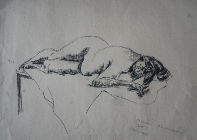
Another reclining pose in pencil
 on grey paper which I had more success 
with than sketch 1, although it's 
 not very clear on a thumbnail, hands
look more natural than on many 
Some of these sketches were done at home, others at my life drawing group. With most sketches I compared measurements using an outstretched arm and drawing tool.  Generally they improved over the course of the exercise, but the areas I struggled most with were:

Sketch 1 – (not illustrated) sitting/reclining figure with legs outstretched. Because I discovered the left upper leg looked too narrow initially, I restated it three times before I was happy with its proportions. Even then I thought the knee looked too thick but on checking with other areas such as the face the measurements agreed with those on the model. Even though the model was placed sidelong to me there was a noticeable effect of foreshortening on this one.
2. graphite stick
On sketch 2   I used a Derwent graphite stick on sugar paper. I have a couple of other graphite sticks which glide across papers very smoothly but the opposite is the case with this kind. It didn’t seem to behave well and produced a rough gritty sensation on the paper. In places I had to increase the pressure very firmly to define the line more. It isn’t the first time I’ve used this type of graphite, it's just that if the mood takes me I feel ‘drawn’ to the challenge.The negative spaces were very useful for guidance, as long as I  concentrated hard on them.


3. ballpoint pen


Sketch 3 (above right) – black ballpoint pen in sketchbook - 12 minutes.
 Sitting pose. This was timed for 10 minutes but I added on another 2 minutes because I ran out of time and hadn’t completed the whole figure. Gauging the length of the lower legs was the main cause of the hold up. I measured them on the model against the distance between the underarm to where the hip meets the upper leg.


The  drawing below right was done semi-blind - in other words I didn't look at the drawing until I'd completed large amounts of the contours.  I went through a process of drawing from one point to another, then stopping and studying where to go next ie. from the back of the ankle, around the foot to the shin. Then from the shin to the groin area and so on. The combination of using the two pencils taped together for a contour drawing and only very occasional checking , I think has materialised in the figure appearing to flicker, not to mention very liberating. The idea of taping the two pencils together was inspired by a superb book on experimental techniques and the artists who use them - Drawing Projects. Although I deviated from the instructions to a large extent, in some ways I wish I'd had the book before I began the drawing course as  it might have encouraged me to be more adventurous.


 - black pierre noire pencil


Above - two early sketches 

Sketch 4 charcoal on brown paper – 6 mins - not illustrated as has been mislaid, but is similar to the charcoal sketch below right. Crouching pose. Once I’d put in the head and shoulders this sketch progressed well in the time. I felt more confident with the hands, arms and legs and was able to do them quite accurately. Enjoyed the process of drawing the right knee area using rapid angular lines. A pose like this with multiple angles seems easier to do than outstretched limbs, as I can easily see the positive and negative shapes..Also liked the way the charcoal glided over the smooth brown wrapping paper.

charcoal
charcoal
General comments: The toes can be a source of fascination  when they form interesting shapes and angles, but I tend to dwell on them for too long, leaving too little time for other areas.
I find that I’m automatically looking at the shapes and as my figure drawing experience progresses I can generally sense a growing confidence in my ability to judge:
Where things are in relation to one another
Negative shapes
Proportions by sight (sometimes) and see shapes  rather than having to measure constantly.
The location of the line of balance.
Judging the length of legs on a sitting or reclining figure can be a stumbling block. When unsure I divide the figure into portions equal to the length of the head. Even so, the negative shapes are less clear when there are no apparent surrounding positive shapes, and I find the number of divisions is not so clear cut as on a totally outstretched or standing figure. In this case I  use the length of another area on the body as a guide, rather than the head.
Another difficulty is hands -  much more practice needed .
http://annidrisco-draw.blogspot.ie/search/label/quick%20studies


This particular model has 
a voluptuous figure full of 
interesting shapes and curves 


 quick studies
Above left 7 min pose -
weight on right foot causing left hip to tilt downwards
I think the left shoulder  should be tilted up 
slightly more.
Above centre - a selection from a larger series of poses of
mostly less than a minute in duration.   

10/10/11

Assignment Four

If I was to complete the course, naturally I had again to face up to the inevitable challenge of the assignment pieces. It was looming ahead like some dragon waiting to breathe fire at me when I got too close. The trouble is, very often my approach has tended to let me down at this stage and the ensuing drawings become too stiff and contrived.  …not the easiest thing for me to avoid. 
Luckily I was able to obtain a patient and resident model in the form of my husband Kevin, so I was off to a good start.

As the instructions didn’t mention anything about using coloured media I thought it safer to stay away.


Line and Shape
I began all the sketches and drawings by marking in the top and bottom of the figures, to give an area to stay within. I find it helps the drawing fit the page. Then I established the size and position of the head with a few feint lines and checked the number of times the model’s head length fitted into the space provided. I simultaneously transferred these measurements onto the page, allowing for a little flexibility. I checked  and re-checked the lower leg length a few times as they took up such a large part of the height from the kneecap to the toe, compared to  the upper legs and lower arms, which were foreshortened by the sitting position.
Because I tend to have difficulty at times (as may be evident), getting the shape of the lower legs to look believable in my drawings, I tried out a method I read about in an ebook about drawing tips. To look convincing as a human leg the upper calf on the outside should be fuller than on the inside and is fuller on the inside lower calf than on the outside. I tried to simplify things on the second sketch with the curving inner lines but it wasn’t as easy as it looked. I spent a relatively long time on the first sketch, to determine proportions were adequately correct in my own mind.
On the first two sketches I was pulled into drawing the details of the hands at the expense of the face, but I was more concerned with the hands for some unknown reason. 
To the relief of my model I was gradually speeding up with my sketches and the third one, in charcoal, was finished the quickest. I enjoyed the doing the sketch in charcoal, mainly because the many repeating lines in the first two have been replaced by a mix of more decisive and undulating lines, but not enough. I do think it looks more spontaneous too. The clothing is indicated more and I’m fairly pleased with the extra features I included this time, considering it was a faster sketch. The model is leaning on the arm of the chair, which I think looks interesting, although I couldn’t expect them to hold a pose like that for two hours or more. The willow charcoal glided smoothly across the cartridge paper surface, and is forgiving and expressive. Because of my sense of success with the third sketch I decided to use it for my final drawing.

I initially decided to go with a pose similar to the first two – the model looking to the front. When I stood back and examined it, after drawing in the outlines, I thought  the model’s pose was too symmetrical and boring. So I then asked the model to turn to a side (or profile) view. I decided to use this angle, as  thinking back over previous exercises I hadn’t used it before with the model in an upright position seated on a chair. It was also a way of the model being comfortable in a non-rigid looking pose.
Final drawing:
For this drawing it was a case of trying to apply a 3 dimensional appearance to the figure using only line and shape with no tone, as per instructions. Looking at the finished drawing I think I had
 some success here and there – the crease running across the 
front of the model’s top slopes in a slightly upwards diagonal
Final drawing (charcoal)
in line & shape
 from left to right (sloping away) so giving a look of perspective. Despite putting in a few outlines first in pencil, there are a good few clumsy looking lines in the wrong place or too thick (behind the upper arm and top of the forearm) but I didn’t want to try and change them incase I made them worse. The base of the sleeve looks a little too narrow. I put in thick line around the figure’s outline – especially the nearest side and the outer edges of the legs to give them definition against the chair, the shape of which I thought would be better to outline only faintly in relation to the figure to give it less significance. The chair arm would probably look better like this also.
I’m glad I used willow charcoal as, apart from the attributes I mentioned beforehand, I found I could vary the weight of line easily and it was easily erased when necessary. I couldn't avoid this as some areas just looked so untidy if I left them alone, but tried to keep this to a minimum.


Tone

The model was lit from the right hand side by an angle poise lamp at least 4 feet away, emitting a good wide beam of light from this distance.


The first sketch (in pencil) again took a long time to do. I was struggling to get to grips with this ¾ elongated angle. I was careful to make sure I was more or less happy with proportions before proceeding further. I didn’t want the final drawing to be a disaster for this reason. I was constantly comparing measurements of one area to another and checking angles against the vertical and horizontal. The model was wearing jodhpurs, yet the roundedness of the upper outer left thigh looks over exaggerated on this one. His feet were sock free this time and I was glad to have the chance to do the fascinating details of the toes from underneath.

Sketch two - this was completed with Pitt art pen. I was less concerned with proportions in this one, more with just correcting the line of the legs. What I notice most here is the flatness of the face - it looks rather like a mask.

The third - a 10 minute scribble drawing in Edding 2.0 calligraphy pen. The poor man looks completely sizzled and/or mummified here. However, I wished I’d done at least one scribble drawing at the start, as I think it would have been a faster operation to grasp the right proportions. It probably would have taken me more than one sketch, as the legs are way too long on this one.   

model has not been electrocuted despite appearances!
Number Four - the ¾ view (in ballpoint pen) I hadn’t tried before, and it looked interesting; It was actually more angled towards a front view. I liked the sharper angle of the legs and the angle of the feet – they looked natural, but this time I already had my sights set on using the same angle as previously. The landscape format appealed more to me, partly because it was a change from the mostly portrait format I had used in the past and because the 
angle of the pose looked well balanced and filled the page.

Sketch four

Tone - final drawing:
The first attempt at a final drawing was a disaster. No matter what I tried I could not get the left foot in the correct position. It was drawn in and replaced 2 or 3 times, when -finally I realized the legs were too long.  At this stage the only thing I could do was take a few deep breaths and start again. At least now I knew what not to do and things went smoother from there on.
I decided beforehand to try out some cartridge paper previously gessoed with a homemade mixture of emulsion paint and pva glue. I read in a book that using this paper one could easily obtain very deep dark tonal shading with 2H to 6H hard pencils. It looked impressive in the book and it had worked well on some other paper I'd gessoed prior to the latest batch.  When I tried it out on the paper I had this time the effect wasn’t quite what I was looking for. I figured maybe I used too much pva in the mix this time and/or the wrong type of emulsion – silk when it should have been matt. Anyhow when I tried 2B and B pencils they seemed to work fine, so I continued in this manner. Fortunately the paper did seem to produce a darker effect with less pressure from the pencils than would be the case using untreated cartridge paper. It also seemed easier to smudge with my silicone paint pusher. The media and surface combined certainly gave a sheen to the whole drawing. To use a different texture paper from the norm was also interesting. 
In the final drawing I tried to treat the background as secondary to the figure, giving it a slightly hazy look, so the figure would have more prominence, while at the same time keeping the background and figure related. I'm not sure I managed to pull this off - the figure seems to blend in with the background quite a lot, although my attention is drawn to the face. 
sketch five
Proportion wise, the model’s hand could be slightly too large, but I’d rather it was this way than too small. When I compared the feet with those in the previous line drawing (after my tutor's comment about them) I noticed they don't look as convincing. The slippers look relatively small. I’m not too happy with the nose, it looks clumsily done – so I’m glad it occupies such a  small part of the drawing as whole. The back left of the chair looks a bit too dark, but probably helps the area as a focal point. The light and shadow seem to form an interesting pattern of movement around the composition. The lines on the picture behind are running in the direction of the model’s head and body. On the smaller picture to the left, the bottom right hand corner of it seems to point towards the head, helping to direct attention towards the area again. These factors I think, are really more of a happy accident than intentional. I feel that I've captured the model's character and achieved a good likeness - and he agrees. However I did struggle with the leg proportions. Comparing this with certain earlier exercises - The Longer Pose and others,  I can detect an improvement in my technique overall, despite the extra time taken in this drawing. I am pleased to be able to admit, my confidence to do both figures and faces has improved markedly over this part of the course, in spite of one or two moments of frustration.
My poor husband was very patient considering I didn’t finish within 2 hours. It was more like 2 1/2 hours not including breaks. I felt relieved and fortunate that he was able to tolerate it as well as he did, since he had already posed for long periods of time for all the sketches and drawings for line and shape in this assignment piece, and the whole project from start to finish took me  several days to complete.


The final drawing (version 1) in pencil on gessoed paper


Spot the difference - in the second drawing above, the cup and slippers have been removed. 
Also I altered the the model's right hand and left foot. These were all points that my tutor commented about in feedback re- the believability of right hand and were the cup and slippers necessary? 
The sole of the model's left foot looked distorted, with no definition to the heel causing the sole to curve round and up the inside of the ankle. This whole are was one solid flat mass. The whole foot looked stiff and too straight. Rectifying this was a process of erasing and re-shading in the odd (appropriate) location.  The toes were adjusted slightly and the lower left leg widened - which looked too narrow and straight before. Practising by sketching my own foot beforehand definitely made the process more straightforward. It surprised me how this time I could see much easier the angles and shapes in relation to one another than during the first attempt. Now the ball of the foot and the toes actually appear to have a convex curve to them, so looking much more natural.
The intention originally with the cup and slippers was to add context, but now they have disappeared I  realize they were over the top and drawing attention away from the focal point - the model. In fact not really doing the job they were intended for. On this occasion there's enough going on elsewhere. 
Beforehand the fingers looked too straight, limp and flat . The fingers were rather like the empty fingers of a glove hanging loose.  I altered the angle slightly, so there was plenty of erasing and rendering to do. It was definitely more demanding  to do than the feet. Now I think it looks more three dimensional and appears to hang naturally as though the armrest is partially supporting the hand, which it is. Looking at the faults now I'm amazed how I didn't see them at first - they appear so obvious now. It's been quite a learning curve I hope that  as I keep looking hard signs of progress will become more apparent.