Search This Blog
5/20/11
5/15/11
A Townscape in Line, a Sketchbook of Streetscapes and a Limited Palette Study
For the drawing of the townscape in line, I searched round for quite a while to find a view that might come somewhere near to what was suggested in the instructions. Finally I found it - some unremarkable looking backs of buildings which fronted on to the main street of a local town - Mitchelstown. Although I hadn't noticed it initially, while in the process of trying some early sketches I began to realise that it had the potential to make an interesting drawing. I was a little intimidated by the idea of interpreting what appeared like a multitude of textures in pen and ink, but after some practice sketches (below) and outlining the main features in pencil beforehand my fear slowly began to diminish. A couple of areas did give me a fright when I thought I had messed them up with a slip of the pen or over zealous shading - the eaves on the two central buildings), but I think I managed to reduce most of the damage with a little first aid.
A few of the townscape sketches |
Townscape in Line |
How did you use a limited colour palette to create a sense of depth?
This applied only to the Limited Palette Study in coloured pencil (below). I used a little black conte crayon and dark blue watercolour pencil – a cool receding colour, with a touch of rose red pencil in the shadow areas. Where I used only blue and rose red combined, they merged into a vibrant but cool dark purple like shade. In areas where I thought increased shadow was needed I added a little black. A sense of depth was enhanced by repeated layers of shading and increasing amounts of pressure on the pencils. I applied rose pink alone, to areas where I wanted an advancing effect. I changed the colour, from what it actually was, on the larger building. The actual colours were black and light grey but I wanted to use a palette that would help to unite its appearance with the much smaller deep pink painted building next door. As the light grey paint on the large building had a blue tinge I decided to deepen the blue and mix in some of the pink shade from the adjoining building into the shadows, and vice versa with the blue and a little black.
Above - a sketchbook of streetscapes
It transpired I wasn’t happy that my preliminary sketches were sufficient because:
1. There was no variety light and shade, as the weather was overcast and at that time of day the orientation of the building I wanted to sketch was away from the sun.
2. I concentrated totally on the flat façade containing the shopfront and the ornate doorway next to it, which didn’t appear to have much potential to provide some sense of form.
After some thought I decided to return on a bright evening a couple of days later, when the sun was shining on the front right hand side of the building and was also casting quite long shadows. I did another couple of sketches - one of them of the complete scene. Admittedly, part of it was from photos I took there and then, as I didn’t have enough time to complete them on the spot.
It was quite frustrating trying to get the scale correct, as I had the scale inaccurate in the sketch of the buildings and I initially used the proportions in this for my final drawing. As the drawing progressed I soon noticed that a roof looked too high in one place then too low in another. When I took out a 30cm ruler to check these with the estimated vanishing point off the paper, this confirmed things, along with one or two other mishaps. So trying to judge the scale and perspective purely by sight was something I certainly wasn’t ready for!
| Limited palette study |
I felt it was really important to capture the architectural details such as the scrollwork and carved details around the nearest door and the left of the shopfront, even the roofs and chimneys, but in an understated way, as I think they are such a crucial part of the atmosphere and character of the buildings in the village and in the surrounding area. Part of the reason I wanted to extend the scene to include the small cottage type building next door was its smaller size and lower roof level. There are also other interesting disparities between this (pink building) and the larger, closer building. The two are both old and full of character. They are very different in style, one is older (probably), more rustic and relatively plain. The other, the larger blue building, is more elaborate in style but still traditional in appearance. Both are typical of local vernacular buildings.
5/6/11
Research Point 4
Claude Lorrain and JMW Turner - how these artists divide their landscapes into foreground, middleground and background.
Claude was a master of aerial perspective and was very curious about the effects of light at different times of the day - of which he made many studies. His lighting effects were soft and subtle and he had a great ability to depict vast areas of sky and great distance.
Usual characteristics of his paintings are enclosures of dark trees and/or rocks in the foreground bringing into focus brighter paler tones in the middleground, containing figures, animals and/or a building or some other structure - mostly classical looking. The sky is calm and magnificent, sometimes luminous (as in View of Tivoli at Sunset) above distant blue hills or mountains. The harmonious nature of his paintings is enhanced not only by the classical/biblical themes he employed, but also by his use of a very wide tonal range throughout. His paintings of sunrise and sunset reveal these effects very effectively. Many of his works are believed to have darkened over time, so some spatial clarity has disappeared.
The famous Claude Glass is small slightly convex mirror tinted a dark colour. It subdues and simplifies the colours in a scene, so giving them a mellow tone. They were once popular with travellers and poets.
![]() |
| View of |
![]() |
| Ascanius Shooting the Stag of Sylvia 1682. |
Joseph Mallord WilliamTurner (1775-1851)
Turner emulated Claude and other masters such as Poussin. At the time, this kind of landscape art - the Grand Style was held in high esteem. All three artists made wonderful observations of aerial perspective in their paintings.
Claude’s landscapes had a look of calmness while Turner’s were much bolder.
Unlike them, he portrayed more dramatic scenes – ships in a storm or shipwrecks and aspects of nature, such as storms and lightning, more ‘real’ scenes. A huge glowing sun was often a feature in Claude’s paintings, which Turner too used repeatedly. He was fascinated by the sea and air and the motion of the elements. Light was a major factor and it certainly seems so in two such studies – ‘Sunlight' and 'Sea: Stormy Sky'. His finished watercolours and later his oil paintings, although still full of atmosphere, are more detailed and describe a more defined foreground, middleground and background. Much of his later work was criticized as abstracts of aerial perspective causing his reputation to suffer - they were studies of the elements rather than representations of objects of nature. Interestingly, Turner’s work has enjoyed a revival in popularity in more recent times, following an exhibition at the Museum of Modern Art in New York in 1966, coinciding with the rise of Abstract Expressionism.
![]() |
| Sea: Stormy Sky - watercolour |
![]() |
| Sunlight - watercolour |
NorhamCastle , Northumberland: Sunrise – is a painting in which the paint (oils) appears to have been applied thinly, giving a delicate appearance. Bathed in a warm golden glow and an atmospheric haze, there is an impression of vast space and minimal detail. In the foreground there are soft warm yet clear contrasts. The tones are warm yellows and reds and there is a grazing animal in warm red. Red and warm yellow tones and relatively distinct brushmarks bring the area forward. Moving back, the middleground contains some
Norham
cooler blues. The horizon is very blurred and colours merge even more. Golden reflection on the water from the sun is quite noticeable and contrasts with the blue of the castle, while it is also very subtle. The background is bluer still and so indistinct as to give only a slight suggestion of distant hills, giving the illusion of great distance.
4/30/11
Check & Log 2 Perspective
I decided to draw a view from a corridor into a kitchen for the parallel perspective drawing. The floor being tiled, I think, was an advantage, although the horizontal spaces between tiles on the inside of the door were too close together. The space is too narrow to fit what is there in the available space. The architraves around the doors on the left are too narrow. Once I’d chosen the vanishing point and drawn in the first parallel line along the dado rail on the right I discovered that many angles were completely wrong, apart from the area below eye level, which isn’t too bad. Before I drew in the receding lines to the vanishing point I knew that some angles were wrong, but I didn’t realize they were so inaccurate! I should have noticed the top of the frames and the bookshelves on the right hand side as these are so obvious to me now.
In the second drawing of the building positioned corner on (two point perspective), with the help of a pencil, I gauged the angles, shapes and proportions of features in relation to other points and angles – particularly the horizontal line at my eye level. I didn’t use a ruler, but a pencil helped with the angle and measurements. Amazingly for me, I think most of it is accurate, apart from the roof line on the left of the high building on the corner, where the receding lines are at too low an angle. The vanishing point is way off the paper, so again I was guessing the angles, but I think they generally look correct.
| Parallel perspective drawing |
Using rulers as a guide really helped me to check the accuracy of the angles. Even with the two point perspective where the vanishing points were off the paper, I was able to estimate with a ruler where they were, and to draw in the eye level (horizon line). This is something I doubt I could have managed otherwise, even with a pencil as a substitute.
Although, I wouldn’t want to be tempted to use a ruler to draw straight lines - I’m sure they would appear far too technical looking. By not using a ruler for this purpose the lines may often be wobbly and uneven looking but at least they have far more chance of looking expressive. It is more difficult to judge the correct angles of the horizontal building, window and door lines etc. without a ruler and I found myself having to resort to using a pencil as a substitute to help with this.
Labels:
check and log,
Part 3,
perspective
4/25/11
Cloud Studies
"The sky is the source of light in Nature and it governs everything". (John Constable)
![]() |
| Oil pastel on smooth paper |
![]() |
| conte crayon on ingres paper |
![]() |
| oil pastel |
![]() |
| charcoal on textured paper - fading light, dull cloudy |
![]() |
| pastel pencil |
![]() |
| oil pastel on brown wrapping paper |
![]() |
| soft pastel on grey sugar paper |
![]() |
| charcoal on old cream pastel paper |
![]() |
| compressed charcoal on cartridge paper- twisted round in various directions between fingers |
![]() |
| ballpoint pen - multi directional and curved hatching |
![]() |
| conte crayon on textured paper NB To view some more skies and clouds see my sketches blog http://annisketches.blogspot.com/ Ohh skies, I could draw them forever.... |
4/21/11
Distant Worlds
![]() |
| Distant Worlds 1 and 2 - acrylic and paper on board. |
Labels:
Assessment,
Landscape,
paintings,
Part 3
4/20/11
Drawing Landscape Sketchbook Walk and 360 Degree Studies
Sketchbook Walk
Initially I didn’t see much of interest in most views on my sketchbook walks and some even looked quite bland. But on re-examining and checking the direction of certain lines and shapes I noticed that these helped to establish a directional flow around the composition. In places they had the effect of drawing the eye towards certain features such as a building or distinctive tree or trees, with the potential for use as focal points.
The biggest challenges were for me, areas of foliage such as lines of trees across a middleground and large patches of grass and heather. I squinted my eyes to try and make out only basic shapes, but if there was a continuous line of trees going across a middleground it was impossible to make them look sufficiently interesting, at the same time simplify them. This was evident in sketch no. 4, Doneraile Park, Sketchbook Walk 2. However, I think there was some progress in the right direction with the trees, by the time I did the larger more finished drawing of a similar scene. Initially I didn’t see much of interest in most views on my sketchbook walks and some even looked quite bland. But on re-examining and checking the direction of certain lines and shapes I noticed that these helped to establish a directional flow around the composition. In places they had the effect of drawing the eye towards certain features such as a building or distinctive tree or trees, with the potential for use as focal points.
![]() |
| Sketches from the first walk (above) |
As I wasn't happy with the background in my first sketchbook walk – it was playing on my mind, so I decided to go on a second sketchbook walk almost a month after the first one and in another location. The background in my first attempts featured an old folly on a hill and I felt that this was pulling too much attention away from anything else. Because it was in the background I felt it wasn't in a suitable place, otherwise it might well have worked as a focal point. It was so dominant that any reasonable sense of distance also seemed unobtainable. With hindsight, maybe I could have made up some distant hills behind the folly, so that it could have been used as a focal point in the middle ground. On the second occasion and with different views, I was hoping that I would have more success with simplification and aerial perspective. It was easier to obtain a sense of distance and form in scenes where there were trees at varying heights, shapes and distances away, as it gave more sense of overlapping forms. To help strengthen the composition, I didn't stick rigidly to the arrangements in the actual scenes and moved certain features around slightly.
I was conscious that treatment of the midground had to involve adding more detail and contrast than the background, but less than the foreground. I had trouble with this in some sketches, but because of the practice the sketches gave me, by the time I did the finished drawing I think had an increased awareness of the midground in relation to the composition as a whole.In dull or hazy conditions - as in the first 2 sketches in Doneraile Park , it was more of a challenge to discern light and shade than on a bright day when contrasts were clear. When conditions were dull and overcast, making tonal values hard to pick out, I made up shadows here and there, but none existent highlights were more difficult to visualize and I really had to squint constantly to pick anything out.
![]() |
| Above three pages - sketchbook walk sketches - Doneraile Park |
In the more finished drawing (Plotting Space...) I think certain areas would have improved with further study of:
(a) cattle grazing to help familiarize me with their individual characteristics.
(b) the foreground was quite uninteresting in reality with short grass in slightly dappled shade. Some studies beforehand of rough foreground grasses would have helped to give me more idea of the best way to depict them. The actual grasses I drew are mostly upright and they could look more interesting if I had varied the direction of them with multi directional marks.
(c) the sky was devoid of clouds on the day I made the sketches and the horizon was high from the viewpoint I chose, and I thought it might improve the composition to give a suggestion of the sky by adding very light clouds.
360 DEGREE STUDIES
Summit of a nearby hill - Kilcruig (or Carrigieenamronety) what a mouthful! Part of a range called the Ballyhouras. Some here would call it a mountain.
360 DEGREE STUDIES
A bit of a stiff climb, but a very peaceful walk. Hidden under a rock is a tin box containing a visitor’s book.
Wide open views all around of surrounding hills and mountain ranges as far as parts of the four counties of Cork , Tipperary , Limerick and Waterford.
In a couple of my 360 degree studies large blankets of heather, interspersed with rocks, took up most of the foreground – in one of them (no. 1 below) the heather stretched away into the middleground - looking quite monotonous.
Above are two sketches which I later followed up with paintings - 'Distant Worlds' inspired by the 360 sketches. I had no qualms about doing the paintings from sketches without photos, but then I wasn't too worried about reality on this occasion. Maybe I was a little over concerned about it before.
![]() |
| 1 looking south |
![]() |
| 2 looking west |
![]() |
| 3 looking north |
SOME SKETCHES AND PAINTINGS INSPIRED BY DOING THE 360 DEGREE STUDIES
![]() |
Research Point 3 - Monet, Pissaro and Cezanne
![]() |
| The Hermitage at Pontoise, ca. 1867 This is over six feet by five in size - Pissarro’s largest painting. |
Artists who worked in series with the landscape such as Monet, Pissarro or Cezanne - the challenges they faced and how they tackled them.
Camille Pissaro (1830-1903)
Although considered an Impressionist, Courbet (a realist painter) was a major influence upon Pissaro. He is believed to have been the first artist to paint with a technique and palette typical of Impressionists. Recognition in the art world was slow for the Impressionists, as their work was such a departure from art that was generally admired around this time – technically detailed realism and idealism, yet he remained true to his vision. Conversely, today his subjects may be regarded as idealistic, but they were truthful depictions rather than more popular paintings which were far removed from reality. He was a well respected figure amongst other Impressionists. Remaining so true to his vision contributed to the fact that he was almost 74 before he finally gained the recognition he deserved.
Pissaro lived in the town of Pontoise from around 1866 to 1883 and painted a series of large scale landscapes. He chose to portray the everyday life of ordinary people who lived there, challenging conventions by his use of colour and expressive brushwork.
![]() |
| Pontoise – ‘Red Roofs’. |
Pontoise – ‘Red Roofs’ he had to work very hard to achieve the expected effect as he believed in painting according to the first unconscious reaction – not giving more importance to one object over another - if it wasn’t for the title the red roofs might be less noticeable.
Later in his life he preferred to paint in comfort, doing a series of cityscapes of Paris at different times of day, from a hotel room giving him a high vantage point.
Paul Cezanne 1839-1906
Pissaro was also highly revered by Cezanne, who is regarded as a Post Impressionist as he was concerned particularly with form and structure aswell as light and colour. Cezanne sought the help of Pissaro about 10 years into his career. His approach was a great influence on Cezanne’s and had the effect of steadying his style, helping him to focus his energy. Yet, he became such a perfectionist with the way he applied each individual brushstroke, in a way that each colour and each value had to be absolutely aligned with others. The effect was to build up a clear sense of depth.
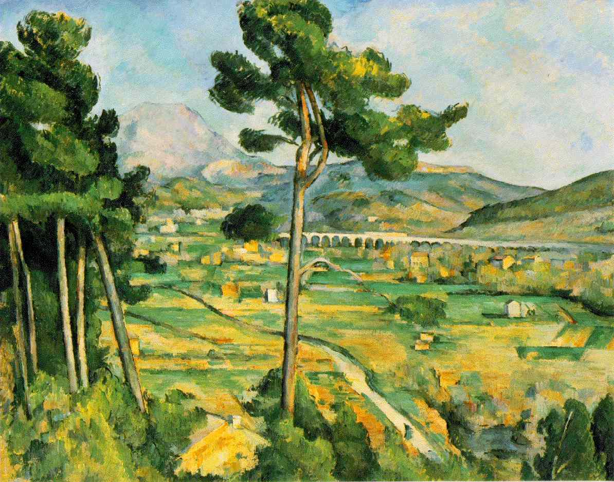
In his series Mont St. Victoire he was fascinated by its rugged geological forms. He painted and sketched it repeatedly from many angles, building up a sense of mass and solidity in his brushstrokes - I can see how his use of bold geometric brushwork inspired the Cubist style.
Painting outdoors in all weathers would surely also have presented him with its own challenges; indeed it was through his detemination to continue working for hours in the pouring rain during one autumn that caused pneumonia and subsequently his death.
![]() |
| Mont Sainte-Victoire 1902 oil on canvas 83x65cm |
![]() |
| Mont Sainte-Victoire seen from Les Lauves - pencil & watercolour 1901-06 48x31cm |
Claude Monet (1840 –1926)
Monet produced much of his series of water lilies (approximately 250 oil paintings) towards the end of his life while he was suffering from deteriorating eyesight, caused by cataracts. According to his letters to friends he would complain about how colours were getting dull and how he found them increasingly hard to tell apart. As the condition worsened, the colours in his paintings became more vibrant. This can be seen when comparing Water lilies (Rome) 1897-99, Water-Lily Pond and Weeping Willow (1916-19 and 044 circ.1920). His anxiety was such that it eventually led him to suspend work on the Lilies series until after the eye operation. After suffering for many years, he had surgery in 1923 – only 3 years before his death at the age of 86. However, he still complained following the operation how his sight was too yellow then blue. He continued with the series, but only one eye was operated on and his binocular vision was adversely affected, with it his sense of depth. He destroyed many paintings due his frustration, though some of them were salvaged by his family and friends.
![]() |
| Water lilies (Rome) 1897-99. |
![]() |
| Water-Lily Pond and Weeping Willow (1916-19). |
![]() |
| Water lilies 044 circ.1920. |
The series is now displayed in separate museums all over the world. An exhibition of part of the series was held in the Musée de l’Orangerie and since a few months after his death, eight of them are on permanent display.
4/10/11
Pentimenti Research Point 2
This is a term which describes an alteration in a painting made by the original painter. It is the part that has been painted over and which has become visible again due to some transparency in the overlying layer of paint, which may have increased over time. A single alteration is called pentimento (singular). Sometimes the underlying layer of the painting has always been visible i careful inspection. Others, especially in the underdrawing, can only be seen with modern methods such as X-rays and infra-red reflectograms and photographs.e paint over many years – usually centuries.
Pentimenti may show that a composition originally had an element, for example a head or a hand, in a slightly different place, or that an element no longer in the final painting was originally planned. The Arnolfini Portrait by Jan van Eyck 1434 is a typical example of pentimenti. The main changes were the lowering of the two faces and the alteration of the position of the female’s eyes. The male’s feet were moved three times in total. Infra-red reflectograms have revealed these alterations.
![]() |
| Arnolfi portrait - Van Eyck |
Some of Lowry’s paintings are painted over other images. The 1938 painting Head of a Man (Man with Red Eyes) when x-rayed showed a female portrait and possibly a self-portrait underneath. It would not be considered pentimenti as the subjects are totally different.
The term has been used when modern painted advertisements on buildings are painted over with new ones and the paint peels away to reveal the underlying layers.
4/9/11
4/5/11
Landscape Drawing Research Point 1
LS Lowry b. Stretford (1887-1976)
Most of the paintings of LS Lowry – in the Salford/Manchester area, personify the northern English industrial townscape. In fact Manchester is known as "the town of tall chimneys". It certainly was in Lowry’s day anyhow!
As a rent collector in the 1920s and 30s he would travel all over the city. The subjects for his paintings were on his doorstep and that is when he started to become fascinated by the industrial scenes all around him. As these townscapes were affected later by the blitz, slum clearance and new housing they changed very noticeably during his lifetime.
As far as I can make out from reading about some of his techniques on the Lowry Gallery website, it seems that he would use sketches rather than a camera to help record the scenes. With a pencil he used smudging and erasing to work the surface of his drawings and rubbing the lines to build the atmosphere. With paper he had in his pockets he would do quick on the spot sketches. His paintings were composed in a room at his home often on a white surface using firmly drawn backgrounds and buildings. Some of these paintings were semi-imaginary.
Pendlebury 1936 -It certainly looks as though Lowry made use of smudging and erasing in this drawing, but in a very neat way.
Claude Lorrain (1600-1682) – better known by the Frenchprovince of Lorraine where he was born. Claude Gellée was his real name. He was a painter of the Baroque style and era.
Most of the paintings of LS Lowry – in the Salford/Manchester area, personify the northern English industrial townscape. In fact Manchester is known as "the town of tall chimneys". It certainly was in Lowry’s day anyhow!
As a rent collector in the 1920s and 30s he would travel all over the city. The subjects for his paintings were on his doorstep and that is when he started to become fascinated by the industrial scenes all around him. As these townscapes were affected later by the blitz, slum clearance and new housing they changed very noticeably during his lifetime.
As far as I can make out from reading about some of his techniques on the Lowry Gallery website, it seems that he would use sketches rather than a camera to help record the scenes. With a pencil he used smudging and erasing to work the surface of his drawings and rubbing the lines to build the atmosphere. With paper he had in his pockets he would do quick on the spot sketches. His paintings were composed in a room at his home often on a white surface using firmly drawn backgrounds and buildings. Some of these paintings were semi-imaginary.
![]() |
![]() |
| Industrial river scene |
![]() |
| Peel Park |
![]() |
| Peel Park |
![]() |
Peel Park |
![]() |
Peel Park I almost prefer these 4 spontaneous looking sketches (above) of scenes in Peel Park, Salford, to the paintings. |
![]() |
| View from window looking towards Broughton |
![]() |
| Dewer's Lane |
Albrecht Durer (1471 – 1528) was born in Nuremberg,Germany. Aswell as being a painter, printmaker he was also a mathematician, engraver, and theorist. He was very successful in spreading his work across EuropeItalyVeniceAlps he made watercolour sketches. These are regarded as the first pure landscapes ever produced in Western Art. , on his way there, in 1494. As he traveled over the and The Netherlands and he made his first trip to through printmaking. The variety and innovative nature of his work made him a true leading light in the art world of his day. Living in Nuremburg, he was well situated to make excursions to Italy and The Netherlands and he made his first trip to Venice in 1494. As he traveled over the Alps, on his way there, he made watercolour sketches. These are regarded as the first pure landscapes ever produced in Western Art.
In the spring of 1495 he returned to Nuremberg but continued to paint landscapes – although he is far better known for other subjects. Landscape as a category of painting, only began to emerge during the Renaissance and was usually populated by figures.
![]() |
| Watercolour 1494-95 |
![]() |
| Alpine landscape 1495 |
Below is an extract from the British Museum website and contains an interesting description of the drawing - Landscape with a Woodland Pool (below) Near Nuremberg , Germany , around 1496:
![]() |
Wooded landscape with distant buildings 1640-50
On the left we see the broken trunks of pine trees rising on a grassy bank. To the right are more pine trees, their deep green tops filling the paper. In between is deep blue water which disappears into the darkening distant horizon. As the sun sets, the clouds turn a deep blue which is mirrored in the blue of the lake. Similarly, the green branches of the pine trees are balanced by the green banks around the water. Dürer's fluid brush and deep colours make it a very beautiful and harmonious depiction of restful nature.The scene may be outside Nuremberg and was probably painted after Dürer had returned from his first visit to Italy , around 1496-97.
The drawing is unfinished at lower right where the white of the paper is clearly visible. Dürer's monogram in the upper centre was added later in another hand.
The following is a link to the website http://www.britishmuseum.org/explore/highlights/highlight_objects/pd/a/albrecht_d%25C3%25BCrer,_landscape_wi-1.aspx
It is generally agreed that this landscape drawing is one of the most sensitive of Dürer's portrayals of nature. It is painted with a brush in water and bodycolour. Dürer was the first artist to recognize the potential of watercolour. Indeed, his work as a landscape artist in watercolour raised the status of this medium.Claude Lorrain (1600-1682) – better known by the French
So as to follow the classical order of the times and because of commercial pressures, he included figures and gave narrative (usually mythological), as landscape in its own right was not considered important around this time. He was more interested in uninhabited natural scenes, as his many drawings and sketchbooks show. Much of his popularity was also based on his use of subtle gradations of tones. Many artists used a
Claude glass to view scenes. This was meant to help them produce works of art similar to Claude’s.
John Constable – a Romantic artist held Claude’s landscapes in high regard and described Claude as "the most perfect landscape painter the world ever saw". He declared that in Claude’s landscape "all is lovely – all amiable – all is amenity and repose; the calm sunshine of the heart".
![]() |
| Claude glass |
![]() |
| Wooded landscape with distant buildings 1640-50 |
![]() |
| View of the campagna |
![]() |
| Landscape with latium with farm labourers - pen, brown indian ink wash and black chalk (1660-63) |
Subscribe to:
Posts (Atom)