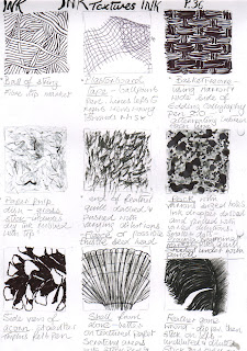
When doing the texture squares I discovered a few new ways of using various drawing techniques to depict surface texture: Blending pencil dust with the fingers I found quite fun, and useful for dense grey or black smudgy areas, then erasing to depict lighter areas or reflections.
A blending stump was helpful to soften tonal transitions with control and has more precision than using fingers or a cloth. I used this to emulate dull metal.
For paper pulp I used ink, rubbing the paper with grass stick and quite dry ink, producing scratchy rendering.
Ink in a dropper was dabbed and pulled to make tadpole like circles and smears for a certain type of rock.
Frottage
 I find this to be an exciting experimental technique and ideal to use a point of departure for drawing, or to incorporate into other artistic applications, such as printmaking, collage and painting. I had real fun with this exercise. Apart from helping me to understand and appreciate the textural make up of surfaces of objects around me, it also helps to build up a library of textural marks. Even what I thought were the most unlikely of surfaces, such as the relatively smooth ones of brown paper, a candle and a chair cover gave surprisingly interesting results and would make good contrasts to the more obvious textures. To use frottage directly in a drawing, I think texture rather than form would be the objective, although it would be interesting to see the results possible.
In the Drawing with Textures – after spending quite a long time experimenting with different materials I decided to try a combination of media for the natural objects, and begin with an open mind. I took a chance with some new effects with ink, including a cotton bud to dab in very dark shadow areas, dark holes in the bark,dragging it (with quite dry ink) for broken texture and for the rock fissures and textures in the bark. I knew I wouldn’t be able to render every object with ink, so I started by using an 8B pencil on the side of the point to apply smudgy tonal shading to the rock at the rear. Then I decided to try charcoal and was so impressed with the results, I continued rendering the bark with this. It seemed the the perfect medium for applying broken texture when I dragged it along lengthways on its side. Certainly it was so easy to smudge with the fingers or blending stick and manipulate on the side of the point for the fissures in the rock, particularly using the thin sticks. For the foliage overlying the large rock I made squiggly marks using a black Conte Pierre Noire pencil.
It is the first finished drawing in which I’ve used my opposite hand (right hand) for some otherwise awkward areas and it felt rather liberating - so not before time! Before very long, charcoal seemed to be dominating other mediums in the drawing – I just found it was ideal for achieving the right textures in so many areas, apart from the large leaf at the front. For this I used a 7B pencil to do the short diagonal veins. It would have had more impact on this occasion (from a textural point of view) if I’d used a grass or bamboo stick and ink, as I’d originally intended, after trying it out during the experiments I did beforehand. If I’d used tonal hatching with ink and pen for the dark leaf at the top left it might have implied form better, but it probably wouldn't look balanced unless other parts of the drawing were rendered with ink also - the berries and leaves may also have been improved by the same treatment. I think the rock and bark aren’t too bad in this respect, as they seem to have more tonal variations, although I concentrated on bringing out the textures more than anything else. I also included the wooden texture of the supporting surface and the fabric background in this drawing.
 |
| A few earlier experiments |
| A Drawing with Textures - my final attempt. |


No comments:
Post a Comment