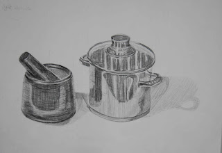
All this resulted in a distinct (rather than gradual) separation between the darkest area of cast shadow nearer the objects, and the outer areas. I think this effect could have been at least partly due to some reflected light from the shiny objects onto the lighter areas of shadow.
2. The alternating values on the stainless steel objects in particular, produced an interesting pattern of light and shade on the surface.
For the mortar, pestle and stainless steel pan I lightly added the outlines with an F pencil and for the shading - 2B and 4B pencils. I tried to follow the round curving shape of the two objects using various weights of line, depending on the depth of tone. I don’t think that I curved the lines adequately towards some of the sides, for instance on the pan – they are a bit too horizontal looking, adversely affecting it’s form. It was difficult to do any obvious hatching on some areas like the handle on the right of the pan, but I tried to follow the curves. I think that the many areas of reflected light and shade on the body of the objects have too hard a division between them. I’m not sure how I could correct this in future – we’ll see!
Note: I later rounded the ellipses more at the base of both objects in the two drawings - the first below and also the coffee pot and sugar bowl further down. The improvement is evident and they appear much more natural now, but I would say the ellipses should be deeper than those at the top of the objects as the angle is sharper from those viewpoints. Then again, since I made the changes the initial ellipses look extremely flat in comparison.
Before
After curving the ellipses more on the base of both articles
The medium used for the coffee pot and sugar bowl was willow charcoal in various thicknesses. The areas of reflected light and shade seemed to follow a straight vertical pattern around the upper two thirds of the sides, as they also followed the length of the handles and coffee pot’s spout, so I tried to emulate this in the direction of my rendering of them. With the later addition of some random short horizontal flicks of charcoal I tried to balance the contrasting effects on neighbouring areas. Some of them were again too horizontal where they should have curved more around the sides. On the lower third of the objects and the inside surface of the sugar bowl the surfaces were angled inwards and this suggested to me the use of a fairly horizontal treatment from the start, following the curvature of both objects. The same went for the lids, although it was more obvious on the underside of the sugar bowl’s open lid. I had difficulty using the charcoal in a way which seemed to demand a more controlled approach, but I enjoyed the challenge.

Before
After


No comments:
Post a Comment